

A unique argument as to why I might be wrong about "How many have PAID???"
Thu, 08/07/2014 - 8:42pm
Chris Conover and I have developed a sort of grudging respect for each other. This evening he asked me why I use a blanket "90% Paid" estimate for the states for which I don't have any hard data, instead of running a weighted average of the data I do have and using that. This is a fair question.
I partially answered it in an entry from about a week ago, in which I noted that if you average the numbers for the 18 states which have provided at least 1 payment rate update since the end of open enrollment:
...Add all of these up and you get a total of out of 2.542 million out of 2.932 million, or 87%...and again, take a look at how out of date most of those numbers are (especially California, which makes up almost half of the total, yet hasn't been updated since April 21st...a solid 9 days before hundreds of thosuands of their policies even started coverage!).
Once again, I'm quite confident that the true eventual number is around 90%.
However, this was based on an unweighted average. He's absolutely correct that I should really do a weighted average at the very least...so today I did (the numbers are slightly higher now as more data has come in from a few states). Lo and behold, the weighted average still comes in at 86.8%:
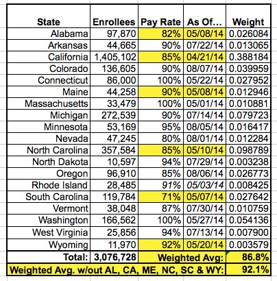
However, this still leaves the problem that a third of these states haven't had their payment rates updated since April or May. To work around that, I then removed any states which haven't updated their numbers since before June 1st, with a 4 exceptions: CT, MA, RI and WA. Massachusetts and Washington automatically have 100% payment rates; Connecticut had virtually 100% as of their May update, and Rhode Island is a special case (see my updated entry for them from earlier today).
Once I remove the other 6 states (AL, CA, ME, NC, SC and WY) which haven't updated their data since May, the weighted average rises to...92.1%.
Presented with this, Conover responded with three counterpoints:
1. First, he notes that removing those 6 states means I'm only left with 1/3 of my total sample, and it's therefore not representative anymore.
My response: No kidding. Why do you think that I’ve been so frustrated about the lack of data from those and other states? However, it’s hardly my fault.
2. Next, he points out that removing 6 of the "old" states while keeping the 3 "old" ones which have 100% payment rates is "cherry-picking". OK, fair point, although the reason I keep these is because, at least in the case of MA and WA, that 100% rate has no chance of going down or up regardless of how out of date it is; those states require you to pay as part of the enrollment process itself. Still, his point is valid re. Connecticut, so for the hell of it I removed all 3 as well and sure enough, it does drop down...to 89%. I'll have to think this one over.
On the other hand, removing those 3 states makes for an even smaller and less representative data pool, which he was already complaining about. Can’t have it both ways.
Finally, we come to his most interesting theory as to why the national average payment rate might be lower than the 90% (or 89%?) which I have it pegged at. Here's his own words:
...one could argue that the states with more recent data are the ones that are more “on top of things” administratively, which may mean they have in place policies and procedures that have the effect of boosting their payment rates. Thus, extrapolating from this cherry-picked group to the 33 states/DC that couldn’t even get their act together enough to report payment rates seems dubious at best.
...which set of states are the non-reporters most like: the “laggards” who haven’t reported in months or the “go-getters” who have provided a more steady flow of administrative data?
This is an interesting argument that he's making.
Of the 18 states providing their payment data 12 (2/3 of them) are Dem or at least Dem-leaning, and 10 run their own exchanges.
Of the 33 other states (+DC) not providing data, 22 of them (also 2/3) are either red or generally GOP-leaning, and only 5 run their own exchanges.
His basic argument here is that Republican-run states are at least twice as likely NOT to be “on top of things administratively”, CAN’T “even get their act together” and are “laggards” when it comes to payment information.
It’s certainly possible that this is the case.
Maybe Texas, Florida, Oklahoma and Alabama are currently being run by tweedledums who aren’t capable of counting past their own fingers and toes.
This is an interesting argument to make; I’m just a bit surprised to hear him making it.
Or, perhaps he's not blaming the state administrators; perhaps he's implying that the residents of red states are twice as likely to be deadbeats. Given the disparity between red and blue states when it comes to federal tax payments vs. federal taxes received, he might be onto something here.
However, I hate to burst his bubble on this issue, but even the GOP’s own report on payments, deeply flawed as it was, still admitted that Kansas, New Jersey and South Dakota (2 of them beet red, one run by a GOP heavyweight) were all running at 86-87% paid (and both PA and MO were running above 80%)…and that was as of mid-April, when over 35% of the enrollees’ policies hadn’t even started yet.
Hell, they had Michigan down at only 55% at the time, but this has more recently been confirmed as being, once again, 90%. Are you gonna seriously tell me that most of these states aren’t at least into the mid- to upper-80’s by now?
Anyway, Conover then asked whether I'm willing to bet money on my "cherry-picked" (his term) 90% vs. the (presumably non-cherrypicked) 87%. As I told him, I’d be happy to do so, not because I’m certain that I’m right but because if I’m wrong, it doesn’t damage my reputation.
A few months ago I thought it was around 93% because that’s what the data at the time told me. When more data came in I dropped it to 90%. IF further data proves that it’s more like 87%, I’ll openly admit my error at that time, but at the moment the preponderance of evidence available at hand suggests that it’s more likely to be closer to 90% than 87% (if only barely...possibly 89.51%, perhaps).
In any event, the bottom line is that it’s a hell of a lot closer to 90% (or 93% for that matter) than to the 67% bullshit that the GOP was trying to throw around back in May. That’s a bet I’ll take any day of the week.
Advertisement
