July Update: COVID Death Rates by Partisan Lean & Vaccination Rate

As always, here's my methodology:
- County-level 2020 Population data via U.S. Census Bureau's 2020 Census
- County-level 2020 Trump vote data via each state's Election Commission or Secretary of State websites
- County-level Case & Death data via Johns Hopkins University Center for Systems Science & Engineering for 47 states; NY Times COVID-10 in the United States github for NE & UT only; & the White House COVID-19 Team Community Profile Report for Florida only.
- BY POPULAR DEMAND, here's an updated Google Spreadsheet with all the relevant data.
Remember: "Decile" means 1/10th or 10% of the total population (all 50 states + DC).
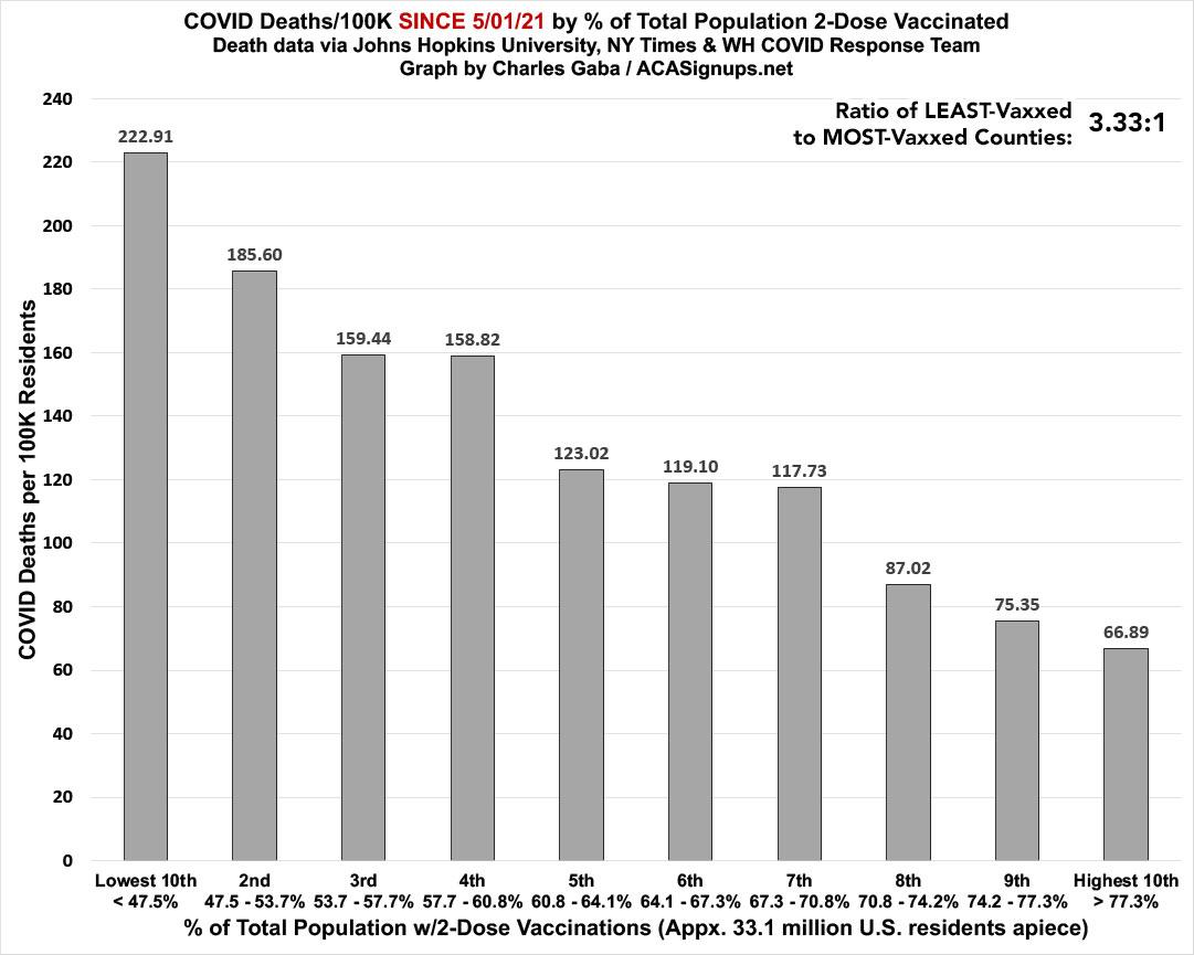
There's still a clear and dramatic correlation between how much of the population has been 2-dose vaccinated and its COVID death rate since last May. The least-vaccinated decile has a death rate ~3.3x higher than the most-vaccinated decile. It's important to note that this jumps around a bit from month to month since a few counties move from one decile bracket to the other as vaccination data is bulk-updated:
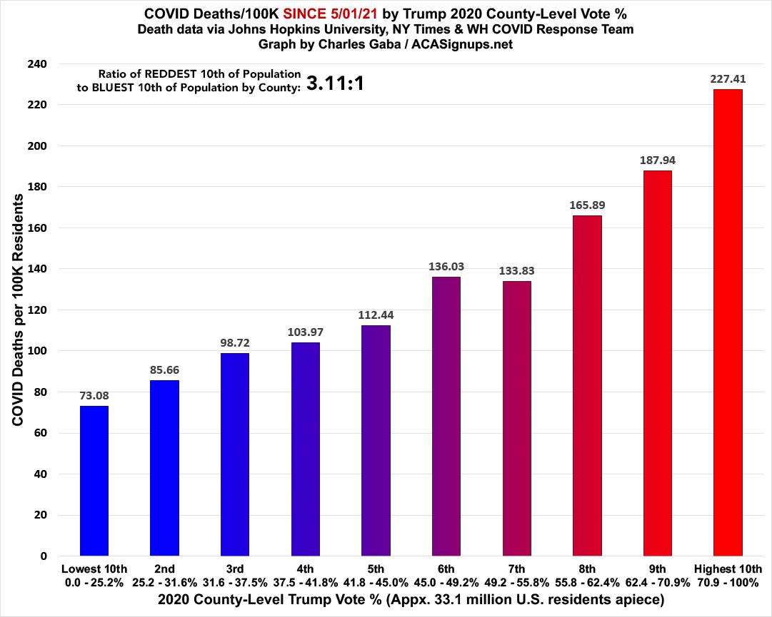
As always, what's even more disturbing is how closely the death rate by partisan lean matches the death rate by vaccination rate; they're almost mirror images of each other: The death rate since last May in the reddest tenth of the country is still nearly 3.1x higer than in the bluest tenth:
I should note that both of these ratios have gradually dipped over the past few months.


