

Weekly Update: COVID Case/Death Rates by Partisan Lean & Vaccination Rate
Mon, 03/07/2022 - 4:08pm
For months I posted weekly looks at the rate of COVID-19 cases & deaths at the county level since the end of June, broken out by partisan lean (i.e, what percent of the vote Donald Trump received in 2020), as well as by the vaccination rate of each county in the U.S. (nonpartisan). This basically amounts to the point when the Delta Variant wave hit the U.S., although it had been quietly spreading under the radar for a few months prior to that.
More recently, I've switched to posting the same data starting on December 15th, which is (roughly) the start of the Omicron variant wave (although this is fuzzier than the start of the Delta wave).
As always, here's my methodology:
- County-level 2020 Population data via U.S. Census Bureau's 2020 Census
- County-level 2020 Trump vote data via each state's Election Commission or Secretary of State websites
- County-level Case & Death data via Johns Hopkins University Center for Systems Science & Engineering for 47 states; NY Times COVID-10 in the United States github for NE & UT only; & the White House COVID-19 Team Community Profile Report for Florida only.
- BY POPULAR DEMAND, here's an updated Google Spreadsheet with all the relevant data.
Remember: "Decile" means 1/10th or 10% of the total population (all 50 states + DC).
Here's the final ratios for the Delta wave (6/15/21 - 12/15/21):
- Delta wave CASE rates: 2.46x higher in the reddest decile than the bluest decile
- Delta wave DEATH rates: 5.77X higher in the reddest decile than the bluest decile
- Delta wave CASE rates: 2.12 higher in the least-vaccinated decile than the most-vaccinated decile
- Delta wave DEATH rates: 4.77x higher in the least-vaccinated decile than the most-vaccinated decile
What about Omicron?
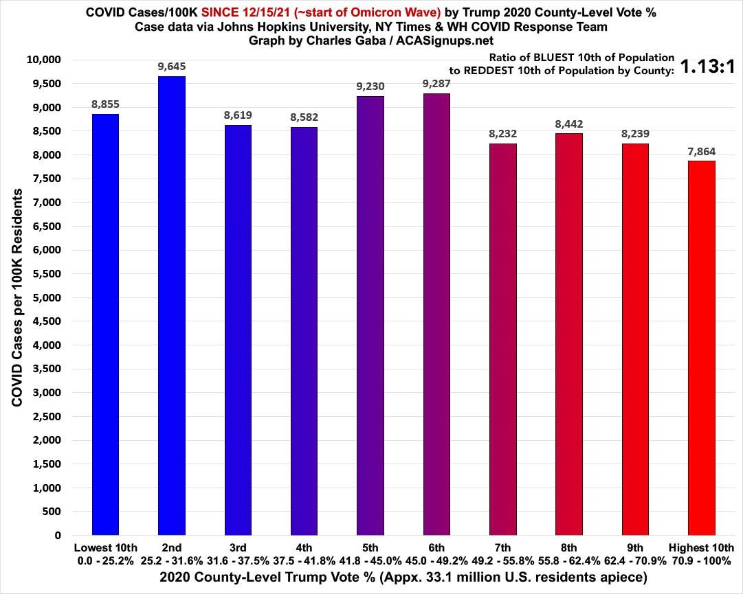
First, the partisan breakout: The case rate ratio is a very different picture under Omicron. For the first two months of Omicron, case rates are 1.13x higher in the BLUEST decile than the reddest:
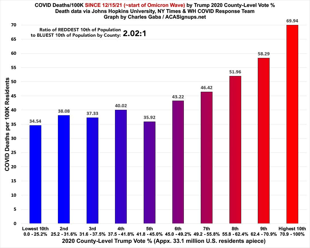
Death rates since Omicron started still swing red, as the death rate in the reddest decile is 2.02x higher than in the bluest. This is down from 2.9x higher a couple of months earlier, however, and down from nearly 5.8x higher during the Delta wave. On the other hand, it's up from 1.96x higher last week, which I'll be talking about more below...
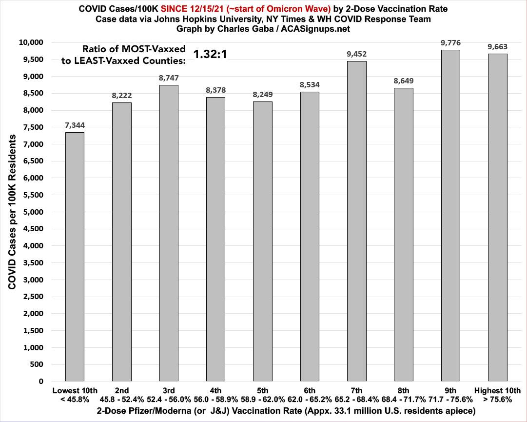
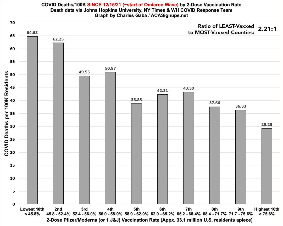
It's a similar story with the nonpartisan vaccination rate ratios:
Case rates since mid-December are now 1.3x higher in the most-vaccinated counties...except that this is down from 2.4x higher a couple of months earlier:
The death rate, however, is still 2.2x higher in the least-vaccinated decile than the most. This is down from 3.3x higher a couple of months ago, and way down from the 4.8x higher ratio during the Delta wave:
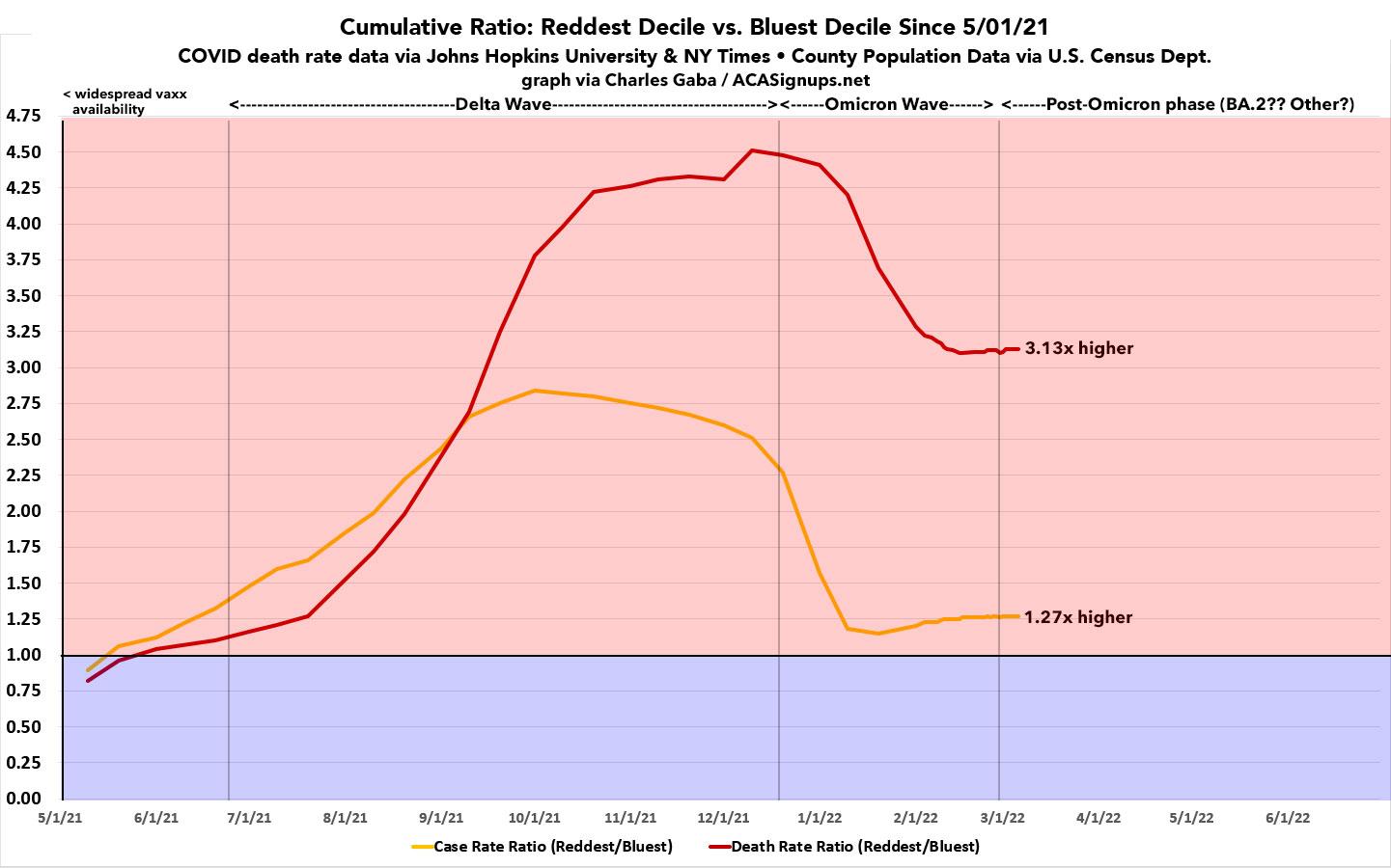
For comparison, here's what the Reddest/Bluest decile ratios look like over time if you start on May 1st, 2021...the point when pretty much all U.S. adults could theoretically have received their second COVID-19 vaccination shot (all adults became eligibie to get vaccinated in every state by early April; the second shot is given 3 weeks after the first):

As you can see, the death rate since May 1st, 2021 has been 3.1x higher in the reddest tenth of the country than the bluest.
The graph below shows how both the ratio of both case and death rates have changed over time. Notice how both were slightly higher in the bluest decile up until right around the point that vaccines became widely available...after which they both quickly became higher in the Reddest decile and have stayed that way ever since.
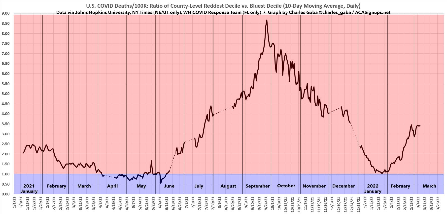
I've also added a new graph. This one shows the 10-day moving average of the ratio between the DAILY death rates in the reddest & bluest deciles, dating all the way back to January 1, 2021.
The dotted lines are data gaps; these are due to a few absurdly massive outliers (either high or low) caused by one-time backlogged data dumps which skew the daily ratios (even on a moving average basis).
As you can see, aside from a brief period from early April through mid-June last year, the daily COVID death rate in the reddest 10% of the United States has been running several times higher than in the bluest 10% every day for over a year now. The discrepancy reached its peak at the height of the Delta Wave in late September, when it was briefly running nearly nine times higher in the reddest bracket than the bluest.
Since then it's gradually dropped off as the Delta wave subsided and the Omicron wave took hold, and at one point in January the gap was nearly erased...but not quite. Starting at the beginning of February, this reversal...reversed itself again, and the red/blue gap is now shooting upwards again at a pretty fast clip.
Remember, the graph below is the daily ratio, not cumulative, which means it won't start pulling the cumulative ratios back up again until it starts running higher than whatever the cumulative ratios are as of that date.
Stay tuned...
UPDATE: Some people have also been asking about the actual raw numbers involved here, so here's a table showing the raw COVID-19 deaths reported for each month over the past year (from March 2021 - February 2022), along with the death rate per 100,000 residents, according to the data from Johns Hopkins University.
Again, I had to use the NY Times for Utah, the NY Times for Nebraska starting in July, and the White House COVID Response Team's Community Profile Reports for Florida starting in September. For Florida's June, July and August death data, I had to use estimates based on the difference between the May and September numbers:
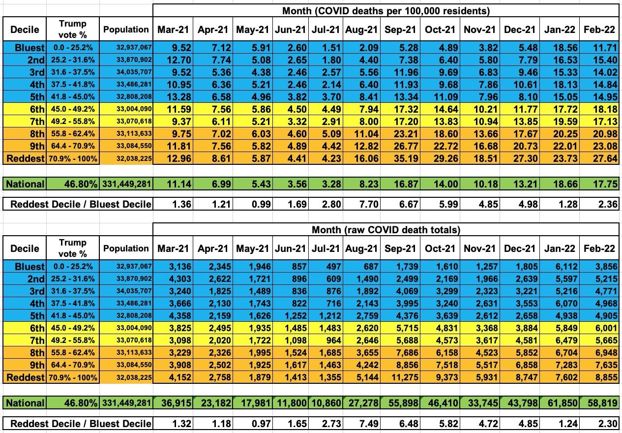
As you can see, the Reddest/Bluest Decile ratios run pretty close to identical whether you go by raw numbers or deaths per 100,000; this is by design, because each decile has roughly the same total number of U.S. residents included (according to the 2020 U.S. Census, anyway).
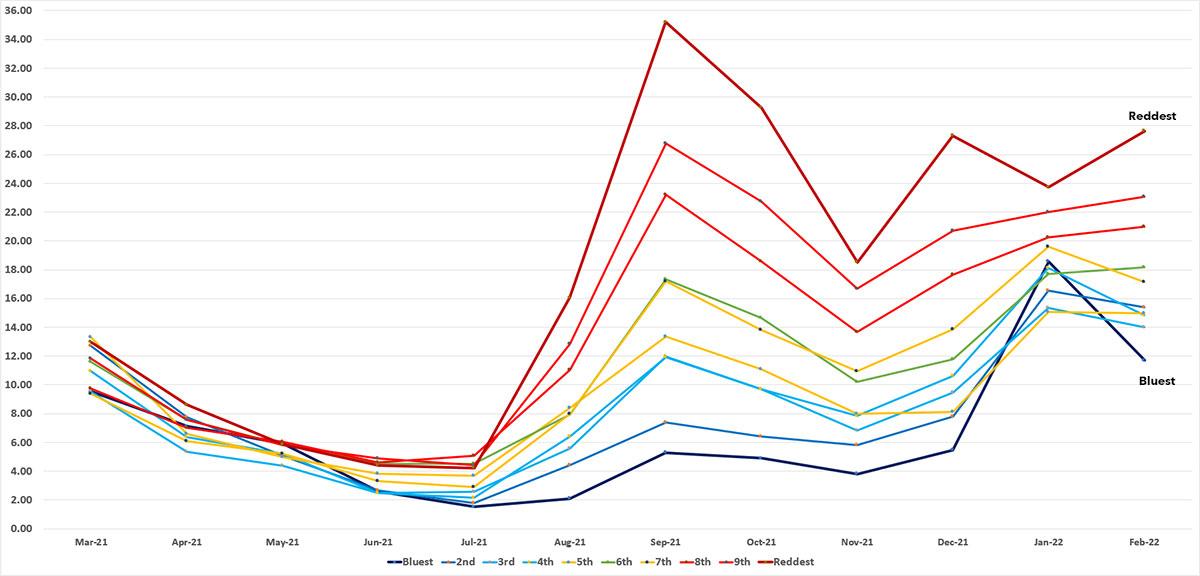
Here's what the monthly death rate data above looks like visually. As you can see, the Delta wave basically destroyed Red America, whle the Omicron wave narrowed the gap dramatically (not entirely, however).
Advertisement
