

UPDATED: COVID red/blue divide: The first 11 months vs. the second 11 months
Tue, 09/28/2021 - 9:09am
I promise this is the last one of these I'll post this week!
The first known U.S. case of COVID-19 has been confirmed to have occurred sometime in December 2019 (the first known U.S. death was on February 6th, 2020).
Assuming the first case was ~December 15th or so, it was roughly 325 days from then until the Presidential Election on November 3rd, 2020, or a little under 11 months.
It's been 327 days from Election Day through September 26, 2021.
In other words, almost exactly as much time has passed in the post-election phase of the COVID pandemic as in the pre-election phase.
With that in mind, and given yesterday's viral (no pun intended) article by David Leonhardt of the New York Times which cited my data showing the dramatic red/blue COVID case/death divide since the end of June, I've decided to revisit the earlier COVID death rates as well to see where things stood up to the 2020 election...and since then.
I actually already did this once before for my "Simple Actuarial Analysis" post, but since then I've decided to switch to using decile graphs instead of percentage graphs. To explain:
- Breaking the vaccination and case/death rates into even 10% Trump voting brackets (0-10%, 10-20%, etc.) was a problem because the U.S. population isn't evenly spread from 0 - 100%. Over 84 million Americans live in counties which gave Trump between 40-50% of the vote in 2020, while only 1.7 million live in counties where he received 0 - 10% of the vote...and only 118,000 live in the 90 - 100% bracket.
- A decile graph means that the population is instead broken from lowest to highest into 10 brackets of roughly ~31.1 million Americans apiece, which is far more representative. It's even more helpful for the vaccination rate graph, since there's barely any counties which are below ~25% or above ~80% vaccinated.
Again, I couldn't break the population brackets into exact 31.1 million resident chunks because the counties which cut across that threshold are usually several hundred thousand in size. Since there's no way to slice the county in half, I have to include them in one or the other. I have them broken out as evenly as possible, however.
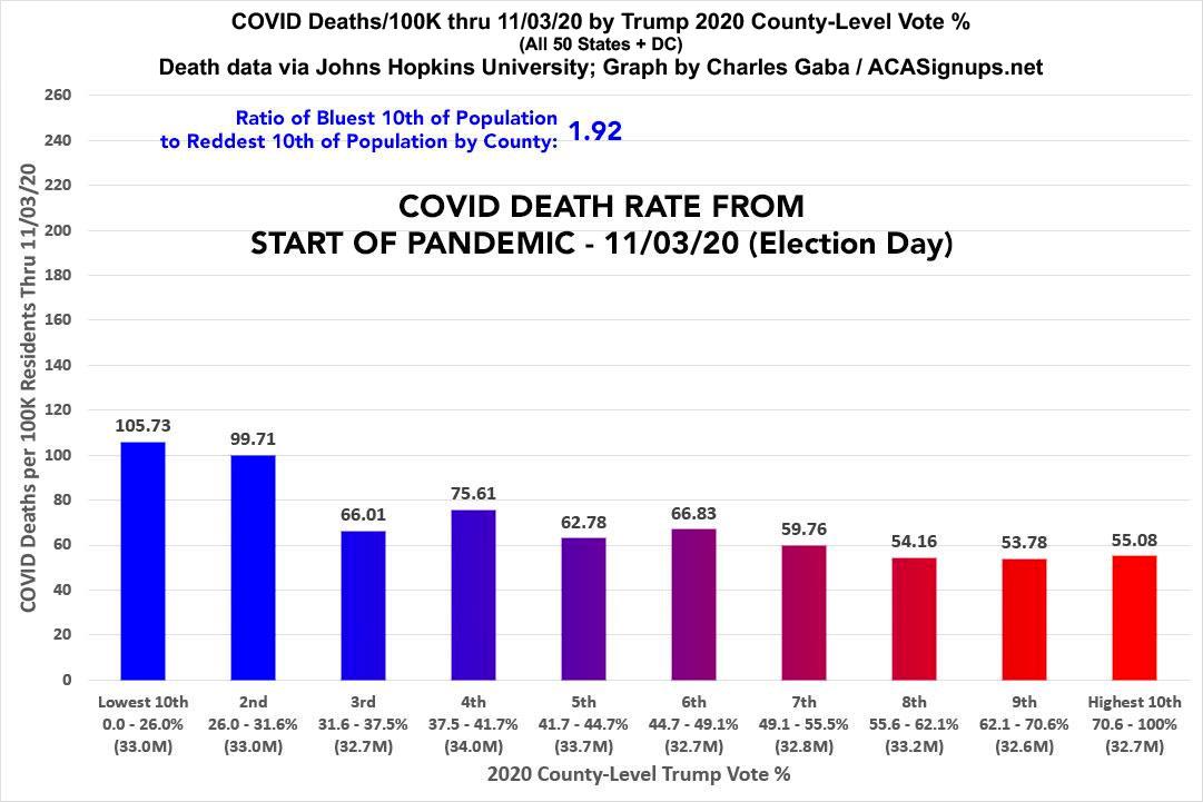
From the start of the pandemic until Election Day 2020, as you might expect, the death rate in the most Democratic-leaning tenth of the country (where Donald Trump received less than 26% of the vote) averaged around 106 deaths per 100,000 residents, or around 92% higher than in the most Trump-leaning tenth of the country (where Trump received more than 70% of the vote):
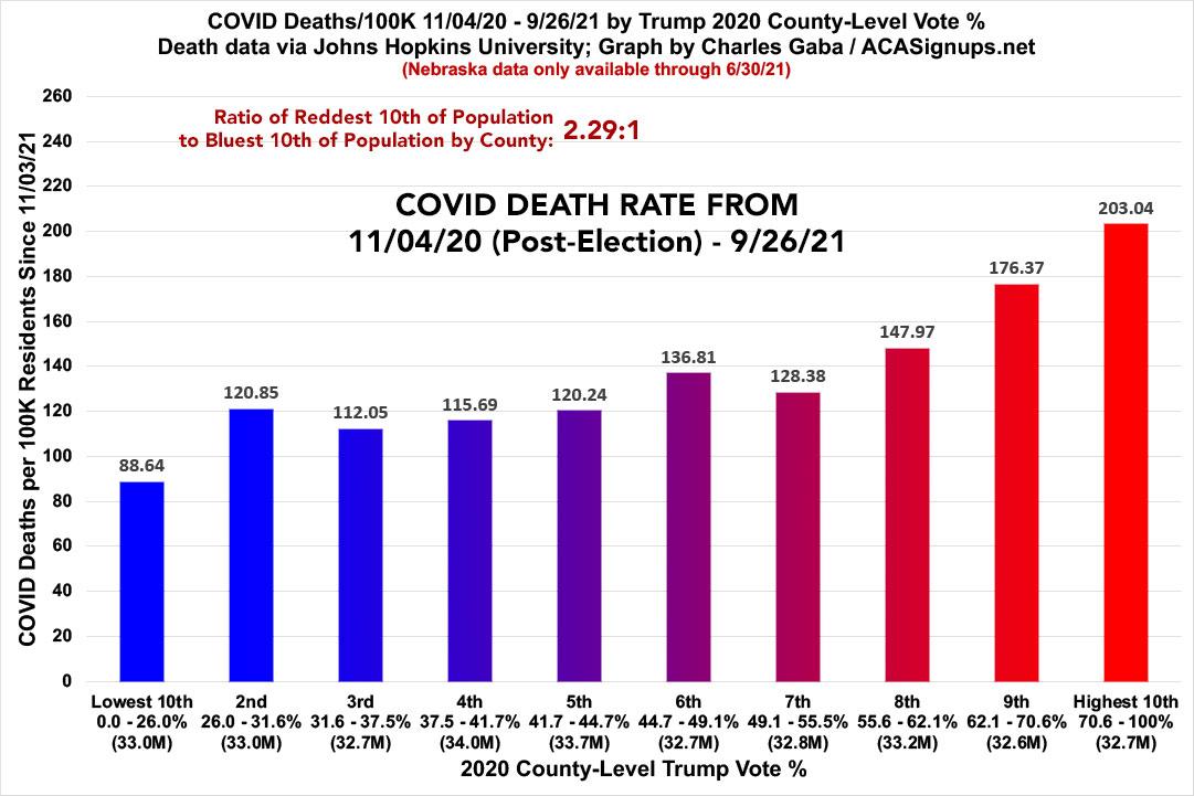
By contrast, in the 11 months since Election Day 2020 (from 11/04/20 - 9/26/21), there's been a complete reversal and then some: The death rate in the Trumpiest areas of the United States has been 2.3x higher than in the least-Trumpy tenth:
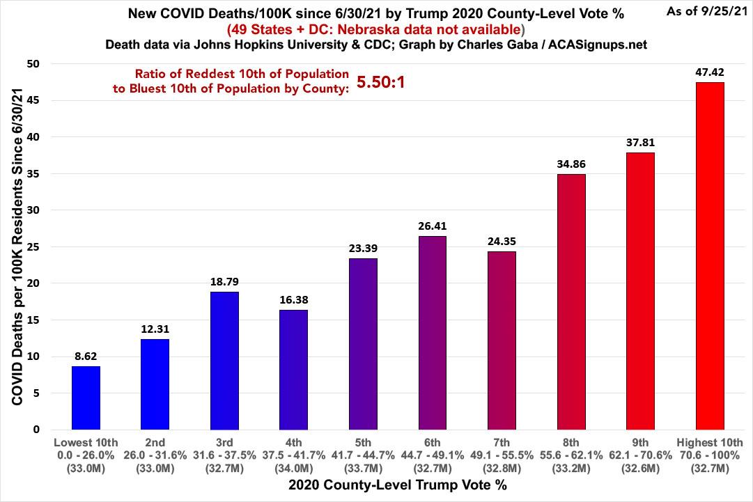
I've previously been reluctant to lump in deaths from June - September in with data from prior to then because Florida (and Nebraska) stopped reporting deaths at the county level in June. Recently, however, the CDC has started breaking out Florida's deaths by county again, which allowed me to run a new graph all the way from 11/04/20 until the present. Nebraska's post-June deaths are still missing but it's a much smaller state than Florida (just 1.94 million people, or 1/11th the size of Florida) and they haven't been hit nearly as hard (so far) by the Delta wave as Florida has been, so I'm willing to forgive that, though I did include a note on the graph about this.
Both of these graphs use the same scale...and it's also worth noting that even then, the death rate among the bluest bracket has been 16% lower for the second 11 months than it was for the first 11 months...while in the reddest bracket it's been nearly 3.7x higher.
As you can tell by once again looking at the death rate since the end of June only, this pattern has only been accelerating:
The usual caveats apply:
- Besides Nebraska missing data since the end of June, these also don't include U.S. territories since they don't vote for President in the general election.
- Most importantly: These graphs only lay out where the higher/lower vaccination, case and death rates are, not necessarily WHO. Remember, the reddest counties still usually have blue patches and vice-versa.
NOTE: For anyone interested in checking the data itself, I've uploaded most of it to a Google Docs spreadsheet; I'll upload (and update) the rest soon.
UPDATE: Just for the hell of it (and to help shut down a handful of people whining about my "arbitrary cut-off date" of 11/03/20 even thouogh there's a pretty obvious and sensible reason for that), here's what the same graph looks like when you combine the entire pandemic to date as of 9/26/21:
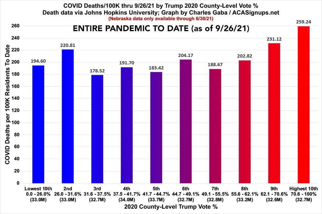
The death rate in the reddest bracket is still 33% higher then the bluest one. Of course, the second bracket over has a higher death rate; if you compare it against that one instead, it's only 17.4% higher as of this writing.
Advertisement
