

Update: A picture's worth a thousand words, etc.
Sun, 05/16/2021 - 8:55pm
The vaccination levels for each state below are based on taking the total number of COVID-19 doses administered to date according to the Centers for Disease Control), then and dividing that into double the state population (since each person needs two doses to be fully vaccinated) as of April 2020 according to the U.S. Census Bureau.
I then adjust each state by counting the single-dose Johnson & Johnson vaccine twice (since it's effectively similar to getting 2 Pfizer or Moderna doses).
UPDATE 5/21/21: The first few times I did this, I estimated J&J at 3.5% for every state; since then I've found that the CDC does provide the exact number of each type of vaccine for every state...it ranges from as low as 1.9% in Hawaii to as high as 6.5% in Maine, which is kind of interesting. The later graphs at the bottom have been adjusted to reflect this.
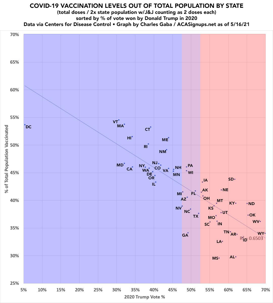
The percent of 2020 Presidential election vote won by Donald Trump comes from Wikipedia, which in turn gets their data from the Federal Election Commission.
There's one massive outlier for vaccination level is New Hampshire, where there seems to be something seriously messed up with their data as of this writing.
According to the official New Hampshire COVID-19 dashboard, as of today, NH has 579,024 residents fully vaccinated (2 doses), plus an additional 179,340 residents who've had their first dose. That should mean a total of 1,337,388 total doses, adjusted up by 3.5% for the J&J shot for a total of around 1.384 million. That should put them at right around 50.3% of the total population as of 5/16/21.
Assuming that's accurate, the R^2 is 0.6404.
UPDATE: Sure enough...
Update from CDC on today's numbers: "The total number of administered doses for the US and New Hampshire were incorrectly reported by an additional 619,920 records. This was due to an error in data processing that is being corrected" and will reflect in tomorrow's data. pic.twitter.com/TiT7uYsTA7
— Benjy Renton (@bhrenton) May 17, 2021
Here's the final version; R^2 is 0.6503
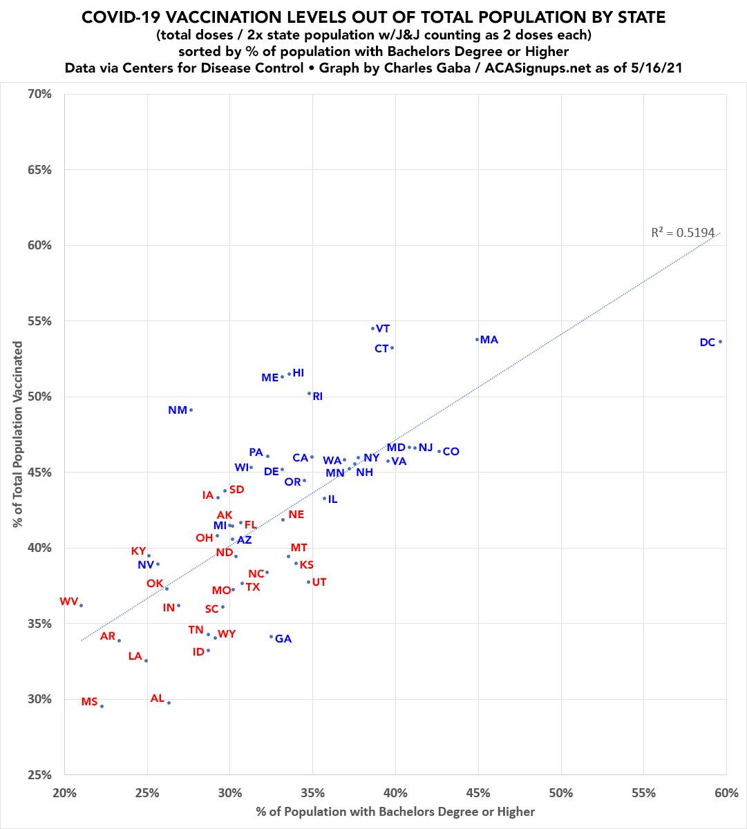
UPDATE: At the request of several people, I've added another version which plots out each state by Educational Attainment (% of population over age 25 w/a Bachelor's Degree or higher, according to the U.S. Census Bureau). As you can see, there's also a strong correlation here, but not as strong as by partisan lean:
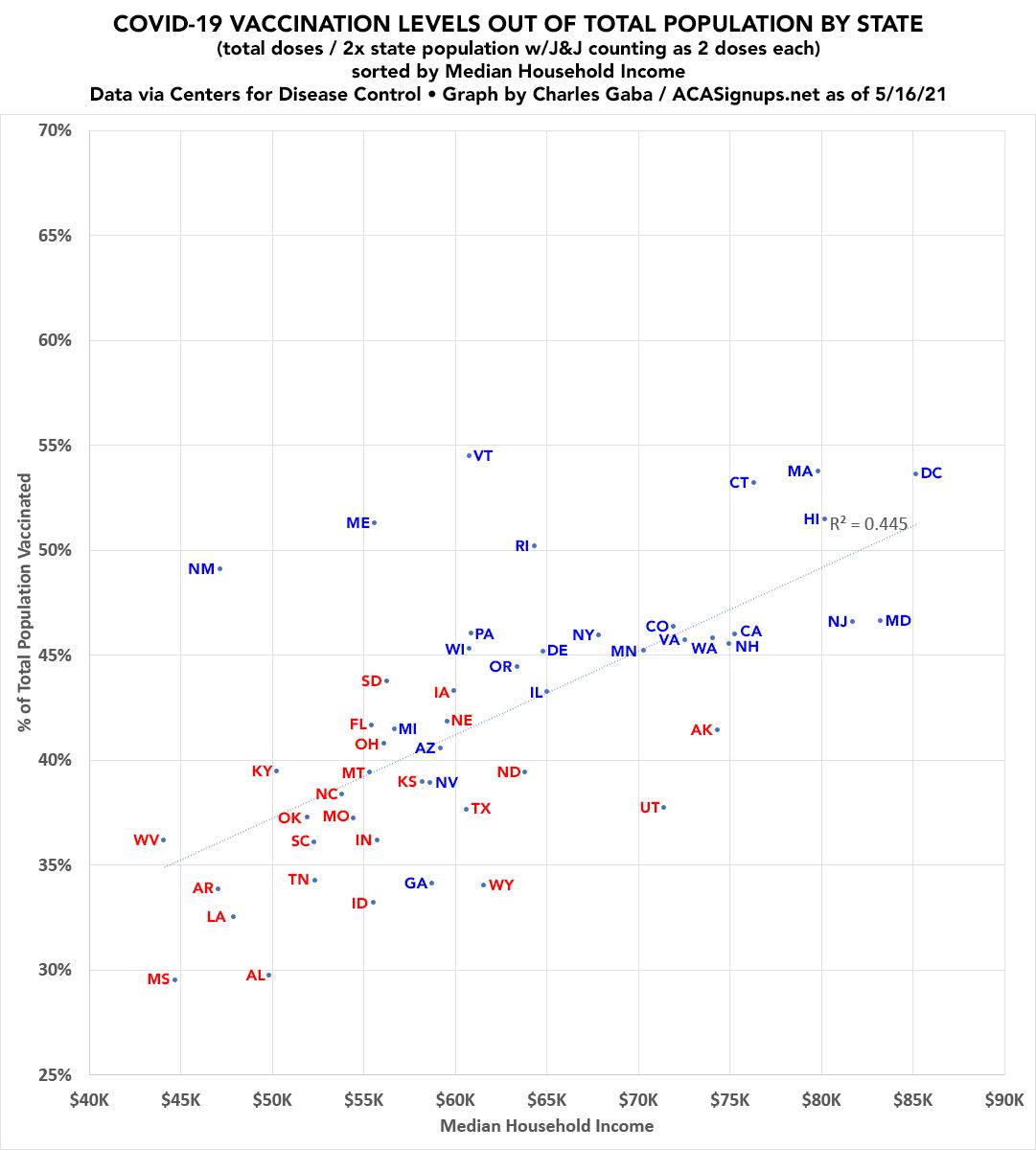
UPDATE: I've also plotted it out by Median Household Income (as of 2018, via the American Community Survey). Again, a definite correlation but not as strong as when ranked by partisan lean.
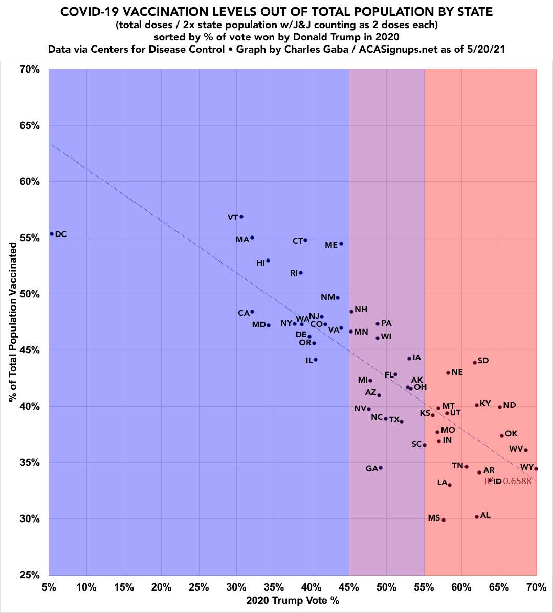
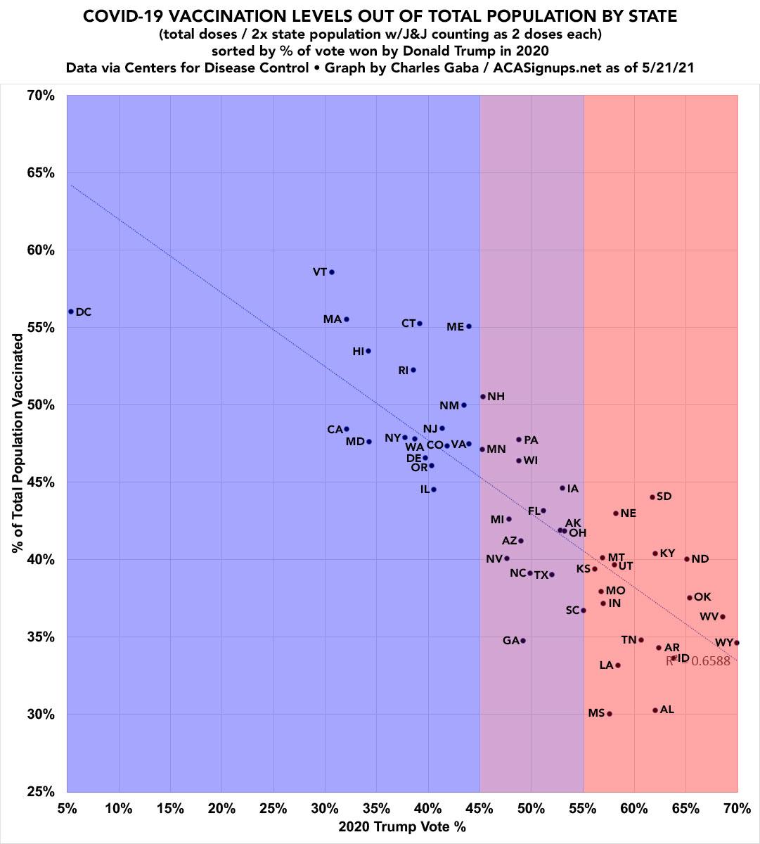
UPDATE 5/20/21: Here's what it looks like 4 days later. R2 is up to 0.6588.
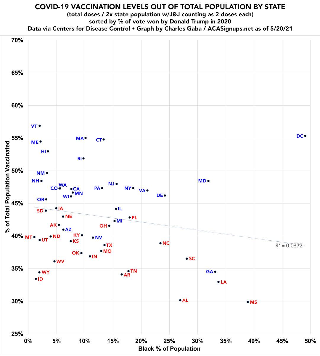
I've also plugged in a RACIAL DEMOGRAPHIC version based on the percent of each state's popualtion which is Black, according to 2018 Census Bureau estimates (by way of BlackDemographics.com). Obviously there's also Hispanic, Native American, Asian American/Pacific Islanders etc, but this illustrates things the most clearly:
UPDATE: Here's 5/21. R2 remains the same. The biggest news is that Vermont and New Hamsphire jumped dramatically (2.1 & 1.6 points respectively, which is way out of line vs. the typical 0.2 - 0.6 points per day. Either there's a data error for one or both, or these two small Northeastern states are kicking ass.)
Advertisement
