

You asked for it, you got it: #COVID19 vaccination levels BY COUNTY, graphed
Wed, 05/19/2021 - 1:54pm
So over the weekend, I posted a simple scatter plot graph which displayed the current COVID-19 vaccination rates across all 50 states +DC according to what percent of the 2020 Presidential vote was won by Donald Trump.
The original version (with the incorrect New Hampshire data) went somewhat viral on Twitter; it's racked up over 12,000 Likes and thousands of retweets as of this writing.
Here's what it looked like after I made a couple of corrections (particularly New Hampshire, which had some data reporting glitches which have since been worked out):
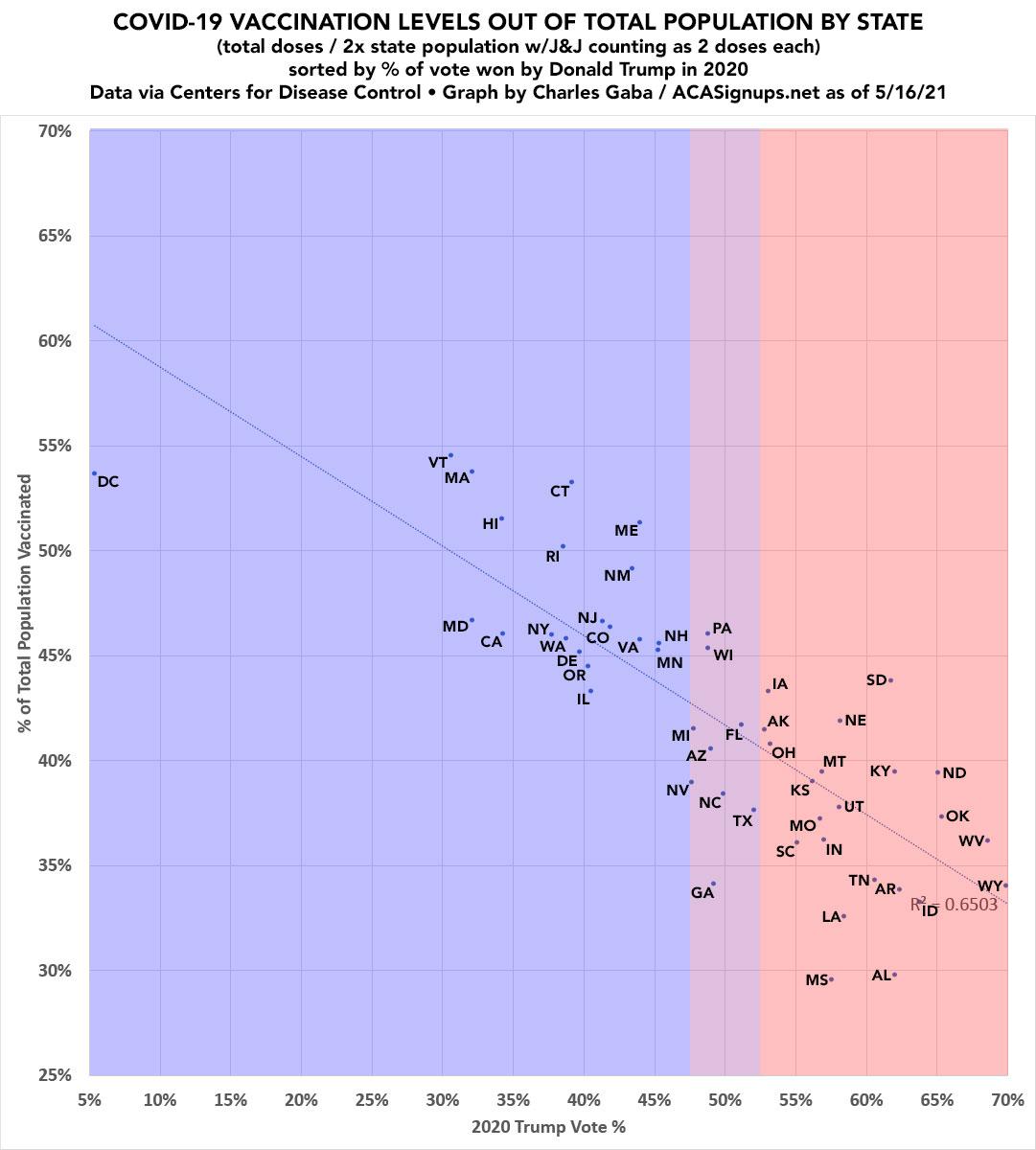
However, there's still an obvious problem...those little dots aren't weighted by population size, which kind of makes a big difference considering that California (~39.5 million residents) is 68 times the population of Wyoming (576,000 residents).
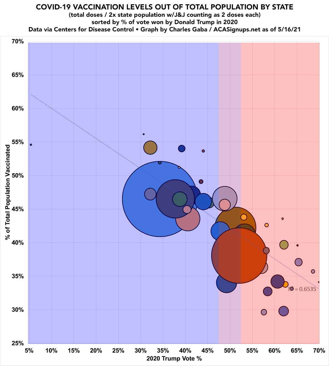
Here's a bubble version of the same graph...I've randomized the colors to make it easier to distinguish some of the smaller/overlapping states:
But that's not what you really came here for, is it?
I promised COVID-19 vaccination levels based on COUNTY-level data, and by gum, I'm gonna deliver. A couple of quick caveats:
- Nearly all of the vaccination data for the county graph below comes from the Covid ActNow Risk & Vaccine Tracker database as of 5/18/19.
- In some states, the COVID ActNow database has actual total doses (which I divide by 2 since each person needs 2 doses to be fully vaccinated). I only have data for the J&J vaccine for Michigan at the county level at this time. Around 3.5% of all doses administered are J&J, so this would bump every county up slightly if included.
- In other states, the COVID ActNow database has data for "partially vaccinated" (1 dose) and "fully vaccinated" (2 doses, or 1 J&J), but not for the total number of doses administered, which is what I prefer. For those states I'm using an estimate based on (2x fully vaccinated) + (partially - fully).
- For instance, if a county has 600 "partials" and 400 "fully", I'm assuming that means a total of 1,000 doses administered (400x2) + (600-400). I don't know how accurate this is, but it should be close...and I'm using it consistently for every county where they don't list an actual total, regardless of state or Trump vote percentage, so any variances should balance themselves out.
- Massachusetts doesn't appear to break out their vaccinations by county (they use zip codes instead), so I just used the statewide average for each of its 14 counties. On the other hand, every MA county voted for Biden anyway (Trump got no more than 43% in any county), so I don't think this moves the needle much.
UPDATE: Thanks for Linda Watt for noting that the NY Times breaks out fully vaccinated residents by county, but that doesn't tell me the total number of doses administered.
- There are two counties listed as having NO vaccinations administered at all. As you might imagine, these are located in Hawaii (Kalawao County, which only has 86 residents) and Alaska (Kusilvak Census Area, population 8,314).
- At the opposite end of the spectrum, there's three questionable outliers which I'm looking into:
Bristol Bay Borough, Alaska, has supposedly administered a total of 1,269 doses for their 836 residents, for a total rate of 75.9%.Cass County, Iowa has supposedly fully administered a total of 19,821 doses for their 12,836 residents, for a total rate of 77.2%Manassas Park, Virginia (city/county) has supposedly administered a total of 32,326 doses for their 17,478 residents, for a total rate of a whopping 92.5%.
It's possible that some or all of these are data errors...or it's possible that they're correct. If anyone with knowledge of the situation in any of these counties wants to clue me in, I'm all ears and will update accordingly, though none of these are large enough to make much difference overall.
UPDATE: Thanks to Kimberly Sheridan for figuring out the issue with Manassas Park, VA: I had Manassas Park and Manassas City swapped! I"ve corrected this in the graphs below, not that it makes much difference. Also, "Erin of Alaska" confirms that Birstol Bay Borough is indeed kicking ass re. vaccinations.
UPDATE: I've also gotten the actual total doses (including J&J!) from the Iowa COVID dashboard, and it turns out that Cass County is indeed a data glitch; Cass is only at 42.5%. I've also gotten the hard numbers from the California COVID dashboard, which only made nominal changes. Graphs below have been updated.
Otherwise, assuming there aren't any significant errors, here's what it looks like: COVID-19 Vaccination levels for the entire population in 3,140 counties nationwide, sorted out by Trump's % of the 2020 Presidential election vote. Behold!
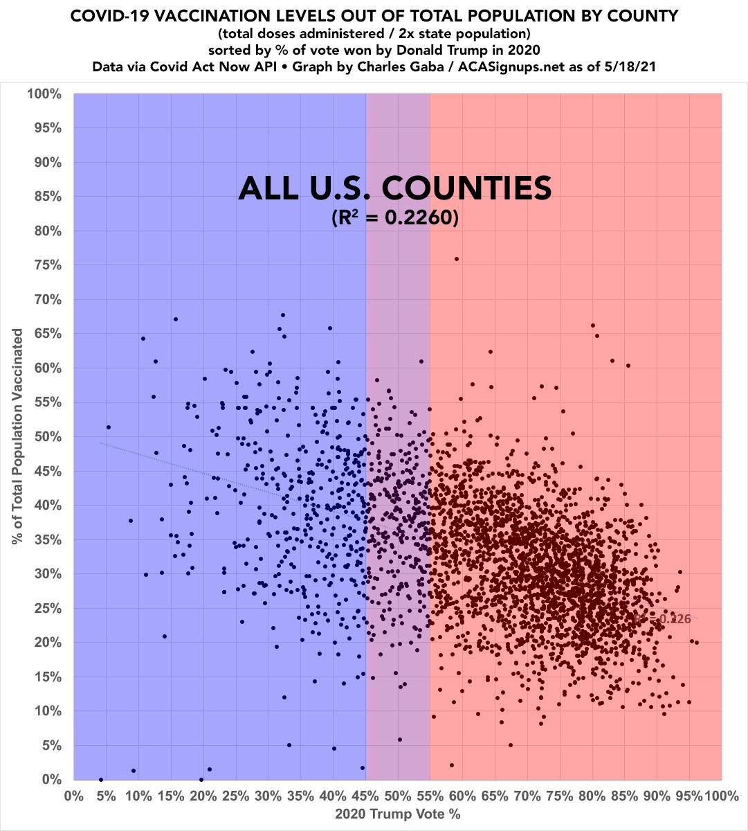
NOTE: Some people complained that I was "showing bias" in the state-by-state graph because I started the Y-axis at 25%. Well, since there's such a wide range of both voting and vaccination levels at the county level, you got your wish: BOTH the X and Y axes both run from 0% all the way to 100% here. No skewing or warping of any sort.
Of course, like the "dot" graph above, this one isn't weighed by population size either...which is an even bigger deal at the county level, since the largest county in the United States (Los Angeles County, California...population over 10 million) is an insane 116,000x larger than the smallest (Kalawao County, Hawaii, population 86). Even if you "don't count" Kalawao, there's still Loving County, Texas, population 169, or just 1/59,400th the size of L.A. County.
Therefore, I've also gone the bubble graph route for the county graph as well (not much point in color-coding when there's over 3,100 bubbles to color...). Voila!
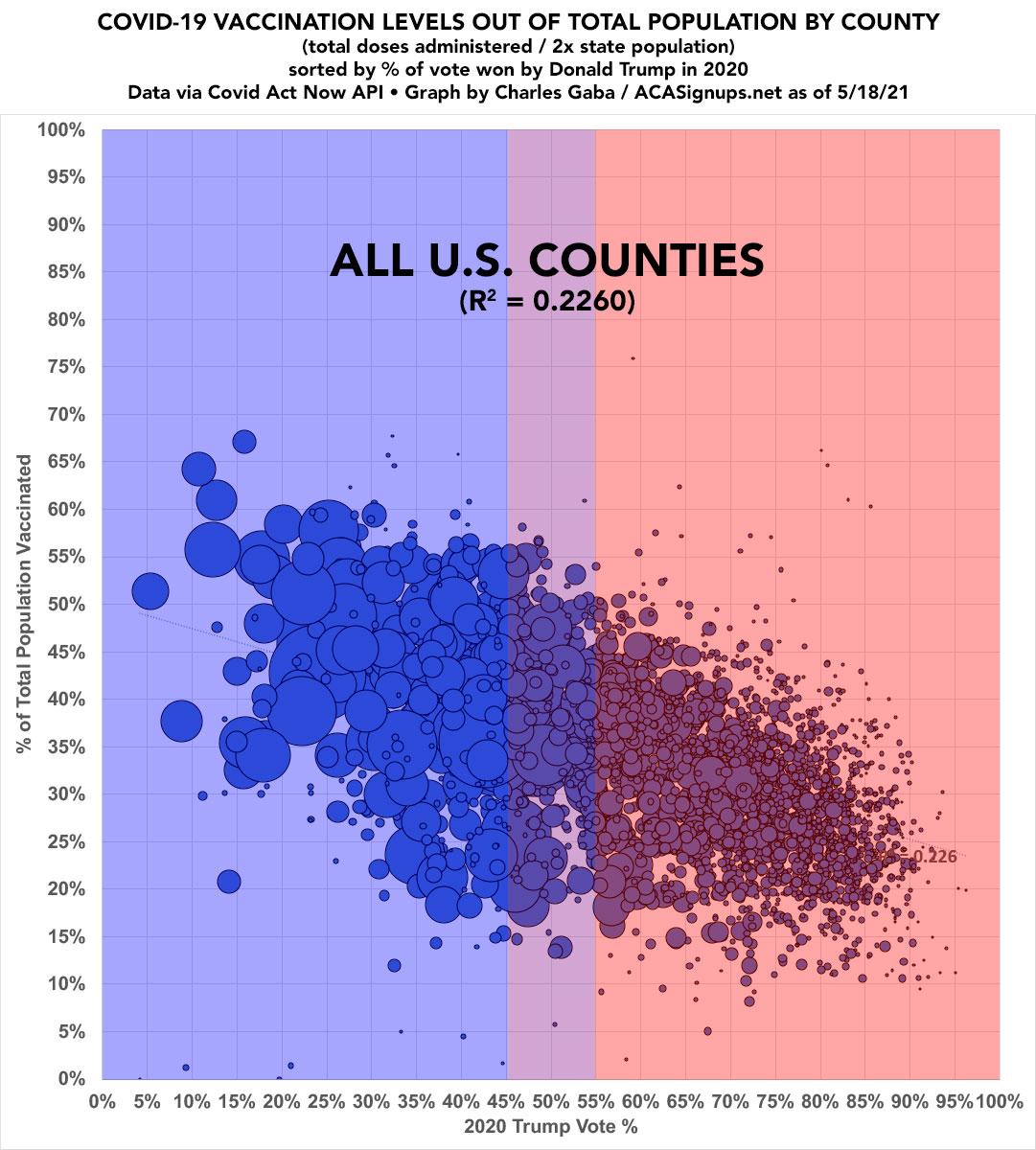
The R-squared factor isn't nearly as clean at the county level as the state level, of course, but that's to be expected. The overall trendline, however, is just as clear.
Advertisement
