

The Graph is Back!
Fri, 11/13/2020 - 5:45pm
Way back in October 2013, I launched the ACA Signups project as a light, nerdy hobby thing which was only supposed to last around six months, through the end of the first ACA Open Enrollment Period (March 31, 2014). Instead...well, let's just say that it's more than seven years later and I'm still doing this.
The reality is that The Graph itself doesn't serve a whole lot of useful function anymore. The enrollment patterns were erratic the first couple of years but have since settled into a pretty predictable...if not downright boring pattern for both the federal and state exchanges. The main reason I keep doing it each year is mostly out of tradition these days; after all, without The Graph, there wouldn't be an ACA Signups and I wouldn't have become a healthcare policy wonk in the first place.
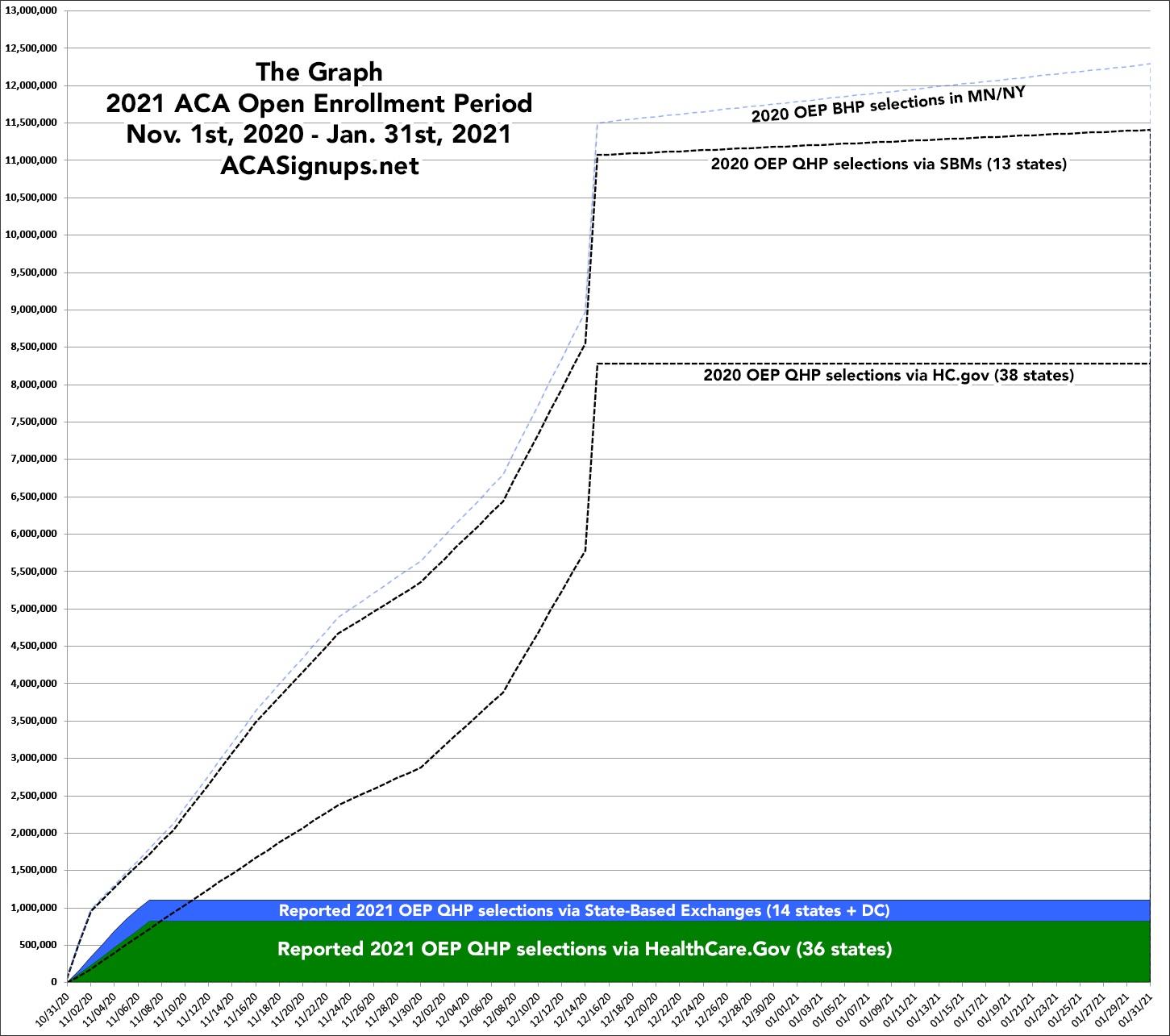
The federal exchange (HealthCare.Gov): A steady climb the first four weeks; a lull Thanksgiving week; a steady climb the next couple of weeks; and a massive spike the final week (partly due to people jumping in before the deadline, partly due to CMS auto-renewing the several million current enrollees who didn't actively renew immediately after the official December 15th deadline. After that, there's a slight drop-off in HC.gov enrollments as CMS subtracts some enrollees who actively cancel their renewals or who have residency verification issues, but it's basically a straight line from 12/15 - 1/31.
The state-based exchanges (SBMs): The first few years of Open Enrollment, the state exchanges followed the same procedure as HC.gov: They'd wait until the deadline passed, see how many current enrollees were left who hadn't either actively renewed/re-enrolled or cancelled their policies, and would then auto-renew those left. Over the years, however, more and more of the state exchanges have begun front-loading their auto-renewals: Many of them are now entering all current enrollees into the system as renewing for the following year, and then subtracting those who actively switch or cancel their renewals.
The practical upshot of this is exactly the same; the only difference it makes is in how and when the enrollments are reported. As a result, while the HC.gov line below follows a concave curve for the entire enrollment period, the SBM line follows a convex curve the first week before shifting back to a concave curve. Also, unlike HC.gov, which basically flatlines after 12/15 (the official OEP deadline), the SBM line continues to slowly creep upwards since most of the SBMs have later final enrollment deadlines (this year 11 out of 15 SBMs go beyond 12/15, four of which extend all the way until January 31st).
Finally, there's the BHP line. Basic Health Plan enrollments are only available in Minnesota and New York, and they're sort of difficult to categorize--like other Qualified Health Plans, they're subsidized ACA-compliant major medical policies...but unlike other QHPs, they aren't counted as part of the same risk pool and are only available to those earning less than 200% FPL. BHP plans can also be enrolled in year-round, similar to Medicaid, although the vast bulk of BHP enrollment still happens during the Open Enrollment Period anyway.
The biggest change this year (aside from any impact due to the COVID pandemic and/or concerns about the Supreme Court potentially striking down the ACA itself) is that two more states have split off of the federal exchange: Pennsylvania and New Jersey. Before this year, only Idaho and Nevada had made this move, but their combined enrollments only amounted to 156,000 people last year (less than 1.4%). By contrast, PA & NJ combined made up a good 578,000 exchange enrollments last year, or 5.1% of the total, so the two of them shifting from the federal exchange to SBM status will make a noticeable difference in the pattern below.
Advertisement
