Kaiser: Yes, it looks like 2017's rate hikes DID "rip the Band-Aid off" after all.
For months now, I've been noting that multiple analyses by the CBO, S&P and others kept agreeing that as ugly as 2017's average unsubsidized rate hikes were (around 25% overall nationally, ranging from just 1.3% in Rhode Island and North Dakota to a whopping 76% in Oklahoma), they did appear to do the trick in terms of finally bringing individual market premiums in line with actual medical expense claims, thus stabilizing the overall risk pool. Yes, there are still many areas of the country where this isn't the case yet, but overall it looked like the dust had finally started to settle, allowing a clear picture of what needs to be done next to improve the situation.
Last week, Donald Trump's HHS Dept. itself released a report about the reinsurance and risk adjustment programs which seemed to mostly confirm this. The details get pretty wonky, but it concluded that the overall individual market risk pool seems to be improving a bit (or at the very least isn't getting any worse). However, several commenters noted that this report is inconclusive.
Well, this morning the Kaiser Family Foundation issued their own analysis of two easier-to-understand and much more directly-relevant data points: Medical Loss Ratios and Per Member Per Month Gross Margins:
Concerns about the stability of the individual insurance market under the Affordable Care Act (ACA) have been raised in the past year following exits of several insurers from the exchange markets, and again with renewed intensity in recent months as debate over repeal of the health law has picked up. Our earlier analysis of premium and claims data from 2011 – 2016 found that insurer financial performance indeed worsened in 2014 and 2015 with the opening of the exchange markets, but showed signs of improving in 2016. A similar analysis by S&P looking at a subset of Blue Cross Blue Shield plans found a comparable pattern.
In this brief, we look at recently-released first quarter financial data from 2017 to examine whether recent premium increases were sufficient to bring insurer performance back to pre-ACA levels. These new data offer more evidence that the individual market has been stabilizing and insurers are regaining profitability.
We use financial data reported by insurance companies to the National Association of Insurance Commissioners and compiled by Mark Farrah Associates to look at the average premiums, claims, medical loss ratios, gross margins, and enrollee utilization from first quarter 2011 through first quarter 2017 in the individual insurance market.1 These figures include coverage purchased through the ACA’s exchange marketplaces and ACA-compliant plans purchased directly from insurers outside the marketplaces (which are part of the same risk pool), as well as individual plans originally purchased before the ACA went into effect.
It's important to note that there's one major caveat here: This report only includes the first quarter of 2017. As David Anderson notes over at Balloon Juice:
We need to be cautious about using first quarter data. This should be the best time of the year for an insurer for a couple of reasons. First, people are still going through their deductibles. The percentage paid by the insurer as a function of total allowed charges should be the lowest all year...Open enrollment will have just ended in the first quarter. This means the insurers are probably have the most people with low utilization on their books for the entire year. People will drop out of the pool. Those drop-outs will be due to natural movement (emigration, new jobs, marriages etc) and financial reasons (the premiums are too expensive).
In other words, the other 3 quarters of the year are typically worse for insurance carriers than the first quarter (I'm guessing the 4th quarter is worst of all, as people scramble to squeeze in operations and the like before their deductible is reset on January 1st).
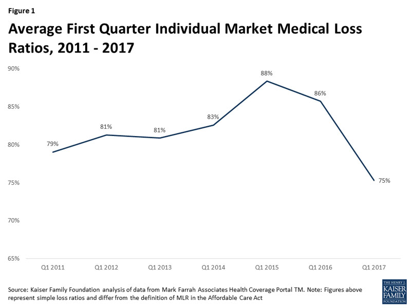
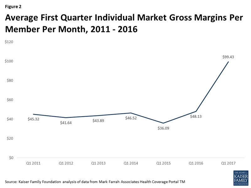
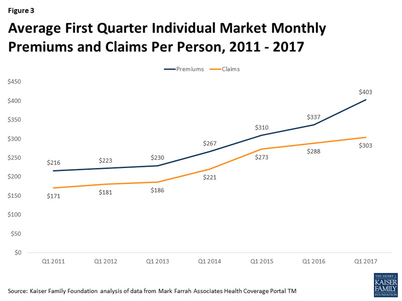
HOWEVER, with that in mind, these three charts still tell a pretty clear story (and remember, these charts compare the first quarters of every year from 2011 - 2017, so the pattern is likely pretty close (worst in 2015, slightly better in 2016, significant improvement in 2017).
First up, the Medical Loss Ratio (MLR). Remember, under the ACA, at least 80% of individual market premiums have to be spent on actual medical care. The idea is to prevent carriers from price gouging and blowing money on junkets to Hawaii, marble staircases, etc. Of course, that 20% maximum isn't profit, since you still have to include administrative overhead and the like, but it's a reasonable cut-off point. The problem the past few years is that the MLRs have been averaging much higher than 80% (and for some carriers it's actually broken 100%), which is why they've been crying bloody murder as many of them have lost money on the individual market.
Well, for 2017, raising rates by around 25% on average seems to have finally done the trick: The MLR in the first quarter plummeted from 86% last year to just 75% this year, well below the cut-off point. Again, the othe 3 quarters of the year are very likely to raise the anual average back up again. Kaiser says that the annual 2017 MLR is likely to be more like 85-90% in the end, so there's still some upward adjustment likely needed...but at the very least this shows things moving very much in the right direction.

OK, what about the actual dollar figures? Again, the trend is clear: For the first quarter, at least, the carriers are averaging around $100/member per month in gross margins. Again, I presume this will drop throughout the other 3 quarters, as the average premium stays about the same while the average claim amount increases...but this is still a vast improvement from the carriers' perspective:

Finally, here's where Kaiser got that gross margin from: Comparing the average premium paid to the average claims per member per month:

This is important for several reasons. First, as Kaiser notes:
One concern about rising premiums in the individual market was whether healthy enrollees would drop out of the market in large numbers rather than pay higher rates...As average claims costs grew very slowly in the first quarter of 2017, it does not appear that the enrollees today are noticeably sicker than it was last year.
So. In Q1 2017, claims went up 5.2% while premiums went up 19.6%. That 14.4 point difference is basically the carriers making up their underpricing from earlier years.
Worth noting: Assuming the average premiums paid per month stay roughly the same throughout the year (~20%), that means the effective average full-price rate hike for 2017 is 5 points lower than the approved average increase (25%). There's a simple reason for this: The 25% increase assumed that every single enrollee stayed in the exact same policy they were in last year, which of course didn't happen; people switched from one carrier to another, from PPOs to HMOs, from Platinum/Gold to Silver/Bronze and so forth, which would obviously also change the effective average rate increase.
Oh, one more thing worth noting: According to this, average premiums on the individual market have only increased 75% since 2013 ($403 vs. $230), not the 105% claimed by Trump's CMS division (which I actually proved was only 95% anyway, when an additional 10 states are included).
In short: There's still a bit of a ways to go to bring carrier rates fully in equilibrium with the actual costs of comprehensive, guaranteed issue, community rated individual makret policies...but this data clearly shows that the vast majority of the gap has been closed.
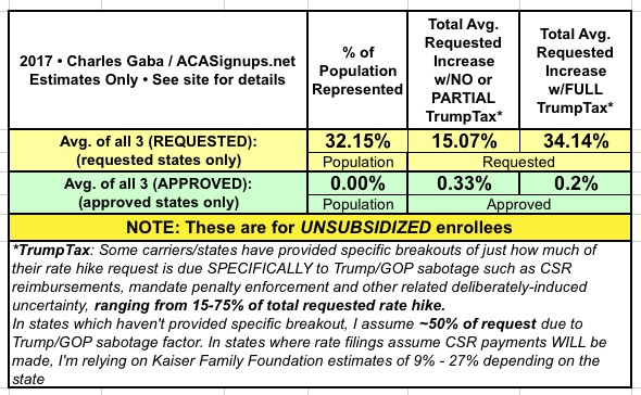
So, what does that mean for next year? Well, across 18 states so far, here's what things look like:

My very rough guesstimate so far is that the 34% "full TrumpTax" rate hike breaks out something like the following (give or take):
- 2%: Return of the ACA's Insurance Carrier Tax
- 6%: Actual Medical Cost Trend
- 3%: Remaining Underpricing
- 4%: Mandate Enforcement Uncertainty
- 19%: CSR Reimbursement Uncertainty
In other words, at the moment it looks like without the Trump/GOP Sabotage Factors, 2018 rate hikes would likely be something like 11% higher...not great, I admit, but not horrific either.
Once you pile the CSR/Mandate Enforcement factors into the mix, however...that leaps up to a whopping 34%, for absolutely no reason whatsoever other than Trump/GOP wanting to destroy the individual market to justify Trumpcare.


