

IMPORTANT UPDATE: New HHS ASPE report is mostly accurate...and mostly meaningless.
Tue, 05/23/2017 - 9:13pm
(title changed to reflect first update below)
The HHS Dept. has issued a new report via the Assistant Secretary for Planning & Evaluation which concludes that...
- Premiums for individual market coverage have increased significantly since the Affordable Care Act’s key provisions have taken effect, but most estimates have focused on annual increases and have not captured the comprehensive increase in premiums since 2013, and thus do not accurately capture the ACA’s true effect.
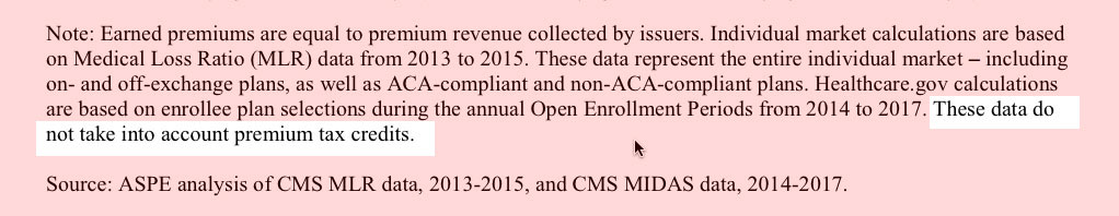
- Comparing the average premiums found in 2013 MLR data and 2017 CMS MIDAS data shows average exchange premiums were 105% higher in the 39 states using Healthcare.gov in 2017 than average individual market premiums in 2013. Average monthly premiums increased from $224 in 2013 to $476 in 2017, and 62% of those states had 2017 exchange premiums at least double the 2013 average.
The big headline, of course, is that according to the ASPE report, individual market premiums more than doubled on average between 2013 (the last year before all newly-enrolled-in healthcare policies had to conform to full ACA regulations) and 2017.
To which I respond: Yes, I'm sure you're correct...and your point is?
I'm not going to attempt to debunk the methodology behind this report. It looks fairly reasonable to me, and they do make sure to include the major caveats at play:
- They only compared the 39 states currently being run through the federal exchange at HealthCare.Gov, which means that the 12 state-based exchanges (including New York, California etc) aren't included
- They only compared on-exchange enrollees but not off-exchange, for 2017. Since the demographics for on-exchange vs. off-exchange enrollees is quite different income-wise, the average premiums are probably somewhat different as well.
- They had to use two different sources for the 2013 and 2017 averages for each state since the years covered by the data sources didn't span the full 4-year period
...and so on. To their credit, they're quite up front about all of these and a couple of others as well. Fair enough.
Here's the thing, though: There's simply no reasonable way to compare the premiums of the average individual market policies before the Affordable Care Act regulations kicked in to those sold since then. It's an apples to oranges situation for several obvious reasons:
- First of all: How much would the premiums have gone up otherwise if the ACA hadn't been signed into law? If you're going to "blame" the ACA for rate hikes, you have to subtract the difference between how much they would have gone up in the absence of the law.
This is tricky, of course, and it's impossible to prove one way or the other. The full year inflation rate has hovered around the 3% mark for the past several years. Medical expenses have of course outpaced that for a long time, so let's call it an even 5% per year. Compounded over 4 years, that's around 22%, so right off the bat, the ACA can only be "blamed" for around a 83% average net increase at most, not 105%.
- Secondly, prior to the ACA, a good 2 million or so individual market policies were effectively garbage:
Known as "mini-meds'' or "junk insurance,'' these products often are little more than discount cards that can leave unknowing consumers with huge medical debt. Even a policy expert from the conservative Heritage Foundation, no fan of the Affordable Care Act, says they aren't worth keeping.
One example: the "Go Blue Health Services Card'' for which cancer survivor Donnamarie Palin of New Port Richey has paid $79 a month. For that, she gets $50 toward each primary care doctor visit, $15 toward each drug — but zero coverage for big-ticket items like hospital stays.
...Ed Haislmaier, senior research fellow for health policy at the Heritage Foundation, which opposes the Affordable Care Act, said a minority of the 16 million people in the individual market have such low-quality plans.
According to his figures, most of those in this market — about 11 million — have traditional "major medical" insurance, even if it falls short of new standards. Another 3 million get plans through professional associations. And about 2 million have short-term policies or limited benefit plans like the Go Blue Health Services Card.
The size of the individual market claimed by Mr. Haislmaier doesn't match at all with any other estimates I've seen for 2013; the Kaiser Family Foundation, Mark Farrah Associates and so on seem to agree that it was more like 11 million total (I'm guessing "professional association" plans aren't counted). However, assuming that 2 million figure for "junk plans" is accurate, that means that they made up anywhere from 15-18% of the indy market. Of course that's gonna drop your average premium substantially!
Here's more examples of the type of policy we're talking about:
For example, McDonald’s”McCrew Care” benefits...requires employees to pay $56 per month for basic coverage that provides up to $2,000 in benefits in a year and $97 per months for a Mid 5 plan that provides up to $5,000 in benefits. Ruby Tuesday charges workers $18.43 per week (going down to $7 after six months of service) for coverage that provides up to $1,250 in outpatient care per year and $3,000 in inpatient hospital care. Denny’s basic plan for hourly employees in 2010 provided no coverage for inpatient hospital care and capped coverage for doctor office visits at $300 per year.
Wow, $2,000 in benefits per year? Awesome! That's enough to cover...um...one day in the hospital per year, and absolutely nothing else whatsoever!
- Third, and perhaps most significantly, of course, prior to the ACA, insurance carriers could deny coverage to pretty much anyone they wanted to for having a pre-existing condition...and the definition of "pre-existing condition" was so wide-ranging that it meant pretty much whatever they decided it meant. Here's a partial list of conditions which could be considered "pre-existing":
- AIDS/HIV
- Lupus
- Alcohol abuse/ Drug abuse with recent treatment
- Mental disorders (severe, e.g. bipolar, eating disorder)
- Alzheimer’s/dementia
- Multiple sclerosis
- Arthritis (rheumatoid), fibromyalgia, other inflammatory joint disease
- Muscular dystrophy
- Cancer within some period of time (e.g. 10 years, often other than basal skin cancer)
- Obesity, severe
- Cerebral palsy
- Organ transplant
- Congestive heart failure
- Paraplegia
- Coronary artery/heart disease, bypass surgery
- Paralysis
- Crohn’s disease/ ulcerative colitis
- Parkinson’s disease
- Chronic obstructive pulmonary disease (COPD)/emphysema
- Pending surgery or hospitalization
- Diabetes mellitus
- Pneumocystic pneumonia
- Epilepsy
- Pregnancy or expectant parent
- Hemophilia
- Sleep apnea
- Hepatitis (Hep C)
- Stroke
- Kidney disease, renal failure
- Transsexualism
Yeah, it's pretty easy to keep insurance premiums low when you don't have to treat people who have cancer, Parkinson's disease, epilepsy, hepatitis or who have ever had a stroke.
...and so on and so forth.
- Fourth, there's the fact that ACA-compliant policies aren't allowed to cut off your coverage when you hit a certain cap on an annual or lifetime basis. This may not sound like a big deal, but premature infants in the NICU or cancer patients undergoing chemotherapy used to commonly eat up their annual (or even lifetime) limits within a few months.
"But wait!" you say...didn't President Obama repeatedly promise a $2,500/family average premium drop back in 2009? Well, yes. He did. He's taken a lot of heat for that, and rightly so for the most part. Part of the problem is that the guy who came up with the figure was referring to total annual healthcare costs per family (including deductibles, co-pays and other out of pocket expenses...which, of course, are very tricky to compare since so many policies didn't cover so many conditions at the time). In addition, it's my understanding that he was referring to rates going up $2,500/year less than they otherwise would have. Still, PolitiFact did a lot of analysis into the "$2,500" claim and concluded that while there were some reasonable caveats and so forth, Obama sometimes did threw that number around pretty sloppily. Whether this was a deliberate lie or he was just being sloppy about it, clearly the "$2,500 less!" quip didn't play out the way that most people expected it to.
In short: The HHS's ASPE report was clearly released primarily so the GOP can bash the ACA with it for "doubling premiums!" when they're attacked over the Godawful "American Health Care Act" aka Trumpcare. The fact that it was released just one day before the CBO releases their much-anticipated scoring of the final version of the AHCA is, I'm certain, no coincidence; Paul Ryan & Co. want to have this ASPE report in their back pocket tomorrow afternoon to pull out as soon as the CBO score is released with, I presume, terrible numbers.
Don't fall for it. The simple truth is: Yes, full-price, unsubsidized premiums for individual market healthcare policies probably have doubled since 2013...but that's primarily because they have to actually cover healthcare and carriers can no longer cherry-pick who they're sold to.
I think the analogy I used 3 years ago is most appropriate: You can't compare the price of a golf cart vs. that of, say, a Ford Fiesta. Yes, they're both 4-wheeled vehicles. Yes, they both have steering wheels, an engine and so on...but beyond that they're not remotely in the same category, and trying to compare how much each costs is kind of pointless.
Having said all of this, I do find one thing interesting: The wide variation from state to state in how the 2017 rates compare to the 2013 rates. I expected a fairly narrow range, but it's actually huge! I've simplified the table on Page 4 of the report to make it easier to read:
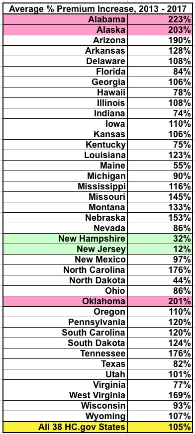
OK, I know that Alaska has always had insanely expensive health insurance due to a variety of geographic and demographic factors...but what's the deal with Alabama and Oklahoma? On the other hand, what's the deal with New Hampshire and New Jersey? What state-specific policies, regulations or economic conditions were in place back in 2013 which led to the average rates only increasing by 12% over 4 years in one and a fairly tame 32% in the other? (Again, in the absence of the ACA, we're generously assuming that premiums would otherwise have gone up by about 22% over that timeframe).
I don't know the answer to this, but I figured I'd throw it out there for others to ponder.
In the meantime, the ASPE report, while mildly interesting and making a fine (if utterly disingenuous) talking point for the GOP, can pretty much be shrugged off otherwise.
UPDATE: D'oh!! I almost forgot a fifth, vitally important point: The ASPE report refers to the unsubsidized average premiums!
According to the ASPE report, the average unsubsidized indy market policy premium in 2017 is $476/month.
According to the official CMS 2017 Open Enrollment Period report, 84% of exchange enrollees receive APTC assistance, and the average tax credit provided to APTC recipients is $383/month:
Advance payments of the premium tax credit are available to reduce premiums for eligible consumers. Eighty-four percent of consumers who selected or were automatically re-enrolled in a 2017 plan through HealthCare.gov had APTC, with an average value of $383 per person per month (see Figure 3).[14] Among consumers with APTC, the average APTC covered about 73 percent of the gross premium, resulting in an average premium after APTC of $106 per month. For those consumers who selected bronze plans and received APTC, the average premium after APTC was $88 in 2016 compared to $98 in 2017. For those consumers who selected silver plans and received APTC, the average premium after APTC was $100 in 2016 and $101 in 2017.
There should be roughly 10.6 million people on ACA exchange policies today and roughly 7.1 million off-exchange ACA-compliant policies:
That makes the breakout something like the following:
- APTC enrollees: ~8.9 million x $489 - $383 = $106/month
- Non-APTC enrollees: ~8.8 million x $476/month
- AVERAGE INCLUDING APTC: $291/month
Yes, that's right: If you include the ACA's tax credits, all of a sudden the average premium paid by individual market enrollees under the ACA isn't actually 105% higher than 2013's $232/month...it's only 25% higher. (I accidentally tweeted this out as 23% at first)
You may argue that APTC shouldn't "count" here...but if that's true, then the AHCA's revamped tax credits shouldn't "count" when estimating how much people pay either. You can't have it both ways...you can't say "prices have doubled due to Obamacare!" without also including the tax credits provided by Obamacare.
Granted, about half the individual market is paying the full 105% rate hike, and that's a real problem...but it doesn't change the fact that the overall premium paid by the average enrollee is only 25% higher than 2013, not 105%.
UPDATE: According to a couple of my regular commenters (farmbellpsu and M E) below, some of my math/estimates in the first 4 points may be off:
- M E thinks that the "alternate universe" average annual percentage rate hike would have been more like 4% (3-5) per year instead of 5%. If so, that would mean roughly 17% over the past 4 years instead of 22%, leaving the ACA responsible for the other 88% instead of 83%.
- Both farmbellpsu and M E seem to think that the 2 million mini-meds/junk plans weren't included in the ASPE report's 2013 averages...but commenter "joe" thinks that they were. If they weren't, then I presume the 2nd bullet point would become a non-factor.
- M E notes that the pre-existing condition denials "only limits people from optaining coverage originally"...that is, before your policy kicks in. This is accurate, but doesn't change the fact that if someone lost their existing coverage for more than 63 days they were at risk again, which is the larger point.
- M E notes that around 72% of individual market policies sold by eHealth pre-ACA didn't include annual/lifetime caps on coverage. That's great, but it also means that 28% did.
- M E raises valid points about network size (most indy market policies were PPOs prior to the ACA, vs. mostly HMOs today) and deductible increases.
Taken together, assuming all of these points are valid, they weaken my argument somewhat but still don't change the larger point: Comparing the pre- and post-ACA individual market policies on price is still comparing apples and oranges.
Meanwhile, Ken Kelly did the grunt work to help strengthen my larger point with additional hard data:
Actually, they haven't doubled. The ASEC report compares the average cost per covered life year in the heathcare.gov population to the same in 2013, but that's an apples-to-oranges comparison for two reasons: 1) (which you note, implicitly) the average AV of Exchange plans is over 70% (excluding the effect of CSRs) vs under 60% in the pre-ACA market. 2) The Exchange population is older - fewer 18-34s (which is often noted) and fewer children (which is not). (Children in most Exchange-covered households are eligible for Medicaid or CHIP, and children are quite cheap to cover - as low as zero in large households).
A better comparison would use the current off-Exchange population, which presumably has similar demographics to the pre-ACA market, and is mostly bronze, so closer in average AV. Off-Exchange plans tend to have better networks than QHPs too. The best comparisons would be specific to age and sex - say, the cost of bronze plan for 30/40/50 year old male/female now vs the average premium for the same in 2013.
Now, who wants to clue me in on what the heck is up with New Jersey?
UPDATE: OK, several people have reminded me that there's a simple explanation for New Jersey's modest rate increase of just 12% over 4 years: They were one of the few states which already mandated guaranteed issue and community rating prior to the ACA being passed in the first place:
@charles_gaba @hiltzikm @bjdickmayhew @_KJKelly @LouiseNorris @EmilyG_DC NJ had guaranteed issue pre-ACA, and premiums were so high that in 2014 they dropped, I think 19%.
— xpostfactoid (@xpostfactoid) May 24, 2017
There were a couple of other states which had guaranteed issue/community rating in place pre-ACA as well, including New York and Massachusetts (thanks to RomneyCare). It's possible that Vermont and DC did as well, although I'm not sure about those. However, all of those states (+DC) run their own exchanges, so aren't included with the 39 states listed in the ASPE report.
@xpostfactoid @charles_gaba @hiltzikm @bjdickmayhew @_KJKelly @EmilyG_DC NY also had guaranteed-issue pre-ACA; premiums are 55% less expensive now than they were in 2013 (adj for inflation) https://t.co/qF4rjNqaJO
— Louise Norris (@LouiseNorris) May 24, 2017
Advertisement
