

MAJOR UPDATES: My crude attempt to visualize the ENTIRE current U.S. healthcare coverage situation
Fri, 03/25/2016 - 12:35pm
ATTENTION L.A. TIMES READERS:
This is actually an older version of the blog post.
I later RE-DID THE WHOLE THING HERE.
IMPORTANT UPDATE 3/27/16 1:30pm: At the suggestion of several people to make the color-coding more distinctive and after re-reviewing a couple of surveys/reports, I've made the following revisions to the chart:
- FIRST: I’ve changed the order of a couple of categories in order to bundle together the major ACA-specific coverage categories (Medicaid Expansion, Subsidized Exchange Policies & Basic Health Program).
- SECOND: After re-checking a couple of reports from the CDC, KFF, etc. I’ve modified the numbers a bit in a few areas (for instance, there are more undocumented immigrants w/out coverage than I had originally listed).
- THIRD: I've made the key down the side easier to read by breaking up the categories and color-coding them as well.
FINAL UPDATES (FOR REAL!!) 3/28/16 12:00pm: I've revised it one more time, making the following changes:
- Separated out Employer-Sponsored Insurance (ESI) into Large Group / Small Group (I'm aware that this likely also applies to Gov't employees, but I don't know the breakout for that)
- Separated out Traditional Medicare and Medicare Advantage (again, the <65 Medicare section likely should have MA separated out as well, but I don't know the breakout for that)
- I was surprised to discover that about 2/3 of actual Medicaid enrollees are children...which makes total sense when you think about it, since most states have much higher eligibility cut-offs for kids than adults, even in expansion states. It turns out that CHIP is separate from "Medicaid for Children".
- I've also added the percentage of population down the side. The color-coded groups are as follows (again, give or take):
- Employer-Sponsored: Appx. 47.7% (154.0 million)
- Medicare: Appx. 16.8% (54.3 million; includes 8 million dual-eligibles)
- Non-Expansion Medicaid/CHIP: 16.1% (52.0 million)
- ACA-Specific (Medicaid expansion, Subsidized Exchange policies, BHP): 6.5% (20.9 million)
- Non-ACA-assisted Individual Market (unsubsidized exchange, off-exchange): 2.7% (8.8 million)
- OTHER (Includes Indian Health Service, Student Health Plans, foreign-paid healthcare, some prisoners (?), etc): 1.2% (4.0 million)
- UNINSURED: 29.0 million
These changes mean that I have to edit the numbering system a bit in the text below. While I could obviously keep slicing the pie up even further, it's becoming quite time consuming and I'd never get done divvying things up, so I'm leaving it at this. Look for a future post in which I lay out my methodology and sources for the various categories.
I should also note that someone asked me about the 2.3 million state/federal prisoners in the U.S. I admit that this question partly stumped me: I know that many states have started shifting prisoners over to Medicaid via ACA expansion, but I've no idea how many this represents to date. Therefore, I would imagine that all U.S. prisoners are lumped in under either "Medicaid (#8)", "Medicaid Expansion (#11)", "Other (#17)" or possibly even "Government Employer (#3)", depending on how the state budgets are categorized.
I tried doing this last July, and while I obviously was off a bit here and there, overall I think I got it pretty close. It's time to give it another shot.
The pie chart below is my best attempt to summarize the current (as in, March 2016) total U.S. healthcare coverage landscape. Due to differences in timeframe, methodology and so forth, this is sort of a composite/blended picture based on hard numbers and surveys from official government sources (HHS Dept, CDC, CBO, Census Bureau, etc) as well as respected 3rd-party outlets (Kaiser Family Foundation, Urban Institute, etc). I didn't include specific links to reports because 1) again, these are composite numbers which likely won't always line up precisely with any specific reports and 2) most of them can be found by hunting around this site anyway.
One important thing to note: Total Medicaid/CHIP enrollment as of November 2015 was around 71 million (and is presumably a bit higher now), yet I have it down as only 63 million. The "missing" 8 million are "dual eligibles"...enrolled in both Medicaid and Medicare simultaneously. I wasn't sure how to handle these, so I lumped them in with Medicare instead (and I'm not even sure how many of them are over/under 65).
Again, I can't stress this enough: The numbers for some of the individual sections may be off somewhat due to the difficulty of wrestling some of the data to the ground, but I think that this is a reasonably good overall picture of the current situation. This is not intended to be a precise measure, just to give a general sense of where things are at.
Click image for a high-res version:
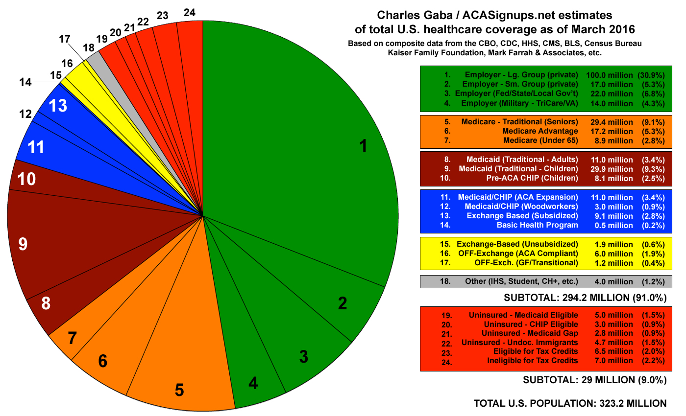
The key should mostly be obvious, but a few notes:
- As noted above, there's about 8 million people who are enrolled in both Medicare and Medicaid. I wasn't sure how to portray them here, so I have them lumped in with Medicare.
- Section 11 (Medicaid Expansion): Total Medicaid enrollment has actually increased by around 14 million people since 2013, but around 3 million of these are "Woodworkers"...people who were already eligible for Medicaid before the ACA but who were "drawn out of the woodwork" to sign up thanks to the law's outreach program.
- Section 15 (ACA Exchange - Full Price): I debated whether to make this section Blue (ACA-specific) or not, but decided that without the ACA, most of these people would likely still have enrolled directly through their insurance carrier anyway (since they have to pay full price either on or off the exchange), so they're in the Yellow section.
- Section 17 will disappear completely within the next couple of years as the last remnants of non-ACA compliant individual policy enrollees switch over to compliant ones (either on or off the exchange, or other types of coverage).
Going back to the blue/ACA-specific areas, it’s important to understand that while the four sections add up to about 21 million people, this is not an exact correlation with the 20 million people who have gained coverage under the ACA. Around 10 of the 11 million Medicaid expansion enrollees are newly enrolled, while around 6 million of the exchange enrollees are. In both cases, the rest were previously covered by some other type of policy/coverage. That leaves around 4 million other “newly covered”, which are spread across other categories. For instance, several million adults aged 19-25 are now covered under their parents’ policies specifically due to ACA requirements...but most of these can be found in the Employer Sponsored section. The chart is so fractured already that I didn’t want to complicate it further by slicing each category into “newly covered/previously covered” as well.
In addition, it’s important to remember that while the ACA is only directly connected to those 4 blue sections, it also impacts large chunks of the rest of the pie, since the pre-existing condition, free preventative care & some other provisions covers all private policies (including employer-sponsored in most cases).
Advertisement
