

Wow. I knew I was in the right ballpark, but...
Tue, 11/03/2015 - 9:32am
My attempt to boil down the overall, weighted-by-market-share, national average 2016 individual market rate increases into a single percentage figure has received a lot of attention over the past few weeks, including not one but two citations from Paul Krugman of the New York Times, feature articles from Bloomberg News and the Huffington Post, and even a partly-mangled version from the right-wing Daily Caller.
I'm not name-dropping for the heck of it here; my point is that I've been a little jumpy about that particular projection (12-13% overall) getting so much attention because I honestly had no clue how accurate it was.
As you'll recall, what I did was this:
As a reminder: What I've done here is to take the overall weighted average 2016 rate increases for the ACA-compliant individual health insurance market for each state (requested in some states, approved in others) and plug those into a spreadsheet. Then, I've further weighted each state's average increase by that state's percentage of the national total, using 3 different criteria: Total Individual Market (as of 2014); ACA Exchange Enrollment Size (as of March 2015); and Total State Population Size (as of 2014). Again, the bold-faced/green states are ones where the 2016 rates have been approved; the rest are still requested only and could change dramatically in some cases.
However, there were a whole mess of caveats included, of course; some rates were requested, not approved; in cases where I didn't know what the rate change was other than that it was under 10%, I used an across the board assumption of 7%; some of the effectuated enrollment numbers were guestimates based on assumptions about the total size of the individual market in that state; and so forth.
Anyway, with all that in mind, when I boiled it all down, I ended up concluding that overall, premiums for ACA-compliant individual market policies (both on and off the exchanges) will likely have an average increase of between roughly 12-13%.
Avalere Analysis: 2016 Exchange Premiums
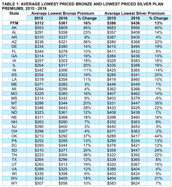
...As shown in Figure 1, the average lowest silver plan in states with a federal exchange increased by 13.0 percent from 2015 to 2016, compared to 3.2 percent from 2014 to 2015.
2016 Exchange Premiums: Changes in 2016 premiums vary widely by geography and regional market dynamics. When considering premium impact, note that over two-thirds of exchange consumers picked silver plans in 2015. Exchange plan enrollment is often concentrated in the lower priced plans in a particular metal level. As such, changes in the lowest priced plans in markets will have a larger impact on the average exchange consumer than the average premium for the entire market.
...Premium data based on the 2014 HHS Individual Market Landscape file, updated as of August 2014, the 2015 HHS Individual Market Landscape file, updated as of October 2015, and the 2016 HHS Individual Market Landscape file, updated as of October 30, 2015. The 2016 Landscape file is accurate as of October 16, 2015, after which several co-ops and other issuers may have exited the market. Analysis excludes state-based exchanges. All premiums are based on a 50-yr old non-smoker. Averages are not enrollment weighted.
Obviously there are some important caveats at play in Avalere's analysis as well:
- My estimate is based on both on- and off-exchange policies; theirs is based purely on exchange-based policies only.
- My estimate includes all ACA-compliant policies (ie, all metal levels, plus catastrophic plans); theirs is based purely on the lowest-priced Silver plans.
- My estimate includes all 50 states, plus DC; theirs includes only the 37 HealthCare.gov-based states.
- Also, it should be noted that Avalere's analysis of the lowest-priced Bronze plan came in with a higher average increase (16%) than the 13% for Silver.
However, having said that, Avalere's other points are also important to keep in mind: While they don't know exactly how many people are currently enrolled in "lowest-priced Silver plans", the odds are that it's well over 50% of them. Again, nationally, 68% of the total chose Silver plans, and most of that crowd likely went with the lowest-price offering. Another 21% went with Bronze plans.
Let's assume that 80% of the Silver crowd went with the lowest-priced Silver, and 80% of the Bronze crowd went with the lowest-priced Bronze. Let's also assume that these averages hold true for the other 14 states running their own exchanges.
If so, that would mean that 71% of all exchange enrollees are looking at an average of
- 76.3% x 13% = 0.09919
- 23.7% x 16% = 0.03792
- Total: 13.7% for roughly 71% of all Exchange enrollees.
Now, this could be further skewed up or down by the other 29% who selected Gold, Platinum, Catastrophic or higher-priced Bronze/Silver plans; and of course, the state-based exchanges may have higher or lower averages for any or all of these data points (for instance, California reported only 64% of enrollees selected Silver plans, but another 25% selected Bronze), so the national average could be a bit different. Even so, I'd say my "12 - 13% on average" turned out to be pretty damned close overall.
Here's the actual table; as you can see, they based their calculations on actual dollar amounts instead of percentage hikes:
Advertisement
