

NRO posts gun violence chart which isn't quite as bad as Jason Chaffetz's
Sat, 10/03/2015 - 9:56am
I realize this is mostly off-topic (although certainly gun violence overlaps with healthcare, both in terms of emergency room expenses as well as mental health services), but I couldn't resist posting about it.
With the Oregon Umpqua community college massacre fresh in the headlines, right-wing publication National Review Online has decided to wade into the gun violence debate by posting a chart which compares the increasing flood of guns in the United States to what they claim is a decrease in gun violence during the same time period:
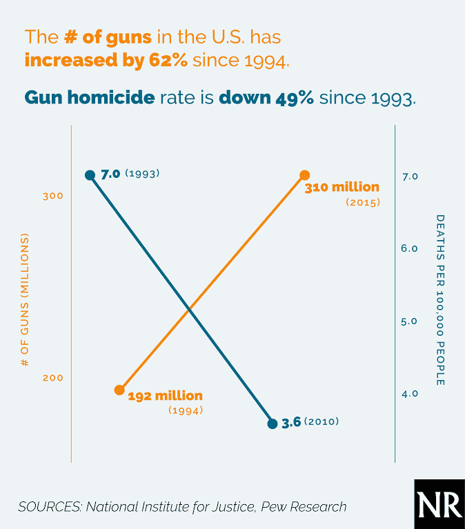
The moment I saw this, I was immediately struck by how similar it appeared--at first glance--to the idiotic "chart" which Jason Chaffetz embarrassed himself with during the Planned Parenthood fiasco a few days ago. Fortunately, the NRO chart is much less misleading in many ways:
- First of all, they included the Y axis for both lines.
- Second, they clearly label what each of the numbers represents.
- Third, unlike Chaffetz, who tried to claim that he had pulled the Planned Parenthood data "directly from their reports", NOR clearly states and displays their sources, both of which are presumably trustworthy.
However, there's still a few major problems with this chart.
First of all, while there is a Y axis for both lines, neither axis goes down to zero.
Second, it only includes gun homicides, not other types of gun deaths, including suicides, accidents, police shootings and so forth.
Third, it also doesn't include non-fatal shootings. After all, if someone goes on a rampage, shoots 10 people but only 2 of them die, that's still 10 people who were shot. They might not have died but they might be paralyzed for life or suffer other permanent/long-term injuries. Even if they're good as new physically a few months later, many will still suffer from permanent psychological trauma.
Fourth, I find it very difficult to believe that it's been a slow, steady drop from 1993 (1994) through 2010 (2015). Has anything significant happened during the 17-21 years in between?
Fifth: I'm not sure where NRO got their 2015 gun figure (310 million). I didn't find that figure for 2015 in either of their sources. However, I'm willing to accept it as being fairly accurate; plenty of media outlets use the "a gun for every person in the country" line when discussing gun violence these days (which would be roughly 320 million as of today); Wikipedia claims the 2014 number as "88.8 per person" which is a drop from the 2000 rate, but whatever; if NRO claims it as 310 million, so be it. That works out to around 97,000 per 100,000 people in the country.
Finally, NRO used the actual number of guns, but for the gun homicides they went with the number per 100,000 people (ie, per capita). Population growth will obviously skew these numbers.
Anyway, I went to the original sources for NRO's chart: The National Institute for Justice and Pew Research Center. I then converted the gun ownership numbers into per 100K rates by dividing by the actual population each year. Finally, I extended the firearm death rates out to 2013 (33,636 total, 21,175 suicides, 11,208 homicides / also adjusted for population). Here's what I came up with:
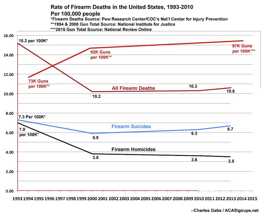
As you can see, there was a significant drop-off of firearm deaths (regardless of category) from 1993 through 2000...but since then, the rate has flattened out or even risen slightly (gun homicides per 100,000 people have continued to drop off at a slower rate since 2000, but total gun deaths have started to rise again over the past 15 years).
Conversely, it is true that the number of guns has indeed increased significantly since 1994 even when adjusted for population growth, and that rate has also dropped off significantly since 2000.
In other words, the NRO's larger claim (the rate of gun homicides has dropped significantly while the rate of gun ownership has increased) is accurate...but they still vastly exaggerated this on their simplistic chart.
To me, the more interesting question is what happened between 1993 and 2000 to cause such a dramatic drop in firearm deaths...and what happened after 2000 to slow down the rate of change of each so dramatically?
For the drop-off in deaths, this could have more to do with advances in medical technology/procedures which may have turned many potential gun deaths into nonfatal injuries. I don't have the data on nonfatal shootings included here, however, so this is speculation on my part.
As for the changes since then, the only significant event I can think of is the expiration of the Federal Assault Weapon Ban, but that didn't happen until 2004.
Anyway, I'm not posting this to claim that NRO is necessarily wrong about their larger point; I'm just saying that when you see an extremely simple-looking chart/graph, the odds are that there's a lot more going on than meets the eye.
Advertisement
