

REPOST: I've corrected the chart Rep. Chaffetz presented at today's Planned Parenthood hearing.
Tue, 09/29/2015 - 3:13pm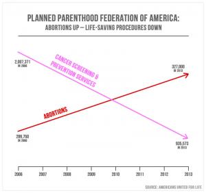
UPDATE 5/19/17: In "honor" of the Jason Chaffetz's announcement that he's resigning in June, I thought it might be a good time to repost this "classic" entry:
During today's Planned Parenthood witchhunt er, "Congressional hearing", Republican Representative Jason Chaffetz of Utah presented a very interesting (some might say "simplistic" and "unsourced & without context" chart which purported to "prove" that Planned Parenthood has supposedly, over the years, dramatically reduced how much non-abortion service they provide while simultaneously increasing the number of abortions that they perform:
Rep. Jason Chaffetz (R-UT) stumbled near the start of a tense hearing on Tuesday when Planned Parenthood President Cecile Richards told him to check his sources on a chart that he said showed a decrease in breast exams and an increase in abortions by the organization.
Richards was testifying before the House Oversight Committee, which began investigating the organization after sting videos were released by an anti-abortion group that allegedly showed Planned Parenthood executives discussing the sale of fetal tissue. Earlier in the hearing, Richards was repeatedly interrupted by Chaffetz.
Chaffetz, who chairs the committee, at one point showed a slide that had one straight line heading downward and another straight line heading upward.
Here's Rep. Chaffetz's "chart":
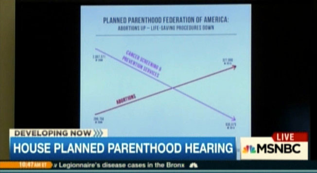
You can't read the actual numbers from the blurry screen shot, but from the the handy "arrows", it's safe to assume that Chaffetz is suggesting that "cancer screenings and prevention services" have taken a nosedive over the years (?) while abortions have increased at an equally dramatic rate.
Judging from the rest of the exchange, this "evidence" was slapped onto the wall for the first time just seconds before Richards testified, and doesn't appear to have been provided to her, any of the other witnesses or, really, anyone else prior to the hearing:
"You created this slide. I have no idea what it is," Richards said.
"Well, it is the reduction over the course of years — in pink, that's the reduction in the breast exams — and the red is the increase in the abortions," Chaffetz said. "That's what's going on in the organization."
...Richards said that she had not seen the slide before and that it "absolutely does not reflect what's happening at Planned Parenthood."
"You're going to deny that —" Chaffetz said.
"I'm going to deny this slide that you just showed me that no one has ever provided us before," she said. "We've provided you all the information about everything — all the services that Planned Parenthood provides. And it doesn't feel like we're trying to get to the truth here. You just showed me this."
Chaffetz claimed that the "numbers" (whatever they are) on the chart are directly from Planned Parenthood's "corporate reports", but Richards stated that...
"Excuse me," Richards said. "My lawyers have informed me that the source of this is Americans United for Life which is an anti-abortion group so I would check your source."
First of all, as Richards notes, slapping a chart on the wall with absolutely no advance notice, context or clear source for the content or claims is dirty pool (and sounds an awful lot like the infamous, grossly-edited videos which set off all of this nonsense in the first place).
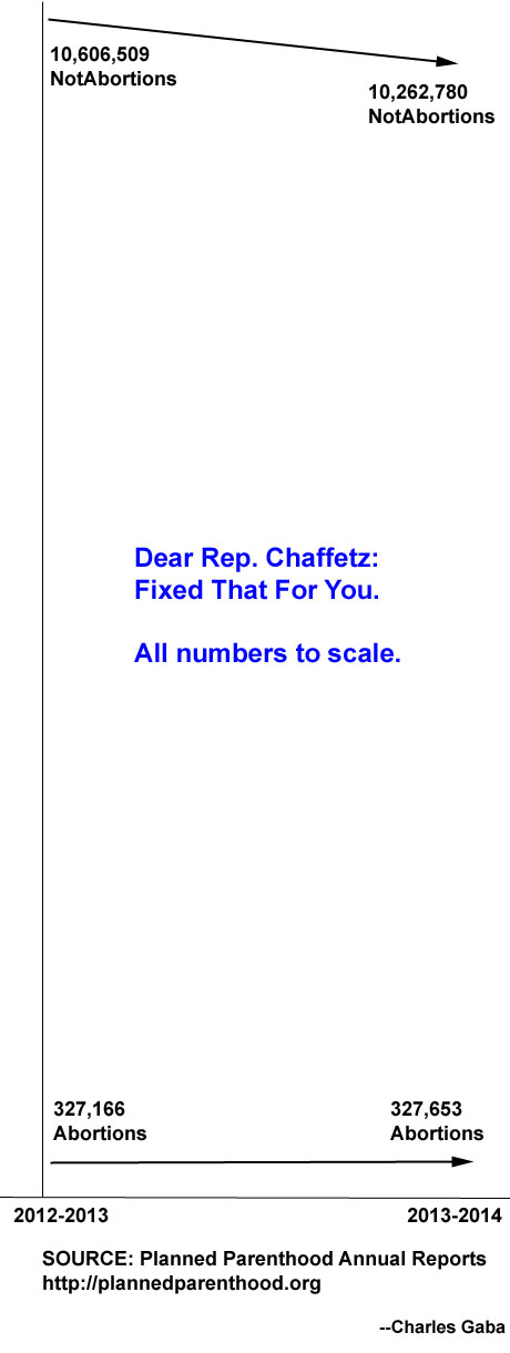
According to the actual Planned Parenthood 2013 - 2014 annual report, last year they performed 935,573 "cancer screenings and prevention" services while also performing 327,653 abortions over the course of the year.
According to their 2012 - 2013 report, they performed 1,121,580 cancer screenings & prevention services that year, while performing 327,166 abortions.
Now, I have no idea what the starting point is for Chaffetz's chart, but assuming he meant year over year, he's technically correct:
- 1,121,580 > 935,573 = a 16.6% reduction in cancer screenings/preventative services year over year.
- 327,166 > 327,653 = a 0.15% incrrease in abortions year over year.
Wow! They performed 487 more abortions this year than last!
Then again, the population also went up from around 316.5 million to 319 million from 2013 - 2014, a 0.8% increase, so technically speaking, Planned Parenthood has reduced the number of abortions they've performed on a per capita basis! Mazel Tov!!
Now, there was a definite reduction in the number of cancer screenings, right? True. However, let's look at the other numbers:
- STI/STD Testing/Treatment: 4,469,308 >> 4,470,597
- Contraception: 3,724,558 >> 3,577,348
- Other Women's Health Services: 1,167,755 >> 1,147,467
- Other Services: 123,308 >> 132,795
Wow, look at that! Some went up, others went down! It's almost as though the number and type of medical services that people need changes from year to year! Astonishing!
In fact, it seems to me that given all the other stuff that Planned Parenthood does, it would be more reasonable to add the rest of the services up (since abortion is supposedly the only "bad" one they perform):
- 2012: 10,606,509 non-abortion services performed
- 2013: 10,262,780 non-abortion services performed
MY GOD!! THEIR NON-ABORTION-RELATED SERVICES DROPPED BY A WHOPPING...3.2% YEAR OVER YEAR!!
Of course, that's just over a 2 year period. Perhaps Chaffetz's chart goes back further.* In fact, I'm quite certain that if you go back to 1915, you'd conclude that the number of abortions performed by Planned Parenthood has increased dramatically (kind of a given considering that the organization wasn't founded until 1916). Plus, of course, the U.S. population was a bit smaller back then...
*SEE MAJOR UPDATE BELOW.
Seriously, though, aside from the fact that abortion is a legal medical procedure (which therefore merits no more scrutiny or singling out than, say, pap smears or mammograms, as long as it's done legally and ethically), it occurs to me that there might be a completely unrelated reason for why the number of NON-abortion related services provided by Planned Parenthood has dropped off year over year:
Obamacare. Seriously...one of the main reasons many low-income folks go to Planned Parenthood (for services other than abortion) is because they're uninsured. Seeing how the ACA has brought decent healthcare coverage to over 17 million people over the past few years (over 5% of the total population), it's hardly surprising that visits to Planned Parenthood might have dropped off a bit.
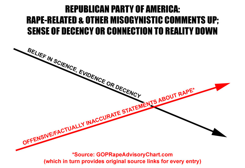
This stunt by Chaffetz is the most idiotic moment in a travesty which grows more idiotic by the day. To that end, here's my own chart, inspired by Rep. Chaffetz...(like him, I've oversimplified it and failed to provide context for much of my "proof". Unlike him, I have included links to my own sources for one of the chart lines:
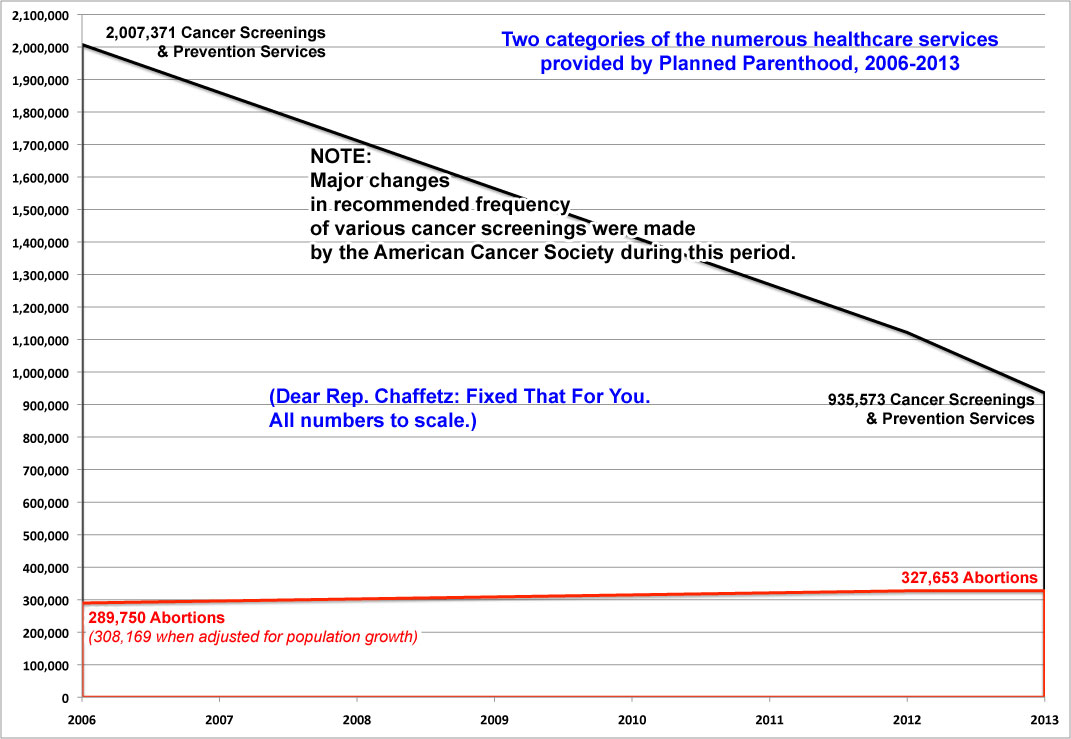
In all seriousness, however, here's an actual corrected chart displaying the numbers I think Chaffetz was trying to (of course, what on earth any of this has to do with whether or not Planned Parenthood broke the law, which they didn't, I have no idea). Unlike Chaffetz's chart, everything here is to scale:
IMPORTANT UPDATE: Thanks to Old Left Good Left over at Daily Kos for providing this link to Chaffetz's original chart; it turns out that it starts in 2006.

Now, at first glance this does certainly appear to support Chaffetz's argument more strongly. Abortions did indeed hit 327K in 2013, and cancer screenings/prevention services were indeed down to 935K.
I'm going to assume, for the moment, that the 2006 figures (2 million cancer screenings, 290K abortions performed) are accurate as well.
Taken at face value, that would mean a 12.9% increase in abortions performed per year, and a 53.4% reduction in cancer screenings & prevention services.
HOWEVER, there's still some major problems with the "Americans United for Life" chart, some of which are obvious, some not so much:
Most obvious, of course: 327,000 is still only 1/3 as much as 935,000. It sure as hell isn't 3x as much, which this chart suggests.
Next: As noted above, the U.S. population increased from 298 million to 317 million between 2006 and 2013. That's a 6% increase, which obviously accounts for a good half of the increase all by itself.
OK, but what about the more "troubling" line--cancer screenings/prevention being slashed more than 50% over the 7 year period?
Well, Old Left Good Left pointed out something else which changed during that time period: The recommended frequency of cancer screenings has changed.
For instance, in 2007, the "annual mammogram" recommendation was apparently changed to:
**May 2007 - Present: Women at high risk based on certain factors should get an MRI and a mammogram every year. This includes women with about a 20% or greater risk using risk assessment tools based mainly on family history, women who had radiation therapy to the chest when they were between the ages of 10 and 30 years, and women who either have or who are at high risk for mutations in certain genes that greatly increase their breast cancer risk.
In 2012, pap smears (to check for cervical cancer), which had been recommended every 1-3 years depending on age/etc; in 2012 this changed to every 3-5 years, and so on. All of these factors could have made a significant reduction in unnecessary screenings and so forth.
Unfortunately, I don't know the number of additional services performed (STD checks, contraception, etc.) for 2006, though it's safe to assume that the total number of non-abortion services at the time was similar to the 30:1 ratio that you see in 2012 and 2013.
Since I don't know what that total was, however, I'm forced to limit myself to the 2 million cancer screening figure...and I also can't specifically account for the changes in screening recommendations due to them being spread out over several years in different categories.
However, even without any of that, the accurate chart still looks dramatically different from Chaffetz's:
UPDATE x2: ARRRGH!! (sigh) OK, it turns out that Vox.com was already all over Chaffetz's stupid chart as well...and they have managed to track down the total 2006 Planned Parenthood numbers:
So it's not true, as the chart implies, that Planned Parenthood has been performing more abortions while drastically cutting back the provision of other services. The overall number of non-abortion services provided by Planned Parenthood barely changed at all, going from 10.29 million in 2006 to 10.26 million in 2013.
That brings me back to the original version of the corrected graph, which now looks like this:
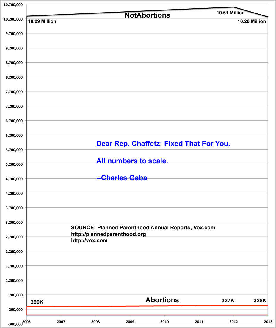
UPDATE x3: Heh. It'sSimpleSimon has dug up a few other yearly reports (2009 and 2011, along with a summary report for 2010)...and by an amazing coincidence, the number of abortions and of all other non-abortion services stayed fairly consistent from year to year, moving up and down here and there as you'd expect:
- 2006: 10,290,000 / 289,750
- 2009: 10,673,921 / 329,445
- 2011: 10,530,695 / 333,964
- 2012: 10,606,509 / 327,166
- 2013: 10,262,780 / 327,653
In fact, as you can see, the number of abortions performed by Planned Parenthood has actually decreased several thousand since reaching what I presume is an all-time high of 334,000 in 2011.
Gee, perhaps the Republican Party should be praising them for the 6,300 reduction!
Advertisement
