

(Updated) 2016 Rate Hikes: State-Level Patterns Emerging So Far...
Wed, 09/30/2015 - 9:45pm
Over the weekend I finally started plugging every state which have 2016 premium hike data for into a chart to see if any patterns were showing up, but I was still missing 6 states. I concluded that Medicaid expansion does not appear to be a major factor (or, at least, not an obvious one), but that there are two other clear trends:
- First, states which are allowing "transitional" plans through next year are definitely seeing higher percentage rate hikes than those which stuck to their guns and discontinued non-ACA compliant policies.
- Second, states which have only published requested rate changes are currently noticeably higher on average than those which have been put through the regulatory approval process.
Today I'm posting updated versions of all three charts, with some slight updates:
- South Dakota has been updated with (unfortunately) higher average requested hikes
- Delaware has been updated with lower average approved rate hikes
- Alabama has had their requested hikes added
- Mississippi has had their requested hikes added
- Virginia has been added with approved hikes
In addition, I've decided to drop the 4th version, which was broken out by an "Red/Blue" categorization, mainly because some of the states are pretty arbitrary (should Michigan, Wisconsin, New Hamsphire and/or Nevada be considered "Red" or "Blue" these days?).
Remember that:
- There's still 3 states missing (Nebraska, Pennsylvania & Wisconsin)
- The "requested" states could potentially change dramatically once final approval is issued (and not always on the lower side...Oregon and Florida actually approved higher increases than the insurance carriers had requested overall)
- Even for the approved rates, there's still an awful lot of caveats in many of the states
With that in mind, here's the updated versions of each.
First, here's the states from lowest to highest, color-coded by whether the rate hikes are requested or approved:
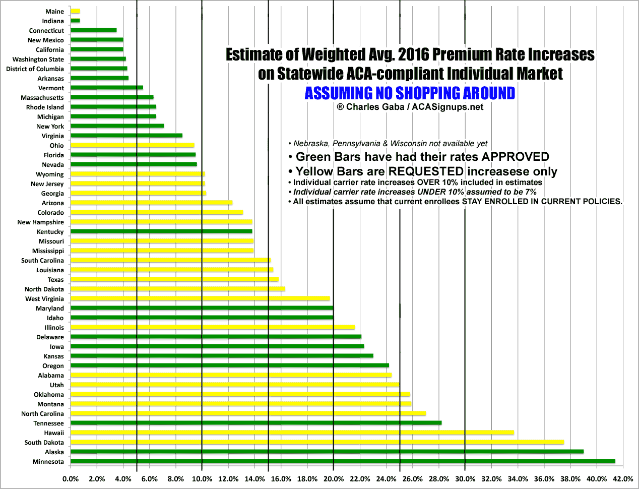
Out of the 46 states (+DC) I have data for, 8 of them are under 5%; 8 more are between 5-10%; 9 are between 10-15%; 7 are between 15-20%; 7 from 20-25%; 5 between 25-30% and the remaining 4 are over 30%.
Next up: Medicaid Expansion vs. Non-Expansion states:
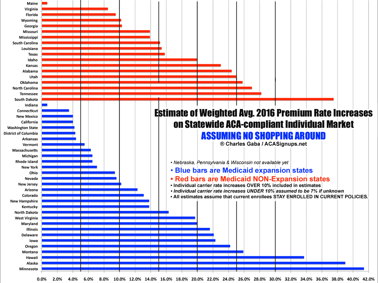
As I noted earlier, the expansion state highs are higher...but the lows are lower. The non-expansion states are sort of lumped in the middle. I have no idea what, if anything, to conclude from this.
Here's the Requested vs. Approved version:
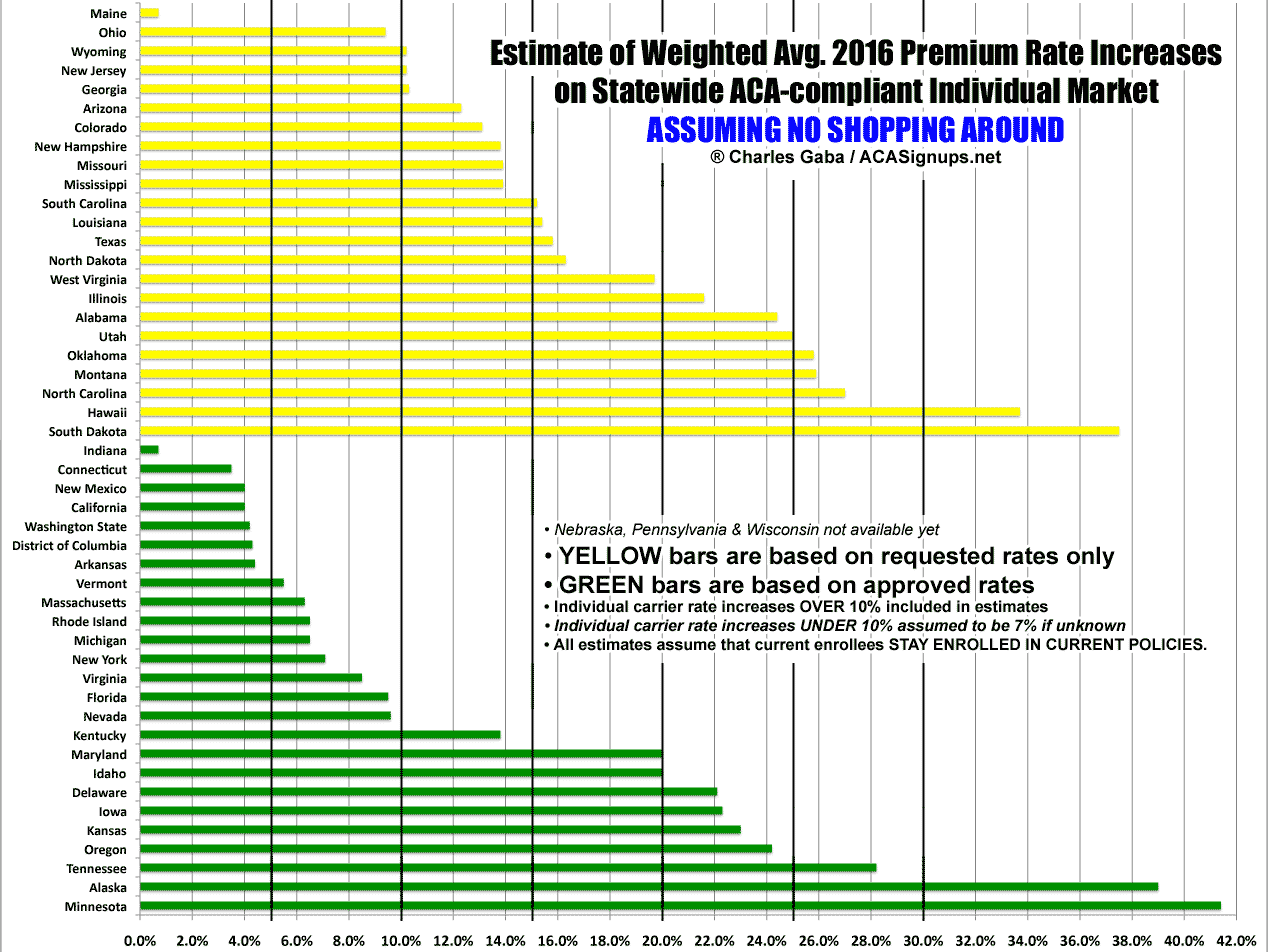
Like I said, this one definitely has a clear distinction; the approved increase states are averaging about 13.5%, while the requested only states are averaging 17.9% increases.
Now, this does not necessarily mean that when the "requested only" states are finally approved that they'll see a 1/3 drop in rate hikes; that could be coincidence, or it could simply mean that the states which are faster to post their approved rates also just happen to be the ones more likely to crack down on excessive rates. If that's the case, then these may be pretty close to the final rates for every state. On the other hand, Delaware just knocked their rates down from around 25% to 22%...a reduction of 3 percentage points. Hopefully those yellow lines will be shorter when they turn green.
Finally, here's the "transitional plans allowed" vs. "no transitional plans allowed" version:
![]()
Remarkably similar to the "requested/approved" chart, isn't it?
Advertisement
