

UPDATE: 2016 Rate Hikes: Two Clear State-Level Pattern Emerging So Far...
Sat, 09/26/2015 - 10:58am
As I've plugged new states into my 2016 Rate Increase estimate project, many people have asked me whether I'm seeing any patterns emerging in terms of which states are seeing higher average rate hikes vs. lower ones. The main question being asked is whether Medicaid expansion seems to have an impact (and by extension, is there any sort of red/blue political pattern emerging).
Until now, I've always answered either "no" or "too soon to tell", mainly because there were still lots of states missing or because so many of the estimates are based on requested increases rather than approved. As of today, however, I've managed to put together at least a ballpark estimate for 44 states (+DC), leaving just 6 states left, so I think I have enough included to look for patterns.
Remember: that six states (Alabama, Mississippi, Nebraska, Pennsylvania, Virginia and Wisconsin) are missing from all of the following graphs.
First, here's the weighted state-wide averages with the states in alphabetical order:
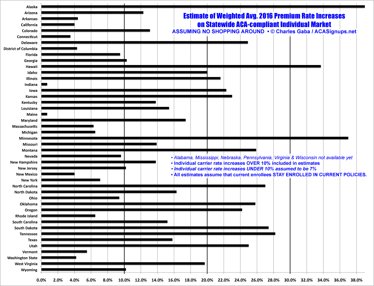
Obviously the rates are all over the map here, with no clear pattern. However, when we sort the states by different criteria, some trends do start to emerge.
First up: Medicaid expansion. The assumption here is that, all else being equal, states which have expanded Medicaid under the Affordable Care Act would presumably also see lower average rate hikes than those which haven't. Let's take a look (click image for higher-res version):
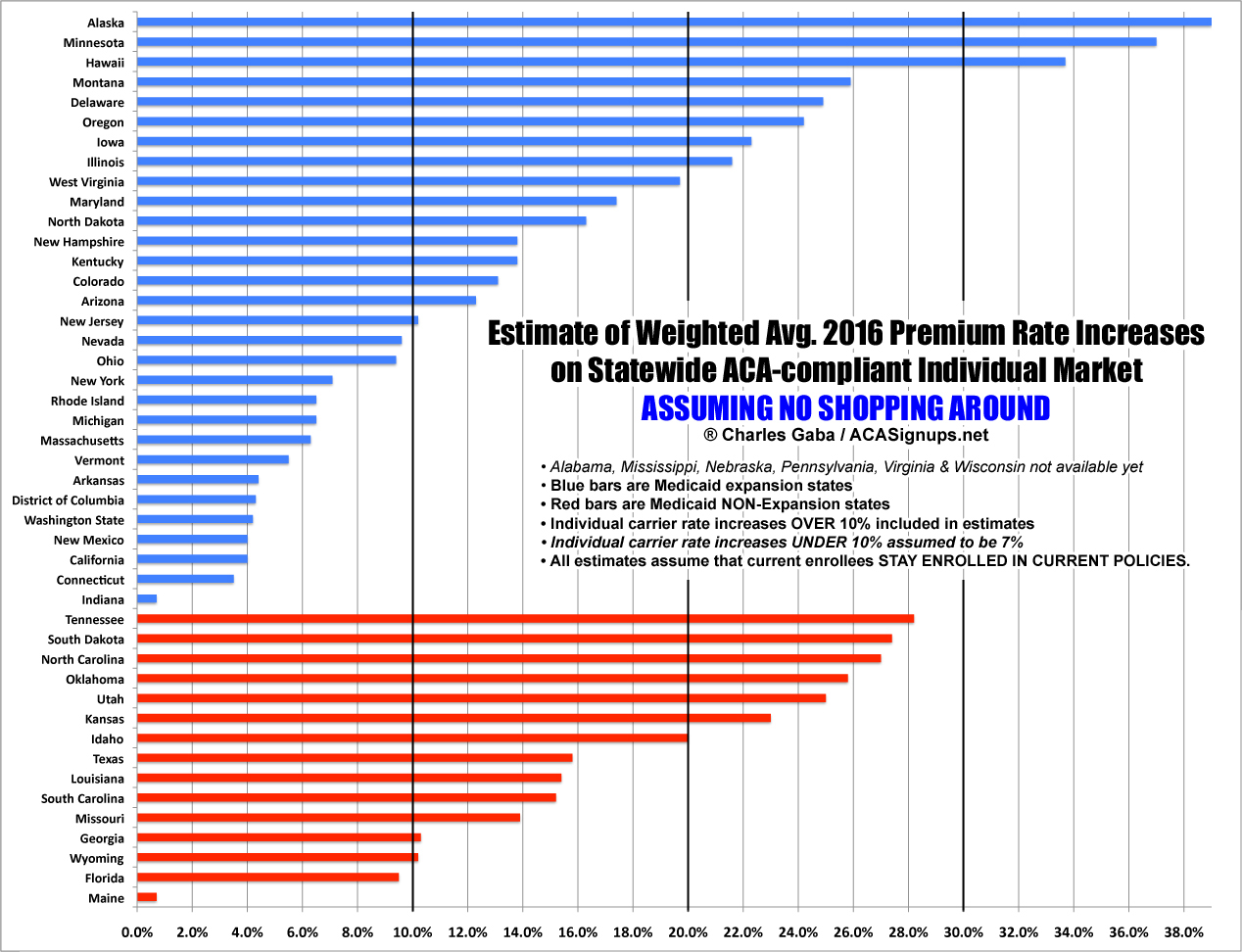
Hmmm...at first glance, the opposite appears to be the case here: The 3 highest average hikes are all in Medicaid expansion states (Alaska, Minnesota & Hawaii). However, the lowest average hikes are also found in the expansion states (aside from Maine, the non-expansion states are all 9% or higher). In addition, Alaska is an outlier since they just expanded Medicaid (and even that was barely forced through by the governor, is still facing a lawsuit from the state legislature and hasn't actually been implemented as of this writing anyway). I should note that 5 of the 6 missing states have not expanded Medicaid; Pennsylvania is the sole exception. My conclusion? There's no clear rate hike pattern based on whether the state expanded Medicaid or not.
Next, let's move from actual Medicaid expansion to the more general "Red/Blue" ideological divide. This is much more subjective; not every state is clearly in one camp or the other.
For instance, Michigan is currently completely run by Republicans at the state level (Governor, State House, State Senate, State Supreme Court, Attorney General, Secretary of State). However, there are hundreds of thousands more Democrats in the state than Republicans, both U.S. Senators have been Democrats for decades and the state has voted for the Democrat in the past 6 Presidential elections in a row. In addition, in 2014, Democrats received more votes than Republicans in the 14 U.S. Congressional races, the state House races and the state Senate races...yet, Republicans still came out ahead due to horrific gerrymandering. My ruling: Michigan is still a "Blue" state.
By contrast, even though registered Democrats also massively outnumber registered Republicans in Kentucky (53% to 39%) and the state currently has a Democratic Governor and Democratic-controlled state House, no one in their right mind would define KY as a "blue" state. The Democrats tend to vote Republican for whatever reason, and they haven't voted for a Democratic Presidential contender since 1996. My ruling: Kenucky is a "Red" state. Similar arbitrary categorizations may hold for some other states.
With that in mind, is there any clear Red/Blue pattern? Hmmm...Sort of. Two of the "red" states are keeping their average hikes under 5% (Indiana and Arkansas), but the bulk of them range from 9% - 28%. By contrast, 12 "blue" states are 10% or lower, and only 2 of them (Hawaii & Minnesota) are above 25% (click for higher-res version):
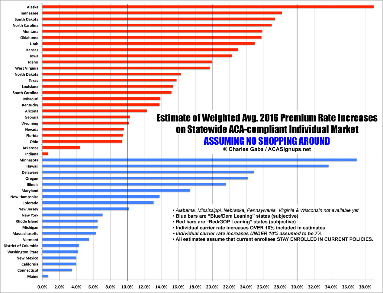
I should note that of the 6 missing states, 3 of them are solidly "red" (Alabama, Mississippi, Nebraska). The other three (Pennsylvania, Virginia and Wisconsin) are harder to categorize, but I'd probably put all 3 in the "blue" category overall.
Finally, let's look at the one clear pattern which has emerged so far: Approved rates vs. Requested rates (click for higher res version):
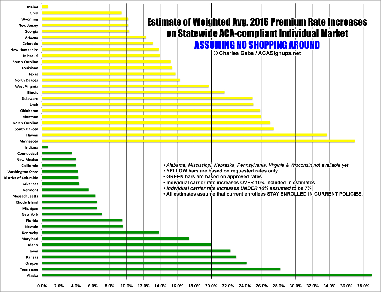
Again, I'd really need to include the 6 missing states to have a full picture, but this one seems pretty clear to me. Of the 23 states which haven't had their 2016 rate changes approved, only 2 of them (Maine and Ohio) are below 10%, and 9 states have requested average hikes exceeding 20%. Meanwhile, of the 22 states which have issued approved rate changes, 14 of them are under 10% and only 5 are higher than 20%.
The obvious takeaway here is that state regulators (at least in states which allow them the power to authorize rate changes) are tremendously important in keeping insurance rates from spiraling out of control. Let's just hope that the regulators in the "requested only" states take their jobs seriously.
UPDATE: Professional actuary Rebecca Stob requested that I break the states out a fourth way: By states which are allowing "transitional" or "grandmothered" policies to be continued into next year vs. those which aren't. There are 3 states (Colorado, Illinois and Oregon) which did allow "transitional" plans...but only through 2015.
Here's what it looks like when you break the states out this way:
![]()
Overall, the states which didn't allow transitional policies do appear to be looking at lower rate increases than those which did, which is what you'd normally expect. This is even more true if you move the 3 turquoise states (CO, IL, OR) over to the "transitional" section.
9 of the 26 states allowing transitional policies are 10% or lower, but 10 are 20% or higher. In the "no transitional" group, 10 out of 19 are under 10%, with only 5 higher than 20%.
However, again, if you move the 3 "2015 cut off" states to the other group, it's much more startk:
- 9 out of 29 "transitional" states would then be under 10%, with 13 over 20%
- 10 out of 16 "no transitions" states would then be under 10%, with only 3 over 20%
So yes, there does appear to be a pattern here, if not quite as strong as the "approved/requested" chart: The states which are not allowing transitional plans next year do indeed seem to have lower hikes than those which are allowing them.
Advertisement
