FOLLOW-UP: Are 2017 rate hike trends simply due to some states starting lower to begin with? Sort of.
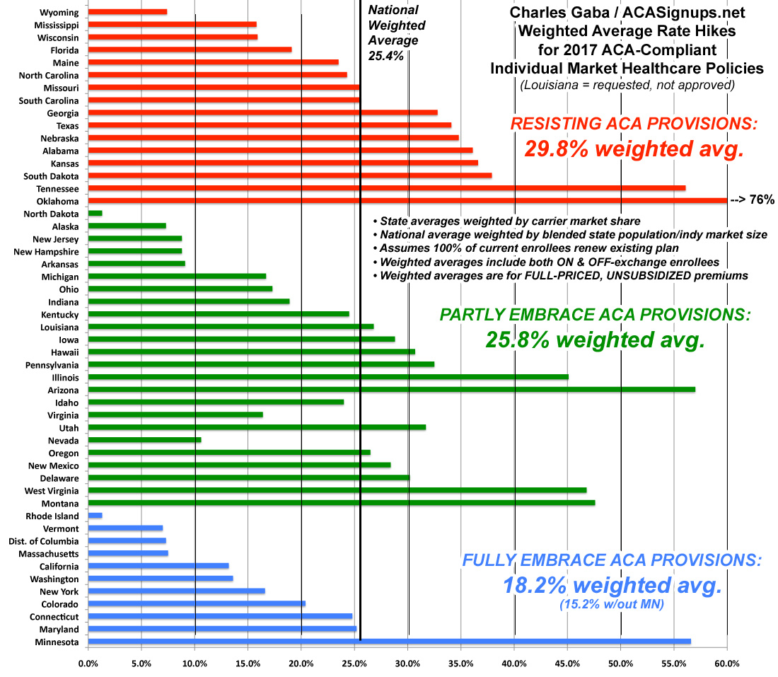
The other day, I posted a bunch of charts which took a look at the average percentage rate hikes in various states depending on three different criteria: Whether they expanded Medicaid under the ACA or not; whether they allowed Transitional plans or not; and whether they ran their own full exchange (as opposed to just offloading the whole enrollment platform to the federal exchange). My conclusion, which has generated a lot of response, was that there's a definite pattern here:

The states which are 100% on board with the ACA exchange provisions (running their own full state-based marketplace, expanding Medicaid and sticking to the original cut-off date for "transitional" policies) average around 18%. If you remove Minnesota from the equation, it's just 15.2%.
Those which implemented only one or two of the above provisions come in at around 26%. In a possibly coincidental quirk, all five of the "halfway" state exchange states (Hawaii, Oregon, Nevada, Kentucky and New Mexico) just happen to also fall into this category as well, which is completely appropriate.
Finally, states which are fighting the ACA kicking and screaming (no Medicaid expansion, no state exchange and allowing transitional plan extensions as long as possible) are averaging around 30%.
Make of that what you will.
However, as I noted in an update, and as I actually wrote myself last year, it's also important to distinguish between the percentage increases and the dollar increases in each state...especially if it turns out that the “blue” states tended to already have higher premiums to begin with. If so, that would mean that the same dollar increase would show up as a smaller percentage increase than a state which had much lower rates initially.
In order to test this theory, I ran the numbers two different ways.
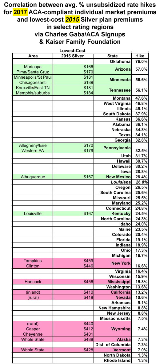
First,  Cynthia Cox of the Kaiser Family Foundation provided this link to a 2015 KFF analysis of the lowest-cost Silver plan in select rating areas across the country. At the time, they found that:
In health insurance prices, as in the weather, Alaska and the Sun Belt are extremes. This year Alaska is the most expensive health insurance market for people who do not get coverage through their employers, while Phoenix, Albuquerque, N.M., and Tucson, Ariz., are among the very cheapest.
In this second year of the insurance marketplaces created by the federal health law, the most expensive premiums are in rural spots around the nation: Wyoming, rural Nevada, patches of inland California and the southernmost county in Mississippi, according to an analysis by the Kaiser Family Foundation, which has compiled premium prices from around the country. (KHN is an editorially independent program of the foundation.)
The most and least expensive regions are determined by the monthly premium for the least expensive “silver” level plan, which is the type most consumers buy and covers on average 70 percent of medical expenses. Premiums in the priciest areas are triple those in the least expensive areas.
To the right you can see the results. Now, there are several very important caveats here:
- The KFF rates are from 2015, not 2016. The situation is quite different this year than last.
- They only cover certain areas of each state (except for Alaska and Vermont, which are state-wide)
- They only cover the lowest-cost Silver plan for each of those particular areas, not any other Silver plans or any of the Gold, Platinum, Bronze or Catastrophic plans
Still, even with all of those disclaimers/conditionals, there does seem to be a pretty clear inversely-proportional relationship between the average dollar amount and the average percent increase...which, again, makes sense; a 57% hike on a $170 premium (Arizona) would bring it to $267...still 40% lower than the $458 you'd see from a 7% hike on a $428 premium (Vermont). The fact that all 10 of the lowest-price average premiums happen to be grouped on the upper half of the rate hikes and vice-versa adds a lot of support to this reasoning.
In order to be certain, I'd have to have:
- 2016 average premiums instead of 2015
- ALL plans from all metal levels instead of just the lowest-priced Silver
- The average across the entire state instead of just certain regions, and...
- All 50 states + DC instead of just 13 of them
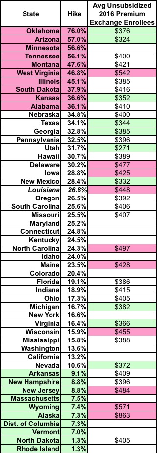
That brings me to the second method:  The official ASPE 2017 Open Enrollment Report, which includes the average unsubsidized premiums paid by 2016 exchange enrollees for all plans!
Unfortunately, while this fills in the first three bullet points above, it doesn't fill in the fourth one, and has some other missing pieces itself:
- It only includes the 38 states which operated off of HealthCare.Gov for 2016, not the 13 state-based exchanges, and
- it only covers exchange-based enrollees who received APTC assistance, not the 15% of exchange enrollees who pay full price or the 7 million or so off-exchange enrollees.
When you plug these numbers in, the picture is much fuzzier; see the table to the right. If there was a direct correlation, the pink cells in the second column should match up pretty closely to the green cells in the third column (ie, highest hikes matching lowest current premiums).
As you can see, they kind of do so...but not really. West Virginia has among the highest premiums in the country this year but is still looking at a 47% average hike next year...and Nevada, which has a fairly low average premium this year is only looking at a 10.6% average hike in 2017.
In other words, there seems to be some correlation, but it looks like it's not quite that simple either.
In general, my guess is that the pattern is a combination of all four factors:
- Medicaid expansion
- Type of exchange
- Transitional plans and
- How low/high the starting premiums were to begin with.
There may be additional factors at play as well, of course, unique to those specific states, but these are the ones I'm able to suss out.


