

So how'd I do on my 2024 avg. rate change project? Not bad at all!
Fri, 12/01/2023 - 6:35pm
As regular readers know, every year I pore over hundreds of annual health insurance policy rate filings from carriers participating in the individual and small group markets, attempting to run weighted average rate changes on a state-by-state level. I then compile all 50 states (+DC) into a national weighted average rate change table.
I generally do this twice for every state: First, over the spring and summer, I crunch the numbers for the carriers preliminary rate change requests. These are submitted to the state regulatory authorities (or in a few cases, federal regulators), who run their own actuarial analysis and then either approve the requests as is, lower the requested rates or (in a few cases) even raise rates more than requested, since part of the regulators job is to ensure that the insurance carriers have enough cash flow to actually pay their claims over the upcoming year.
In some cases, the carriers actually resubmit revised filings later on in the summer if there's some material change to their finances, the marketplace or other policies which change their analysis.
Then, in the late summer/early fall, I go back and run through the approved/final rate filings and compare those against the preliminary requests.
USUALLY I'm able to track down and analyze this data for the carriers in a good 40+ states. However, over the past few years it's become more and more difficult to get ahold of the final rate filings ahead of the November 1st Open Enrollment Period (OEP).
As a result, this year I only had final filings locked in for 25 states +DC before the final rates were posted publicly for every state a RateReview.HealthCare.Gov, alhough I also had preliminary filings for the other 25 states.
Even when the final filings for each carrier are made available, however, I still have to make educated guesses as to each individual market carriers' effectuated enrollment as of April 2023, which is necessary in order to run the weighted averages. Many insurance carriers redact (black out) their "Covered Lives" data in their supposedly "public" filings. The state of Florida redacts nearly all of the filing forms across the board (even going so far as to grey them out with a "Top Secret" icon; I'm not kidding!).
Other carriers round off enrollment to the nearest thousand, which can make a big difference in a state with a low number of enrollees. And some carriers submit so many revised filings that it becomes difficult if not impossible to find the correct/accurate enrollment number.
Even with all these headwinds, I forge ahead year after year, hoping that I'm able to come reasonably close to the both hard numbers: Effectuated enrollment by carrier and weighted average rate changes.
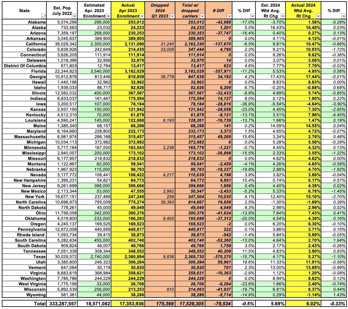
This year, after plugging in as much hard data as I could find and combining that with my best guesstimates for the missing data for all 50 states +DC, I estimated that there were around 18.57 million Americans enrolled in ACA-compliant individual market healthcare policies last April, and that the weighted average premium increase for those policies in 2024 would be 5.7% nationally.
This year, however, my friend/colleague Wesley Sanders gave me a link to a hugely helpful resource for healthcare data wonks which I'm kicking myself for not knowing about earlier: The annual Rate Filing Justification for Single Risk Pool Plans Public Use Files.
These data files, which aren't posted publicly until well after the annual Open Enrollment Period launches, includes all the data I could possibly need to complete this exact project, all wrapped up in tidy CSV ZIP files (along with a mountain of other data which should be handy for other ACA data projects in the future...I'll have to dive into it at a later point).
By tracking down just two columns (out of a couple hundred), I was able to fill in the missing data for about half the insurance carriers nationally, while also making (mostly minor) corrections to some of the other half. In most cases the weighted rate changes for individual carriers was accurate, but sometimes the enrollment data was off by a bit which still modifies the statewide average somewhat.
When I added everything up, I got a grand total of 17.35 million enrollees (around 1.2 million fewer than my estimated total). However, there's one more missing piece of the puzzle: If a carrier drops out of state completely (such as Friday Health Plans, which went bankrupt and is leaving tens of thousands of enrollees in a half-dozen states to switch to other carriers), they generally don't file a full actuarial memo or URRT (Unified Rate Review Template) form for the following year at all. This means their existing enrollees don't show up in the total.
Sanders also helped me acquire raw enrollment data from last spring from a number of carriers, including Friday (which dropped coverage in 6 states), Coventry (dropping out of Florida), Vantage (Louisiana), US Health & Life (Michigan), HealthFirst and Empire (New York), SHA/FirstCare (Texas) and WPS (Wisconsin). Combined, these account for around 175,000 of the "missing" enrollees. There's likely some others missing which I haven't been able to account for, but this should suffice.
With those included, I only overestimated by around 1.0 million people nationally, or 6%, which I'm pretty damned proud of given my limitations.
Over 860,000 of that 1.0 million can be found in just 3 states: Texas, Florida and California, which makes sense given those are the three largest population states as well.
On the other hand, I also underestimated by as much as 60,000 in several other smaller states, which I find more curious.
On a percentage basis, my biggest misses were Iowa, West Virginia and Kansas at the high end and Utah, Massachusetts and New Hampshire at the low end. Again, I'm not sure how I could have underestimated by so much in any state, but whatever.
As for the weighted average rate change, it turns out to be 6.02% nationally...again, I was within 6% (or 0.3 percentage points) of the actual average. Again, not bad! My biggest misses here were Alabama, Kentucky and Kansas, where I had it too low, and South Carolina and Wyoming and Tennessee where I had it too high.
The table below breaks all of this out by state. The light green cells are the states where I had no idea how many actual enrollees there were and had to take my best guess; every state with an overestimate is among these.
Live and learn...this should help make my estimates more accurate going forward, anyway...
Advertisement
