

Weekly Update: Which COUNTIES have the highest per capita rates of #COVID19 cases and deaths?
Sun, 07/12/2020 - 4:41pm
IMPORTANT: As noted here, I made some sort of serious data transfer error in at least two states (Michigan and Texas), making last week's "top 100" ranking questionable. For this week (and going forward) I'm triple-checking to make sure the county names, populations, case totals and fatality totals are sorted properly for all 50 states.
Now that I've brought all 50 states (+DC & the U.S. territories) up to date, I'm going to be posting a weekly ranking of the 100 U.S. counties (or county equivalents) with the highest per capita official COVID-19 cases and fatalities.
Again, I've separates the states into two separate spreadsheets:
Most of the data comes from either the GitHub data repositories of either Johns Hopkins University or the New York Times. Some of the data comes directly from state health department websites.
Here's the top 100 counties ranked by per capita COVID-19 cases as of Saturday, July 11th (click image for high-res version):

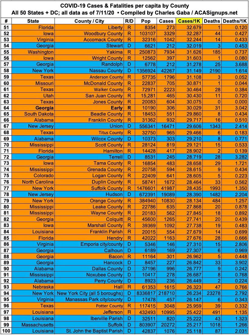
There's still clear disconnect between the counties with the highest rates of infection and the ones with the worst mortality rate. 15 of the 20 counties with the highest rate of infection are low-population rural counties which voted for Donald Trump...and four of the other five are in states Trump won by wide margins (Alabama, Arizona, Arkansas and Louisiana).
New York doesn't even show up until #26 (Rockland County), and Michigan no longer shows up until #287 (even then, it's not Wayne County which ranks highest...it's Oceana County. Wayne County, where Detroit is located, doesn't show up until #341).
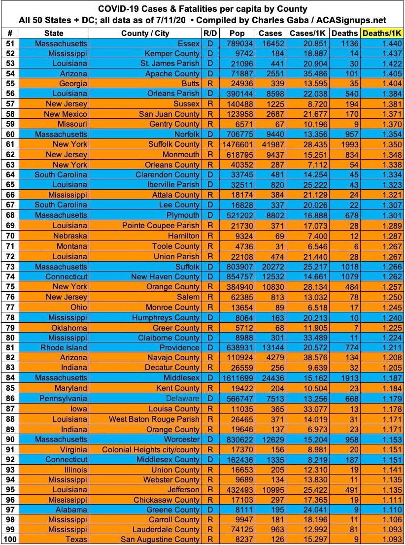
On the other hand, as you can see below, it's still the opposite for fatalities: 15 of the 20 counties with the highest COVID-19 mortality rates voted for Hillary Clinton. It's actually more like 18 out of 20, since both the NY Times and John Hopkins University data files lump all 5 New York City boroughs (which are actually counties) into a single listing. Four of the five are solid blue (the exception is Richmond County, aka Staten Island).
Setting political lean aside, it's noteworthy that the four deadliest COVID counties are located in Georgia.
Here's the top 100 counties ranked by per capita COVID-19 fatalities as of Saturday, July 11th (click image for high-res version):

It's also worth noting how the ratio of per capita cases has shifted between the Clinton and Trump counties over time. Back in mid-March, the rate was 4.5x higher in Clinton-voting counties than Trump counties. As of this weekend that ratio was down to 1.6x. In terms of the mortality rate, the ratio has dropped from 5.3x to 2.7x.
It's been pointed out that a whopping 84% of all counties voted for Trump. However, here's the point: Of the 100 highest-positive rate counties...
- On 3/20, it was 51 Trump counties to 49 Clinton counties.
- By 4/05, it was 57 Trump, 43 Clinton.
- By 5/12, it was 59 Trump, 41 Clinton.
- By 6/06 it was 62 Trump, 38 Clinton.
- On 7/11 it was 65 Trump, 35 Clinton.
Get the picture yet?
Advertisement
