

A Tale of 10 States: How #COVID19 has spread in 5 blue states & 5 red states
Mon, 06/22/2020 - 10:11am
The big story re. the coronavirus pandemic the past week or two is how it's shifting from the mostly northeastern states ravaged by it from March - May to now hitting the sunbelt, south and southwestern states in June (and likely July). With that in mind, here's graphs showing the cumulative per capita increase in positive COVID-19 cases and fatalities over time in the 5 states with the highest cases (all of which happen to be Dem-controlled, w/the exception of Massachusetts having a Republican governor) vs. the 5 states with the highest percent increase in cases over the past week (all of which happen to be GOP-controlled).
I've also included the per capita cumulative testing for each as well, since it's reasonable to expect positive cases to increase as testing ramps up. The critical thing to look for is whether the rate of the upwards curve is greater for testing or new cases. If the testing rate is increasing faster than the case rate, that's a Good Thing. If the case rate is increasing faster than the test rate, that's a Bad Thing.
The death rate is a little different--since there's usually a lag of several weeks between the time someone tests positive until they're sick enough to be hospitalized, are admitted to the ICU and then actually pass away from the disease, any upward slope of fatalities won't show up until a few weeks after the case increase, so a straight line for deaths in the past week isn't necessarily good news.
IMPORTANT: In order to make the graphs readable, I've had to use different scales for all three lines. Testing is per 100 residents. Cases is per 1,000 residents. Deaths are per 10,000 residents. If I tried to use the same scale for each, the fatality line would appear to be horizontal for most states while the testing line wouldn't even fit on the graphs. Again, it's the relative curves which matter here.
FIrst, let's look at the states which were hit the hardest this spring: New York, New Jersey, Rhode Island, Massachusetts & Connecticut:
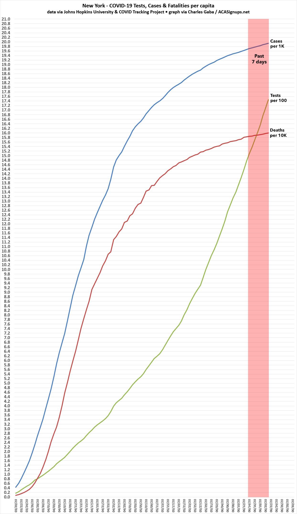
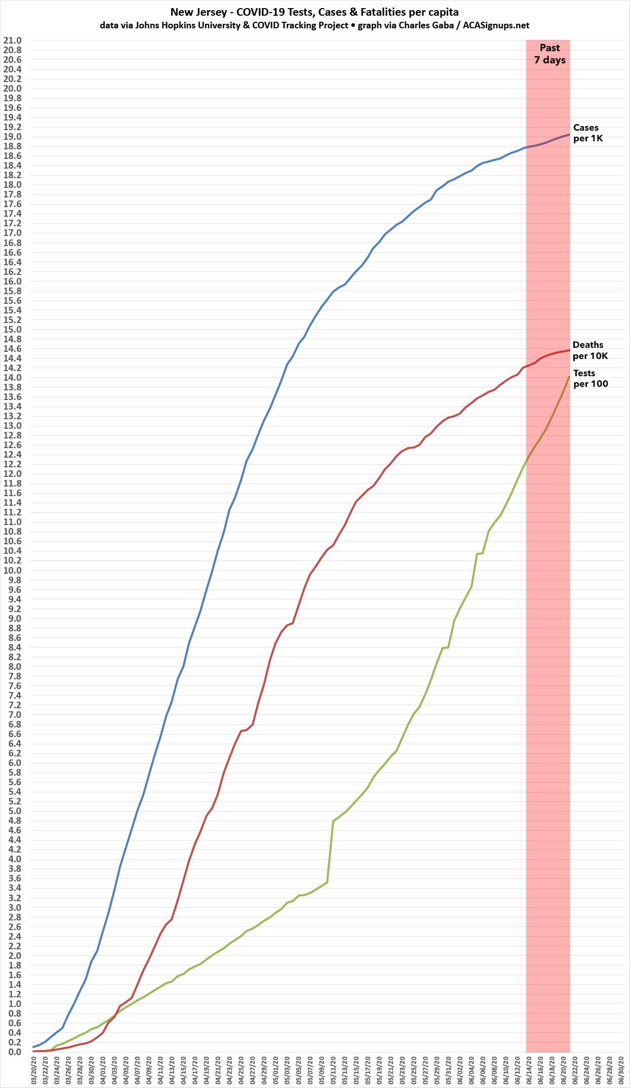
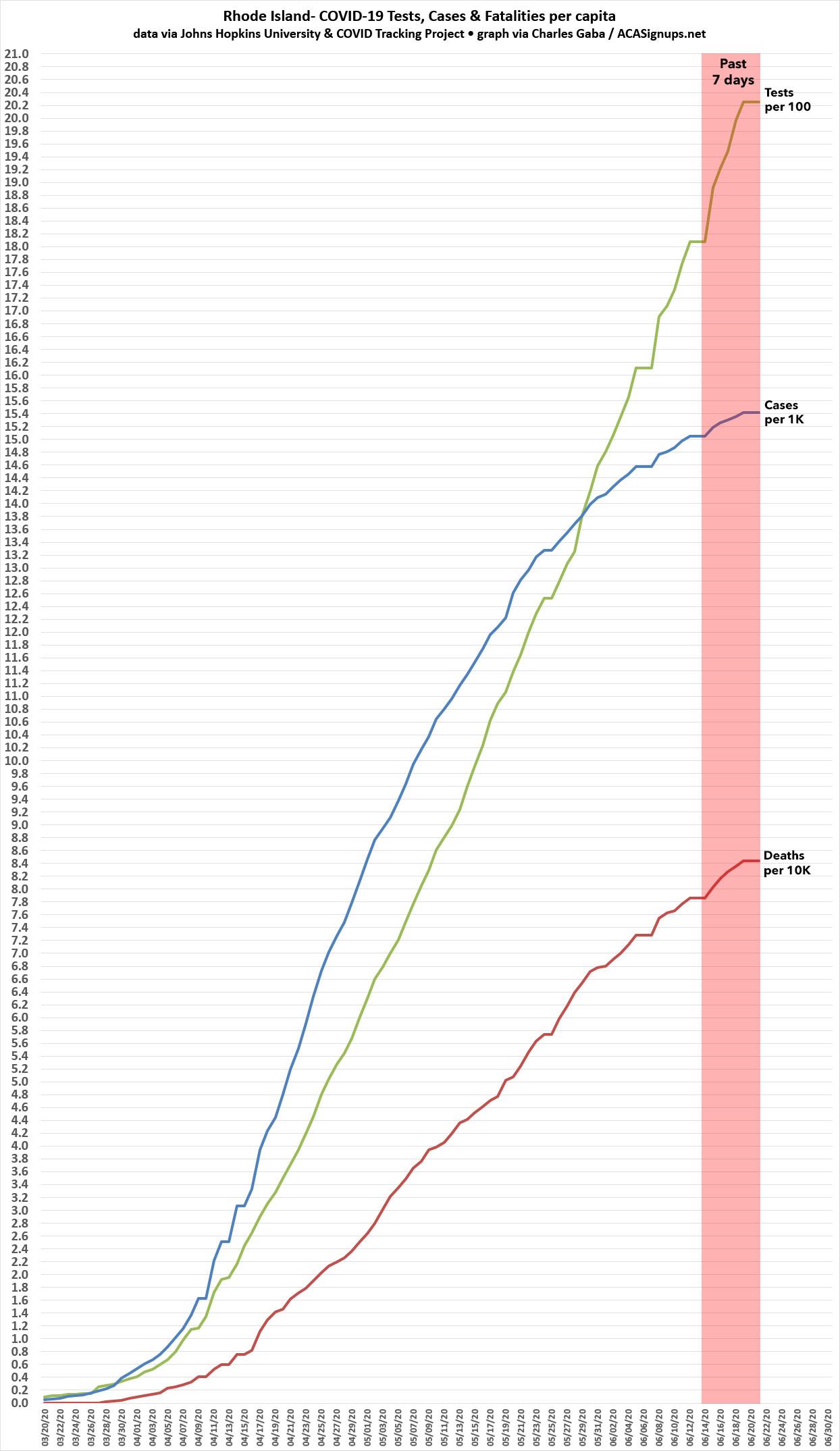
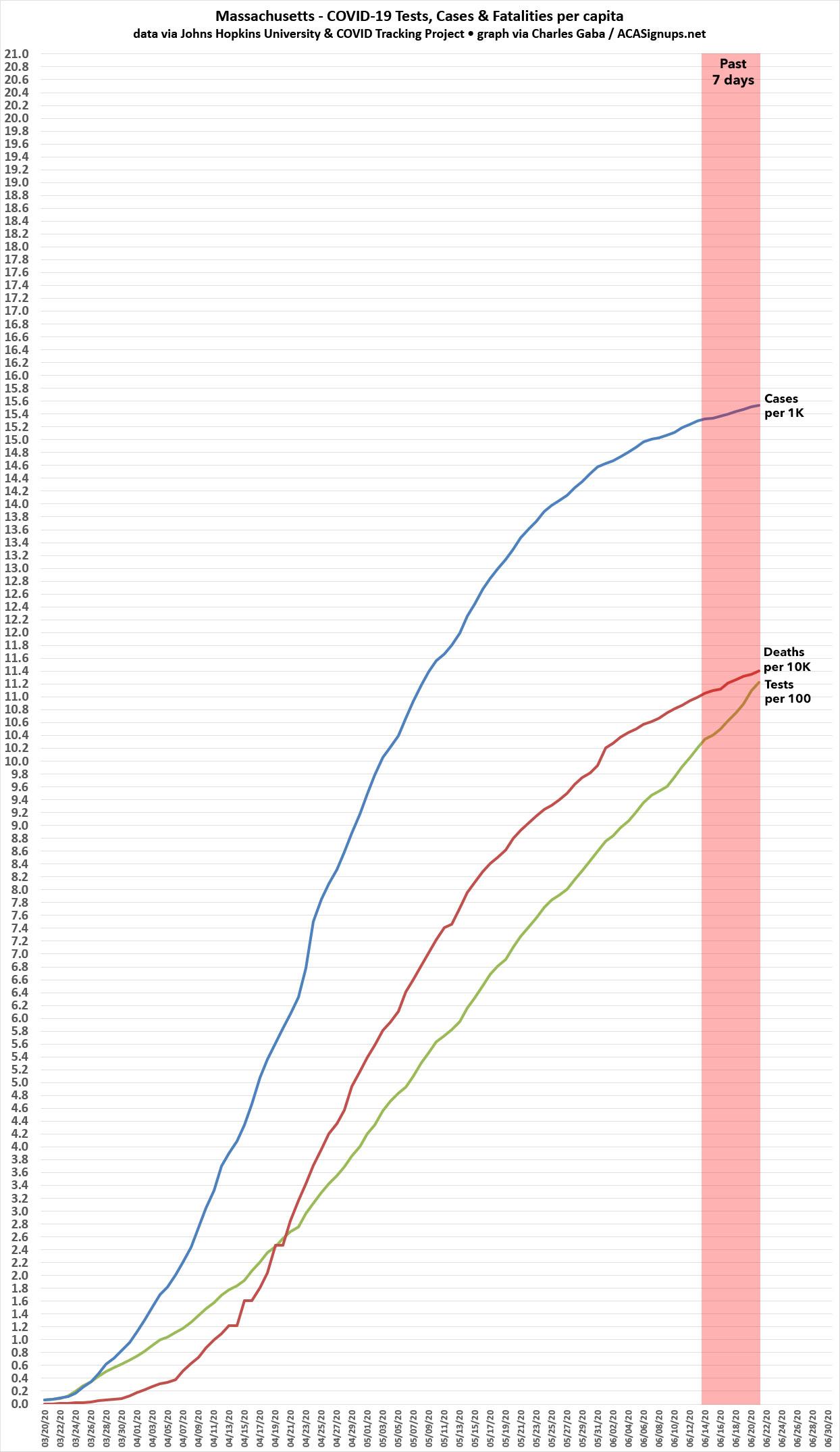
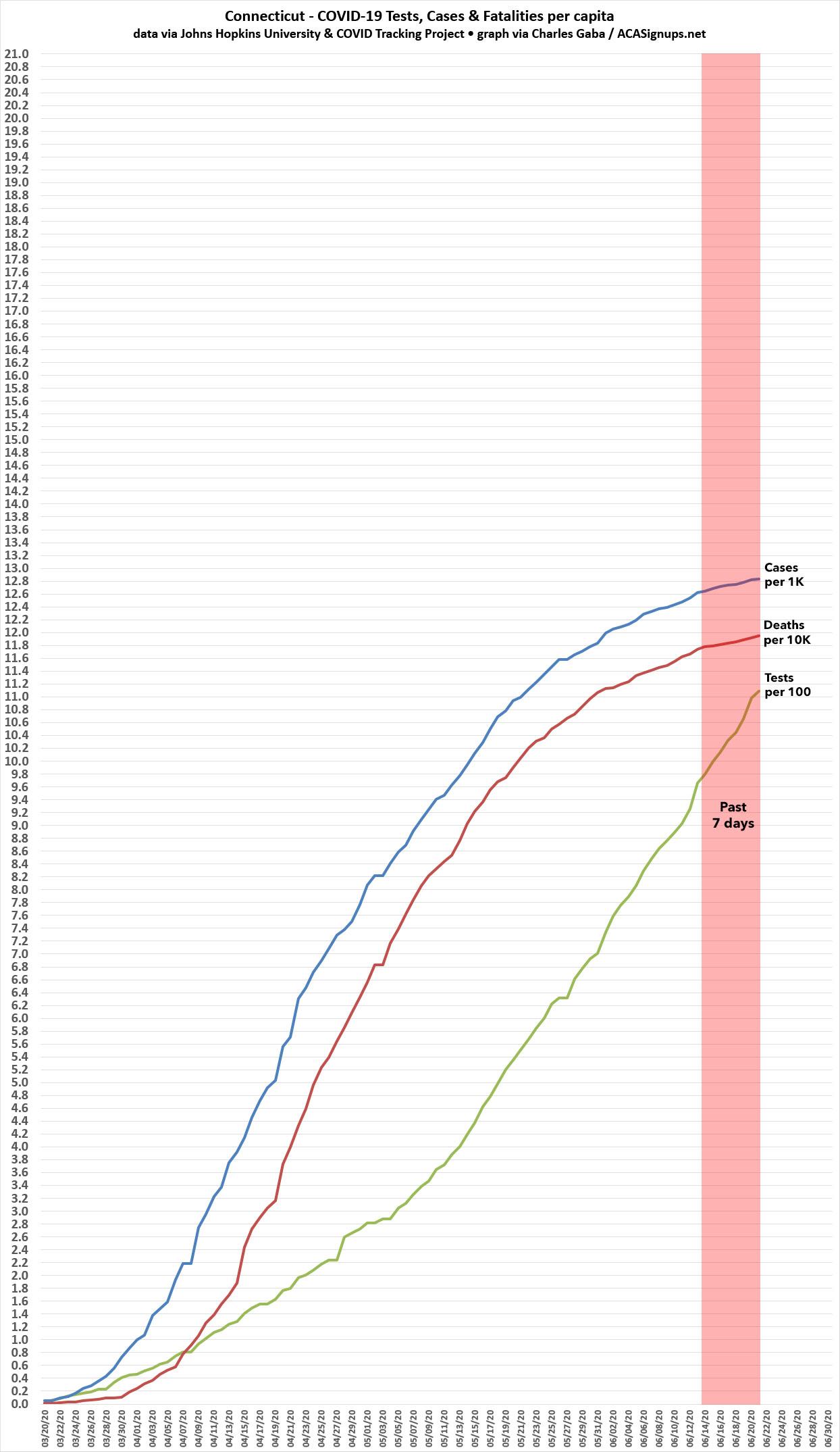
In all five cases, while new cases are still increasing at a noticeable rate, the testing has ramped up much more quickly over the past week or so than new cases have (although the ratio isn't as large as I'd hope to see in Massachusetts).
Next, let's look at the states which have seen the highest 7-day increases from 6/15 - 6/21: Florida, Texas, South Carolina, Oklahoma and Arizona:

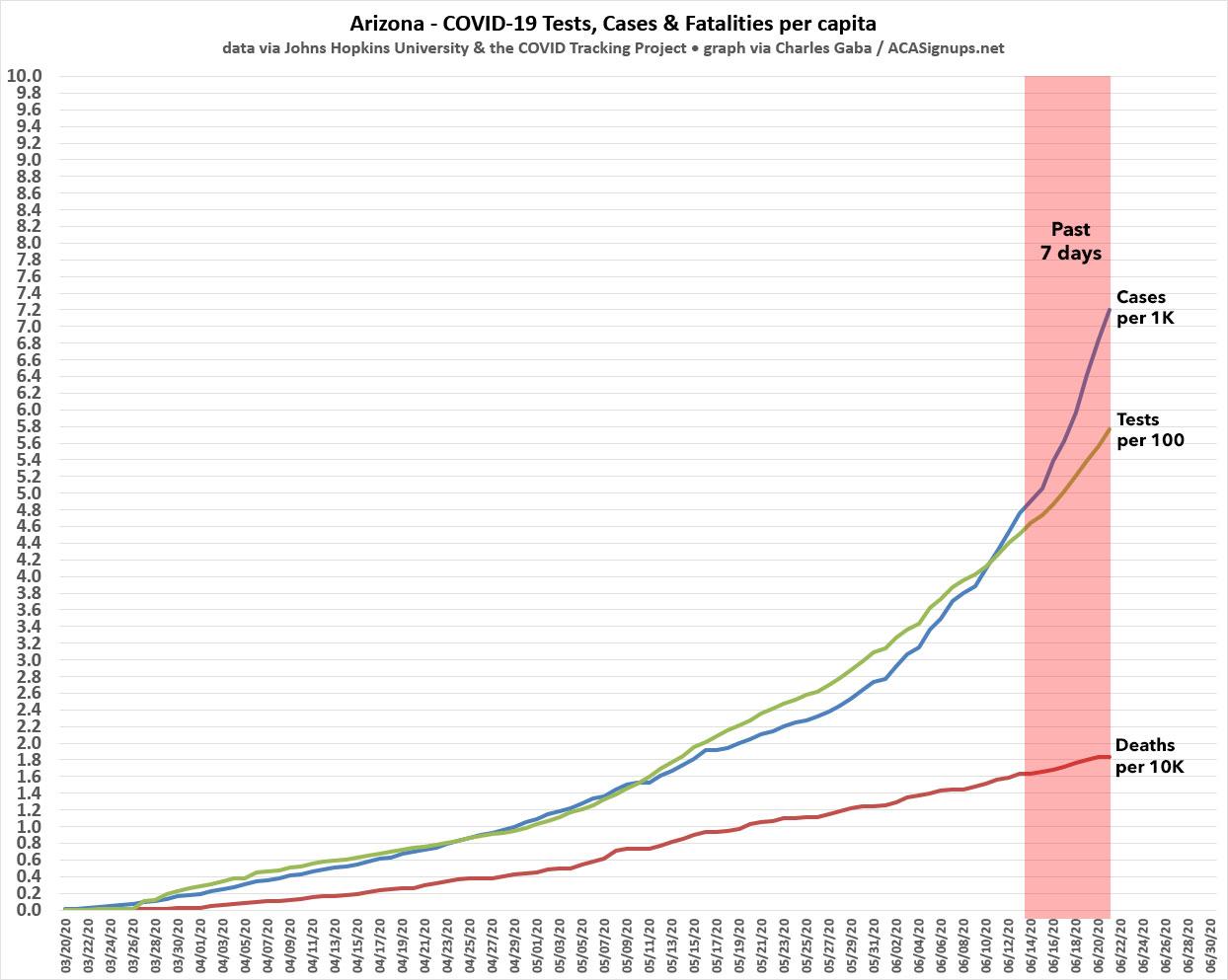

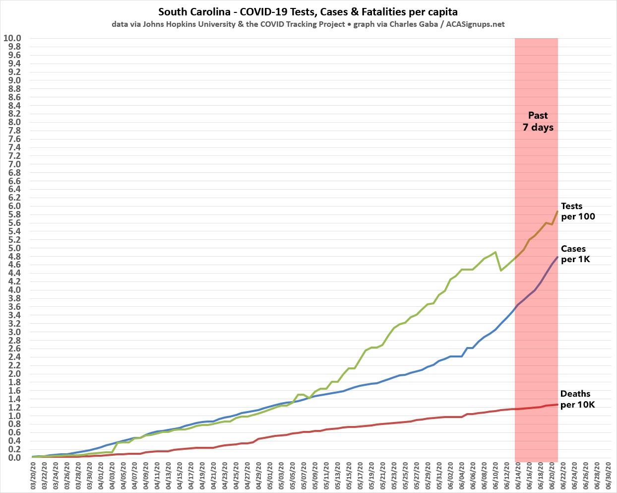
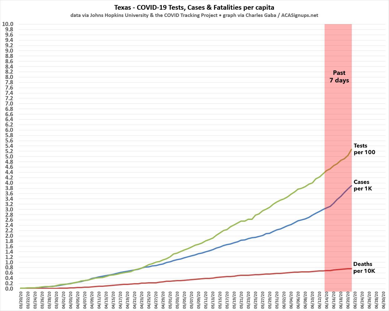
In Texas, Oklahoma and South Carolina, the two past-week trendlines aren't that far apart; the bulk of the new cases (but not all) are likely due to testing ramping up. In Florida, however, new cases are clearly starting to outpace the testing, and in Arizona, yikes.
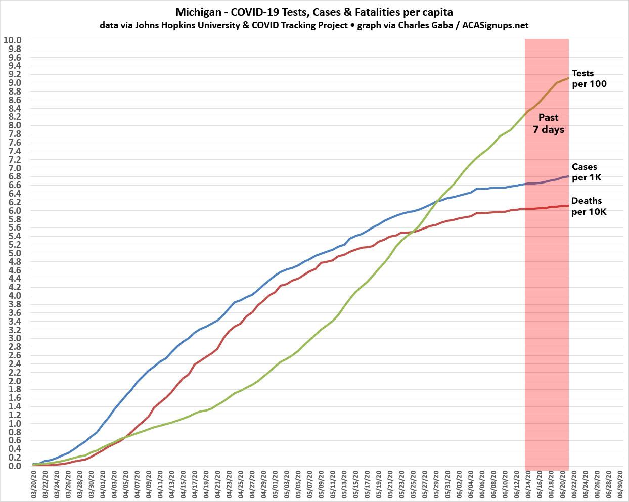
I'll conclude with one more chart: My home state of Michigan, which was also hit hard early on, is a great example of flattening the curve:
Advertisement
