

Minnesota: MNsure releases a whole mess of handy Open Enrollment data
Sun, 02/03/2019 - 2:02pm
The Minnesota ACA exchange, MNsure, wrapped up their 2019 Open Enrollment Period on January 13th, and recently released three big reports chock full of wonky healthcare data nerd goodness. I'm mostly going to just repost some of the key graphs/charts, but make sure to read the full reports for all the details:
- January 16, 2019 Board of Directors Meeting
- January 16, 2019 Year-to-Year Comparisons
- 2018 Annual Report
The annual report is mostly full of inside baseball administrative info, but the first two reports have lots of stuff of interest to the average reader of this site:
First up, their January board meeting slideshow:

I have a tendency to forget about standalone dental plan policies. To be honest, I've never understood why the ACA didn't include both dental and optical care as part of its Essential Health Benefits...I know they've never been covered by most healthcare policies even before the ACA, but that's my point. Why not? Teeth, gums and eyes are part of our bodies, after all...
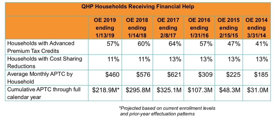
Nationally, around 83% of ACA exchange enrollees typically receive APTC assistance and 53% also receive CSR help. Minnesota's numbers are much lower for each thanks to MinnesotaCare, MN's BHP program which offloads tens of thousands of low-income enrollees who would otherwise qualify for high-subsidy exchange policies. The same is true in New York as well as the District of Columbia (although in DC it's because the Medicaid threshold is much higher, not the BHP program).
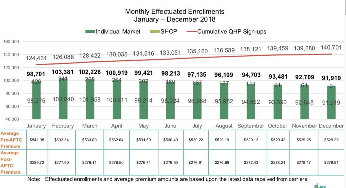
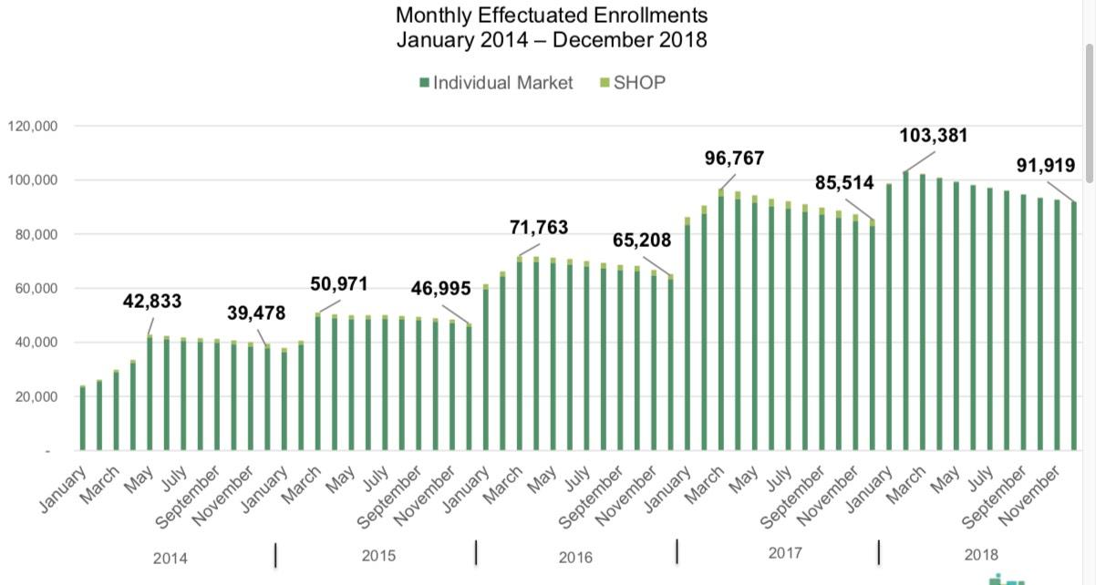
Next up: Average monthly strong>effectuated enrollments and premiums. Effectuated enrollments are the number of people actually paid for in active policies each month. This is different from the number of people who sign up for a policy, since a) not everyone who signs up actually pays their first premium, and every month some people drop their coverage for one reason or another while other new people sign up. In addition, there's a delay of as long as two months between the day you sign up for a policy and when it actually goes into effect.
For instance, if you enrolled between 11/01/17 and 12/15/17, your coverage would start on 1/01/18. If you enrolled between 12/16/17 and 1/13/18, your coverage didn't start until 2/01/18. As a result, even though the official QHP total was 116,358 in Minnesota for the 2018 Open Enrollment Period, actual effectuation only peaked at 103,040 as of February (not including SHOP enrollees), or just 88.6% of that. Over the course of the year, there was net attrition each month, ending in 91,919 for December (79% of the official QHP total). The monthly average for the full year was 97,218 effectuated enrollees, or 83.6% of the QHP total. This is actually pretty typical nationally.
The monthly average premiums are also interesting; this is the first time I've seen that particular stat laid out for any state, much less nationally. The average premiums dropped slightly over the course of the year, by around 2.2% for unsubsidized and 2.5% for subsidized. This suggests that more of those enrolled in Gold plans tended to drop out than Bronze or Silver, I'd imagine.
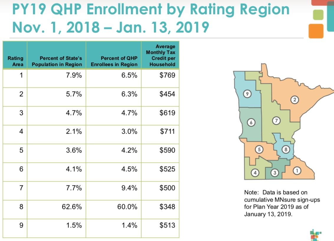
Not much for me to say about the next table breaking enrollments out by Rating Are other than to say that I don't like rating areas. I'd really prefer to see the entire state morphed into a single area. In this case, doing so would have resulted in an average monthly tax credit of $440 per household.
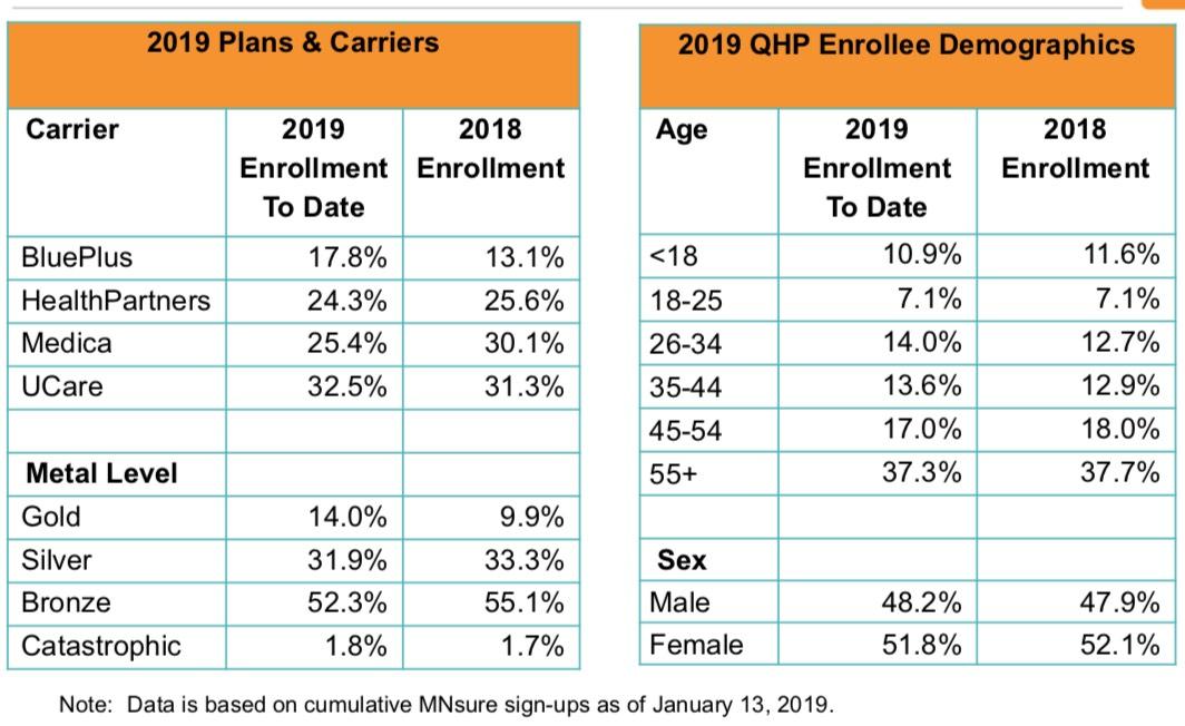
Finally we have the carrier market share breakout, which isn't of much interest to me; the metal level ratios, which are showing a downshifting in spite of unsubsidized premiums dropping over 5% last year; and the age bracket breakout, which shifted slightly older last year.
Next, the Year to Year Comparisons from 2014 - 2019:
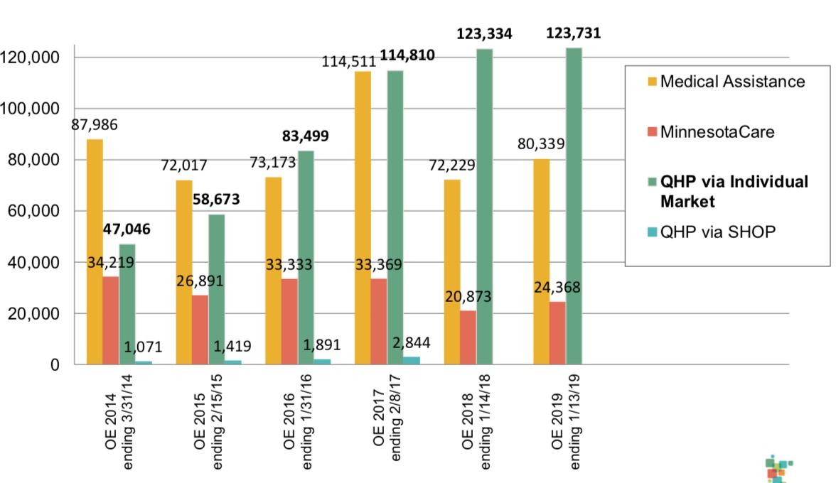
Here's a chart showing the total annual enrollment in each of the 4 types of coverage offered via MNsure: Medicaid ("Medical Assistance"), MinnesotaCare (MN's BHP program); Individual market QHPs and SHOP (small business) QHPs. The first two categories are actually misleading because both Medicaid and MinnesotaCare can be enrolled in via other means as well.
in fact, other charts farther down this page show that only around 10% of all Medicaid enrollees sign up through MNsure (this may consist of the entire ACA expansion population?), and only around 25% of MinnesotaCare enrollees do so. More noteworthy is that Minnesota is one of just four states (along with Massachusetts, Colorado and Hawaii) to increase their QHP enrollment each and every year for five year straight.
For some reason the following table is presented in reverse-chronological order, with 2019 listed first. As you can see, thanks to MN's robust reinsurance program, unsubsidized premiums have dropped substantially over the past two years, leading to average subsidies dropping as well.
Here's the five-year monthly effectuation chart. It shows the same pattern I mentioned above: Effectuated enrollments always peak the month after Open Enrollment ends, then gradually drops off as the year passes before shooting back up again the following January. The December number is consistently around 90% of the peak month year to year:
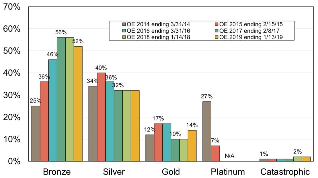
The next chart breaks out the relative Metal Level choices of QHP enrollees over the years. Bronze shot up dramatically through 2017 but has since tapered off. Silver and Gold have remained relatively steady. Platinum, amazingly, held a whopping 27% market share in 2014 before dropping off and eventually disappearing altogether. I'd have to go back to the insane first-year Open Enrollment period to understand what the deal was with Platinum...
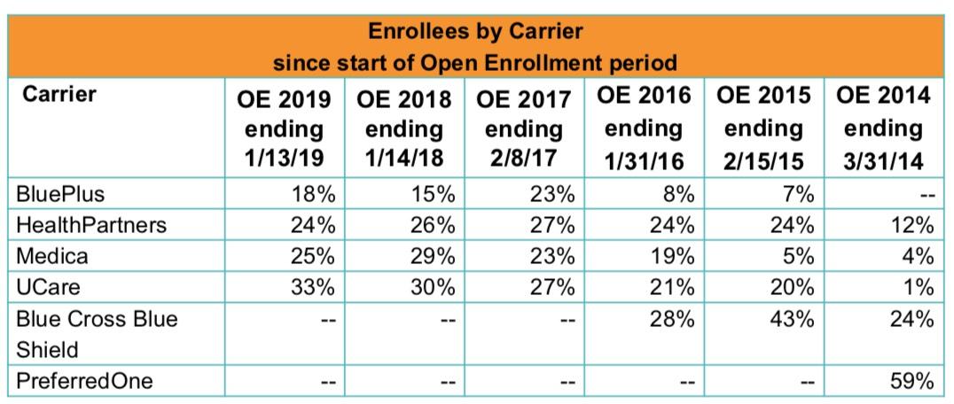
...but it looks like the answer to the Platinum question might be found in this next table. "PreferredOne" held a full 59% of the exchange market in 2014...and then pulled out of the market altogether.
According to this article from September 2014 in the Star-Tribune...
In a news release a year ago, PreferredOne was pleased to announce that it offered “the lowest-cost individual and family health care insurance plans available at all metal levels in eight of the nine MNsure pricing regions.”
PreferredOne had made its decision. It was going to grab some market share.
It worked splendidly, too. The people who managed to hack their way through and get signed up on the barely functional MNsure system turned out to be price-sensitive shoppers, and PreferredOne got most of them.
As of the latest data, PreferredOne has more than 24,000 people, or more than 50 percent of the MNsure folks in a private plan.
So how did taking the low-price position in an unproven market work out? About as you’d expect.
Based on a filing of PreferredOne Insurance Co. as of the end of the second quarter, the company saw its individual memberships shoot up to 80,000, including both the MNsure customers and others. That compared with fewer than 15,000 at the end of 2013.
If you’re the sales manager, maybe that’s news to celebrate. But PreferredOne also got 65,000 more little liability tails.
The individual health premiums written through the end of June were $87.6 million, but the expense incurred for health care services booked in its financial statements was just under $115 million.
For those keeping score, that’s $1.31 paid out for every dollar coming in, a medical loss ratio of 131 percent. Mention a loss ratio like that to anybody who works for a health insurer, and the color will drain from their face, their shoulders will slump and they will start mumbling incoherently.
The Invisible Hand of the Free Market giveth, and the Invisible Hand of the Free Market taketh away...I've never seen a breakout of PreferredOne's metal levels in 2014, but I'd be willing to bet they signed up a ton of Platinum enrollees who then proceeded to rack up gobs of expensive treatments with no deductibles and the carrier covering 90% of the costs of it all.
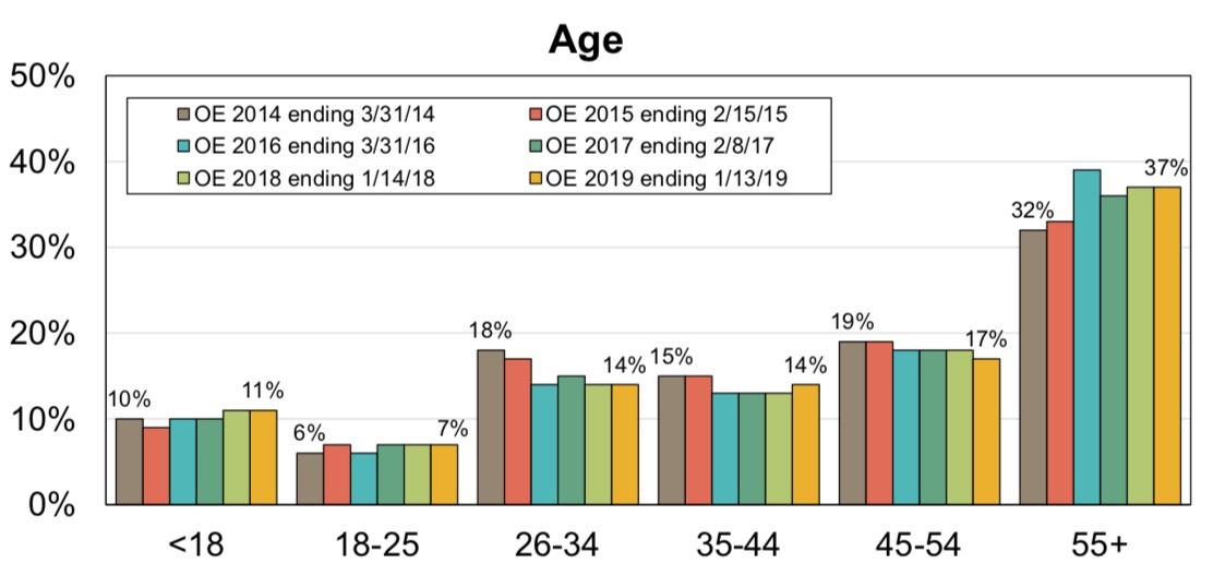
Here's a chart showing the age demographics of enrollees each year. Not a whole lot of movement for the most part, though the 26-34 year old band has dropped a bit while the 55+ band has increased, which isn't a good thing from a risk pool POV.
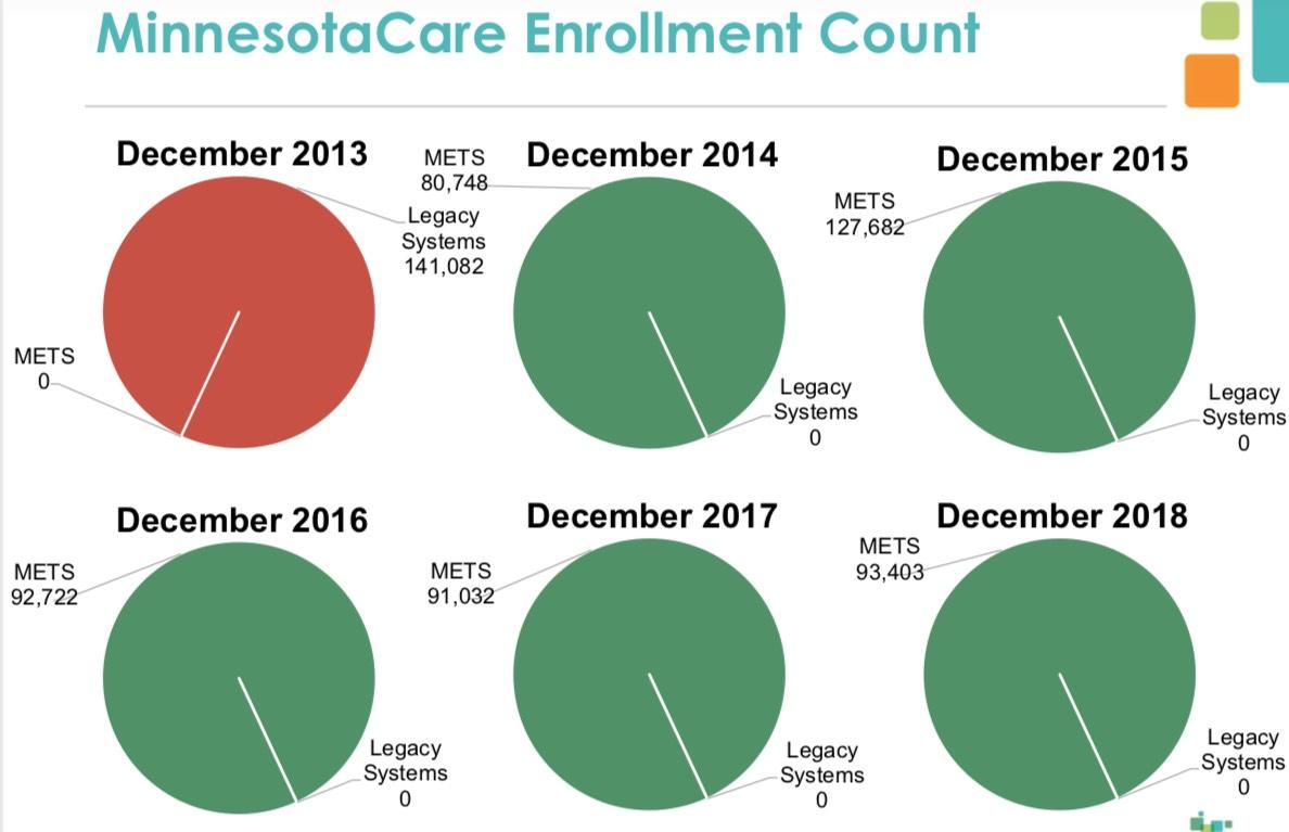
Finally, here's the MinnesotaCare numbers, although as noted above this includes the other 80,000+ who enroll outside of MNsure itself. The most interesting thing to me is that Minnesotacare dropped substantially in 2014, from 141K to 81K (the first year it was overhauled and rolled into the ACA)...but then shot way back up in 2015 to 128K before dropping back off again in 2016 (93K), where it's stayed steady ever since. Huh.
Advertisement
