

Washington State: Datapalooza! OE5 Enrollment Data Breakout!
Sun, 02/04/2018 - 12:50pm
Look what I dug up on the Washington Health Benefit Exchange website!
That's right...it's time for another state-level Datapalooza!® The first two slides come from the Feb. 2nd board meeting Open Enrollment Report; the rest come from the "Open Enrollment For 2018 Plan Year Performance Dashboard" report, which is a bit different; it actually runs through January 26th instead of January 14th for whatever reason. so some of the numbers are slightly different.
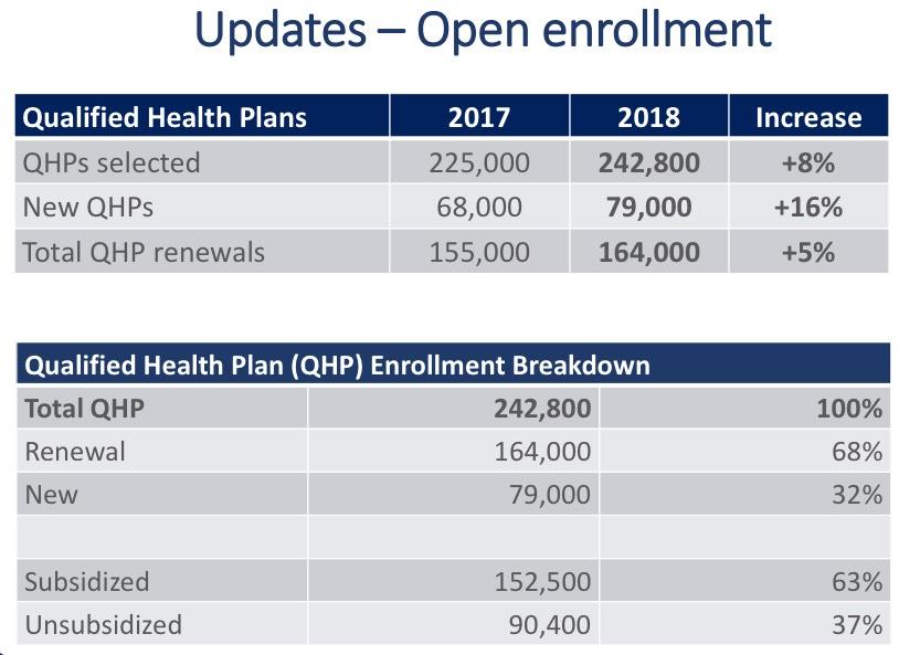
Last year, 139,820 QHP enrollees were subsidized (out of 225,594 total). This year 152,500 are subsidized...a 9.1% increase. That doesn't surprise me at all, given the CSR cut-off/Silver Loading situation. What does surprise me, however, is that unsubsidized enrollment also increased, from 85,774 last year to 90,400 this year...up 5.4%. As I noted with Connecticut, I'm truly surprised that more people were willing to pay full price for ACA policies this year given the whopping 36.4% average unsubsidized rate increase on the individual market this year.
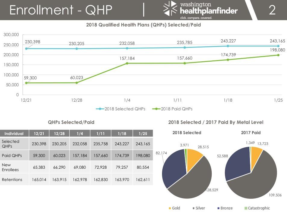
At first glance, the slide above makes it appear that only 81% of 2018 enrollees have paid their first monthly premium. However, it's important to keep in mind that enrollees who signed up after December 15th didn't have their policies go into effect until February 1st; what's relevant here is how many of those who enrolled through 12/15 paid up for January coverage. Washington reported 230,591 QHP selections thru 12/15. I don't know what the breakout of the 198,080 who had paid up as of 1/25 was between Jan and Feb start dates, but this slide suggests that somewhere between 81-86% of January enrollees have paid. This is still lower than the 90% national average rule of thumb I've been using for awhile, however.
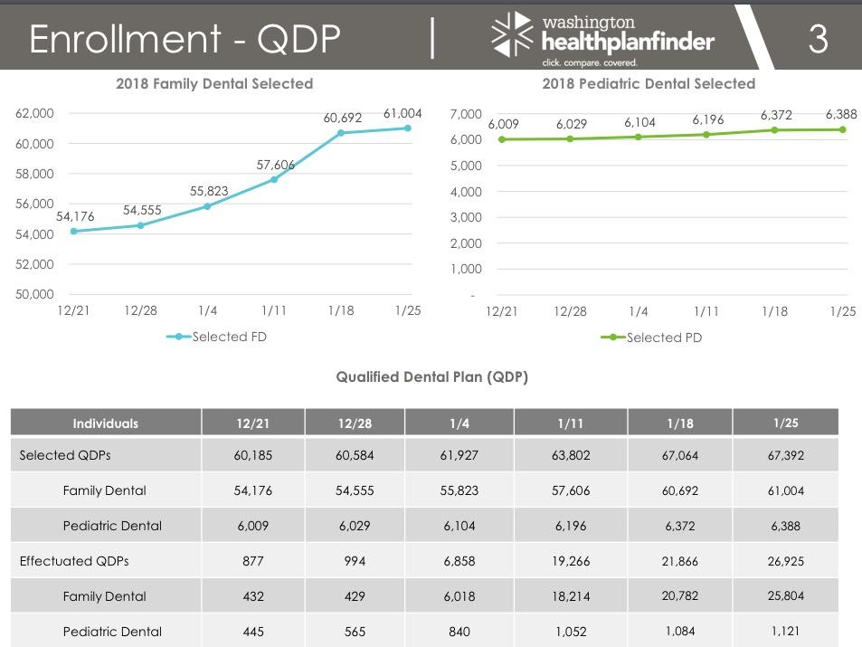
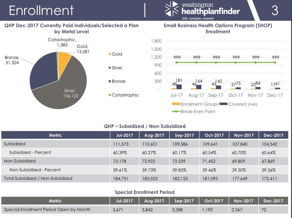
The other important takeaway here is the shift in metal level selections due to CSR Silver Loading, which looks something like this:
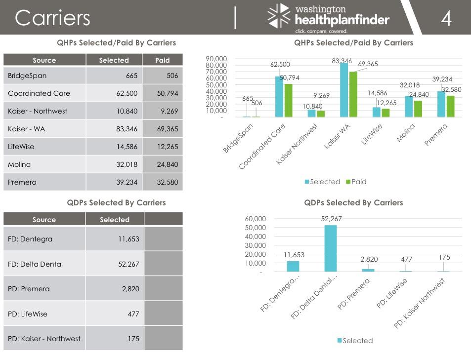
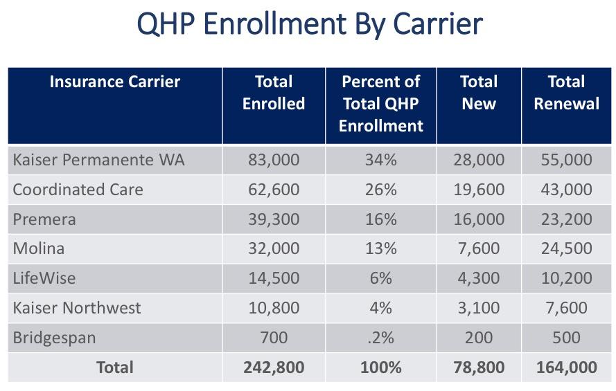
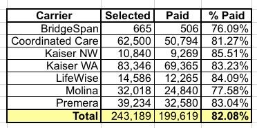
Usually I'm only interested in carrier market share breakouts over the summer/fall since I need this info to calculate weighted rate change averages. However, the table to the top left above is the first time I've seen an apples-to-apples comparison of payment rates between carriers. It looks like Kaiser and LifeWise are pretty good at getting their customers to pay up, but BridgeSpan and Molina, not so much:
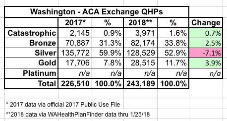
There's also a third report I dug up, which includes enrollment data for 2017, not 2018. It's still extremely useful for trendlines and comparison purposes:
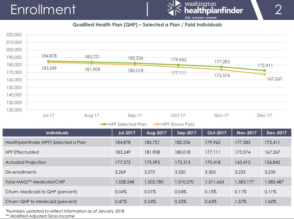
The more critical number to keep an eye on is the "HPF Shows Paid" numbers, which show gradual attrition throughout the course of the year...
...and the number of Special Enrollment Period enrollments, which average around 118 per day in Washington State throughout most of the year before dropping off dramatically in the final quarter as Open Enrollment for the following year ramps back up again.
Washington state holds around 1,8% of national ACA exchange enrollments, which means that 118/day SEP average extrapolates out to around 6,400 per day nationally. This is actually somewhat lower than the ~8,000/day which I've found to be the average in years past. I don't know if Washington is an outlier on the low side or if the SEP average really has dropped by ~20% in general over the past year or so; I'd need a lot more hard numbers from other states before drawing that conclusion.
Advertisement
