

The ASPE "105% Increase!" report completely ignores one leg of the stool.
Thu, 05/25/2017 - 10:44am
On Tuesday, the HHS Dept., knowing that the CBO score of the passed version of the AHCA was imminent (and that it would likely be devastating), released a report which they hoped would take attention away from the CBO score: A comparison, they said, of how much individual market healthcare policy premiums have increased since the Affordable Care Act regulations were fully implemented. To do this, they compared the average monthly premiums for individual market policies in 2017 against average monthly premiums in 2013...the final year before every newly-enrolled individual market policy had to be fully ACA-compliant.
Their conclusion was that, across the 39 states covered by the federal exchange (HealthCare.Gov), average premiums have more than doubled, from $224/month in 2013 to $476/month in 2017...a 105% increase overall.
I noted in my post that this was probably pretty accurate as far as it went. There were some significant caveats included in the report, such as the fact that 12 states (representing arouind 25% of the entire individual market) were missing from the report; average premiums for off-exchange policies (which make up around 40% of the total market) weren't accounted for (which could be significant if the demographics of off-exchange enrollees is different from those on-exchange) and so on. Overall, however, I accepted that their "more than double!!" headline is probably fairly close to the mark when taken at face value.
The reason I mostly shrugged this off is because it's an apples to oranges comparison. Huge chunks of individual market policies prior to 2014 were vastly different from the policies currently being sold in terms of scope of coverage, annual/lifetime limits and so on that it's very difficult to properly compare them. Furthermore, healthcare costs are always increasing to some degree, if for no other reason than normal inflation and an aging population.
I noted that, right off the bat, if you assume a mere 4-5% average annual increase due purely to these factors, that would account for around 17-22% of the increase over a 4 year period. That would still leave another 85% or so which can be "blamed" on the ACA regulations, of course, which still sounds pretty bad.
However, there was one other important factor which--while I mentioned it in passing--I failed to focus on in my initial blog entry: ACA Subsidies. The ASPE report's "$476/month" figure (and the corresponding state-by-state averages) doesn't include APTC assistance for eligible enrollees. (It also doesn't include CSR assistance, but those are related to deductibles, not premiums, so they're irrelevant in this instance). I did an update a few hours later, and my quick back-of-the-envelope math concluded that when you include APTC assistance in the mix, average premiums for individual market policies overall have actually only increased by around 25% since 2013. This is still significant, of course, but it's a far cry from 105%.
Many may question whether APTC assistance "should" be included or not, but it's a vitally important factor. You can't cherry pick which provisions of the Affordable Care Act you're going to include when running a comparison like this--the ACA said, on the one hand, "we're going to require healthcare policies to include X, Y and Z, and you have to sell them to everyone no matter how sick they are!"...but at the same time, also said "...however, since we're requiring everyone to get covered, and we know that requiring X, Y and Z could make policies more expensive, we're also going to give financial assistance to a bunch of lower-income people to help them pay for it!"
 In short, ignoring the APTC assistance when running a comparison like this amounts to pretending that one of the legs of the "3-Legged Stool" simply doesn't exist.
Now, there is one legitimate problem which complicates this point: Not everyone on the individual market receives tax credits. In fact, only around half do. The other half receive no financial assistance whatsoever...if they're self-employed, they may be able to deduct the premiums from their taxable income, but otherwise, they have to pay full price: 100% of the cost.
This is not a minor point. I've written about it extensively in the past, and I happen to fall into this category myself depending on the year. It's a real issue which needs to be addressed; the simplest solution, of course, would be to simply raise or remove the cap on the subsidy threshold (currently 400%) and beef up the formula beneath that. This would do little/nothing to resolve the cost side of healthcare, but it would at least resolve the problem from the enrollee side of the equation.
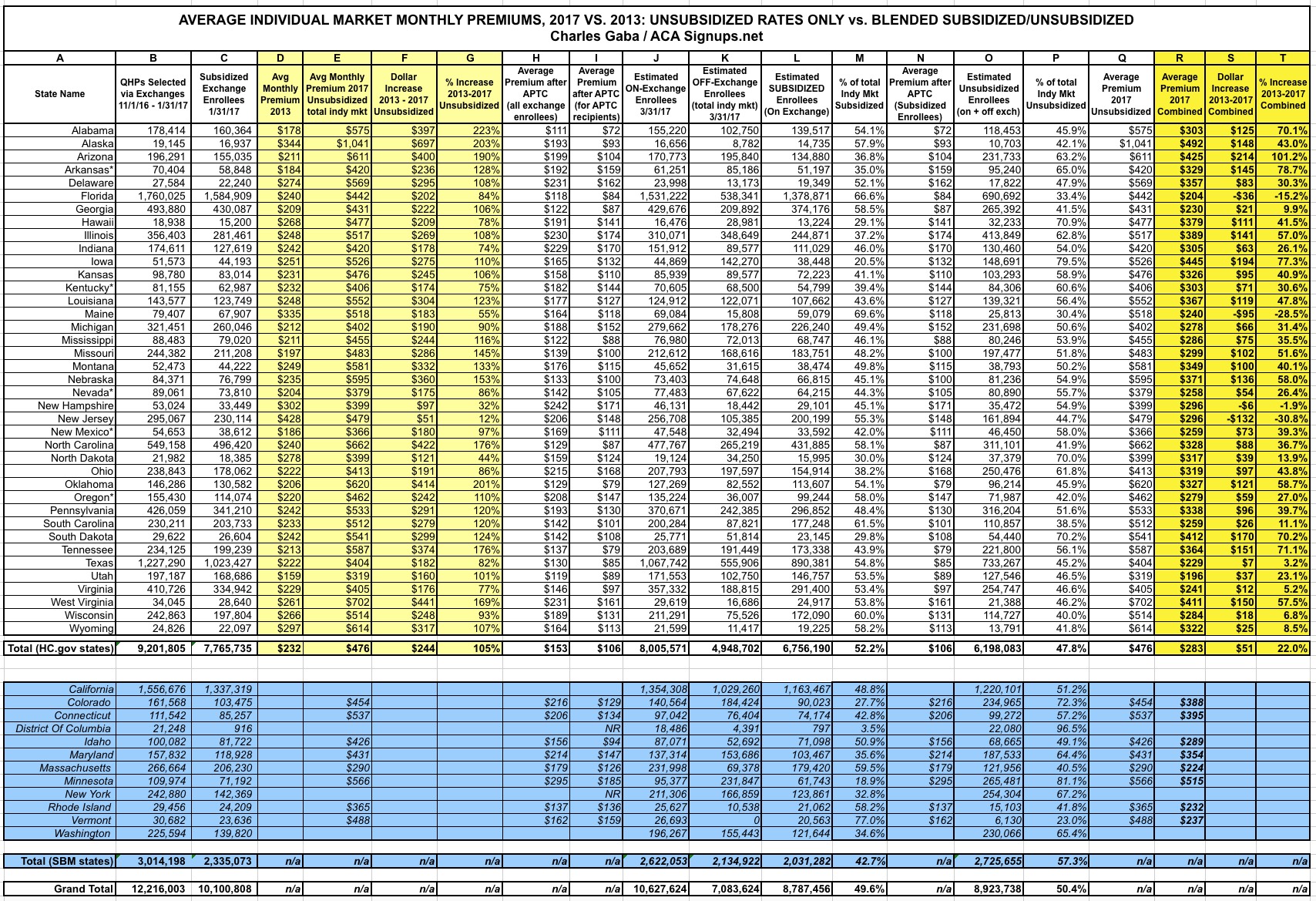
With all of this in mind, I decided to go back and plug the actual numbers for each state into a spreadsheet to see just what things look like when you do include APTC subsidies. Doing so paints a very different picture...at least, for half the market.
Note that in the interest of completeness, I've also included as much data as possible for the 12 missing states, which run their own ACA exchanges main spreadsheet. Unfortunately, these states are missing some critical fields of data, so I can't include them in the overall average increase numbers.
Here's the key for the spreadsheet:
- Columns B & C (total on exchange QHPs selected during the 2017 Open Enrollment Period and the number of subsidized exchange QHPs) come from the official CMS report.
- Columns D, E, F & G (manilla) come directly from the HHS Dept's ASPE report itself.
- Columns H and I come from the official CMS 2017 Marketplace Public Use File, which breaks the OE4 exchange enrollment data out by state, zip code, income level, average premiums and yes, APTC/CSR enrollment and amounts.
- Columns J, K & L come from my own estimates of how much exchange enrollment has dropped in each state since the end of January (around 13% as of the end of March nationally), as well as estimates of the total off-exchange market in each state based on an analysis of recent reports by the Milliman actuarial firm and Mark Farrah Associates. In short, as of 3/31/17, I estimate that there were roughly 10.6 million exchange-based enrollees (of which around 8.8 million receive APTC assistance), plus another 7.1 million off-exchange enrollees, for a total of around 17.7 million people nationally.
- Columns M, O and P break out the state totals between subsidized and unsubsidized. This is not the same thing as on vs. off exchange: Remember, around 16% of exchange-based enrollees are paying full price as well. Overall, it works out to about a 50/50 split nationally, but it's more like 52/48 for the 39 HealthCare.Gov states.
- Columns N and Q are the average 2017 premiums actually being paid by the subsidized and unsubsidized enrollees respectively. Again, these are taken from the CMS OE4 report and ASPE reports respectively.
As you can see, as of the end of March, in those 39 states, there were roughly 6.8 million subsidized enrollees paying an average of $106/month, and another 6.2 million unsubsidized enrollees paying the full $476/month referred to in the ASPE report.
When you combine them, you get an average across the entire individual market of around $283/month versus the 2013 average of $232/month...a weighted average increase of $51/month, or just 22% overall.
AGAIN, I am not downplaying the very real problem that the $476 figure is for the unsubsidized half of the market...but the other half is only paying $106, which is actually a massive drop from pre-ACA average rates for a comprehensive healthcare policy.
Also worth noting: There are four states--New Jersey, New Hampshire, Maine and Florida--where the average premium has actually dropped once you add APTC assistance to the mix. In the case of New Jersey, this is because, as others have pointed out, NJ already had guaranteed issue/community rating policies in place before the ACA went into effect.
There are a few other states which already had guaranteed issue pre-2014 as well (I know New York did, and I presume Massachusetts did as well due to RomneyCare being in place), but most of those also run their own exchanges under the ACA and aren't included in the 39 states analyzed.
(NOTE: CLICK IMAGE FOR HIGH-RESOLUTION VERSION)
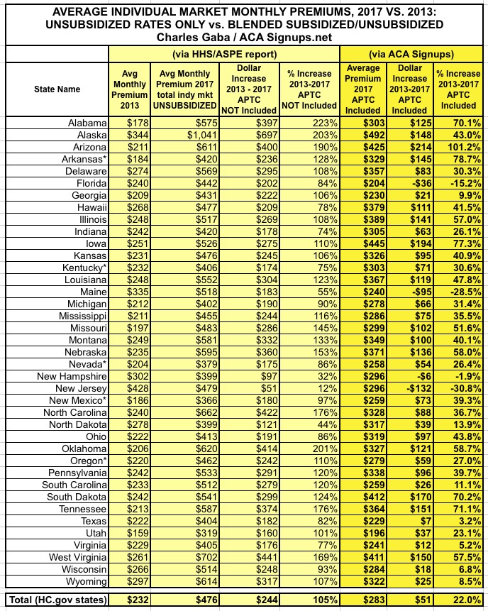
Here's a simplified version which only includes the critical manilla / bright yellow columns for easier viewing/sharing (I've also stripped out the 12 SBM states since they have too much data missing):
Advertisement
