

HealthCare.Gov Window Shopping Now Open: A Walk-Thru
Mon, 10/24/2016 - 1:09pm
For over 2 months now, I've pinned my 2017 Average Rate Hike Project summary to the top of the home page, gradually filling in one state after another as approved rate change data was released. As I indicated in my most recent update to that post, it's time to move on...especially now that 2017 Open Enrollment Period Window Shopping at HealthCare.Gov has officially gone live:

Let's step through the process and see what's changed, shall we?
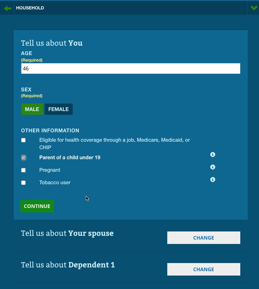
First of all, the general interface is mostly the same but has a slightly different layout:
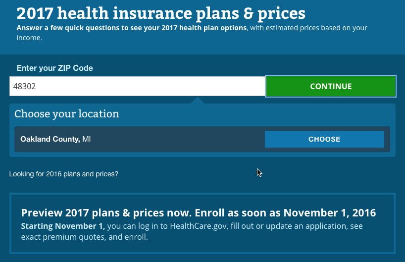
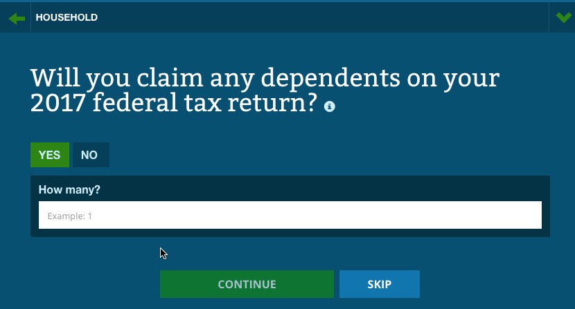
designed to be even more mobile-friendly (note the arrow at the top right...that toggles a vertical menu which lets you move back/forth between steps in the form process):
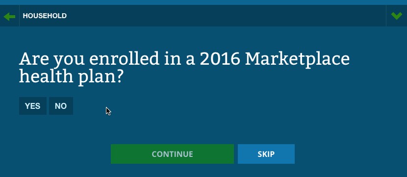
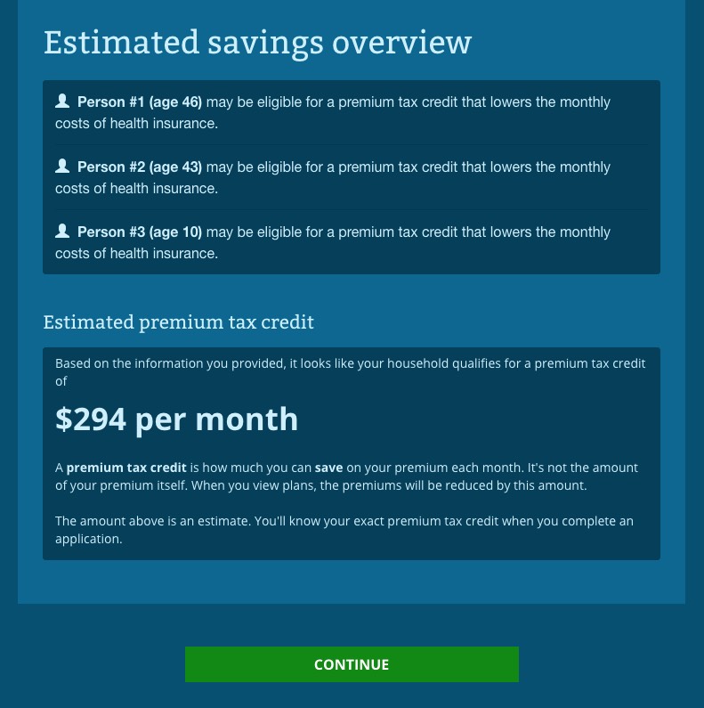
So far, I've been plugging in accurate data (my correct zip code and age). For the rest, I'm using test data. For instance, if your household income is under 250% of the Federal Poverty Line ($50,400 for a family of 3), in addition to the Advanced Premium Tax Credits (APTC), you also qualify for Cost Sharing Reduction (CSR) assistance...
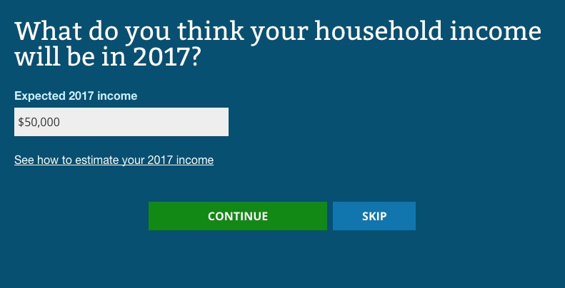
...but if your income bumps over the 250% line by even a few dollars (say, $51,000 for a family of 3), you're out of luck:
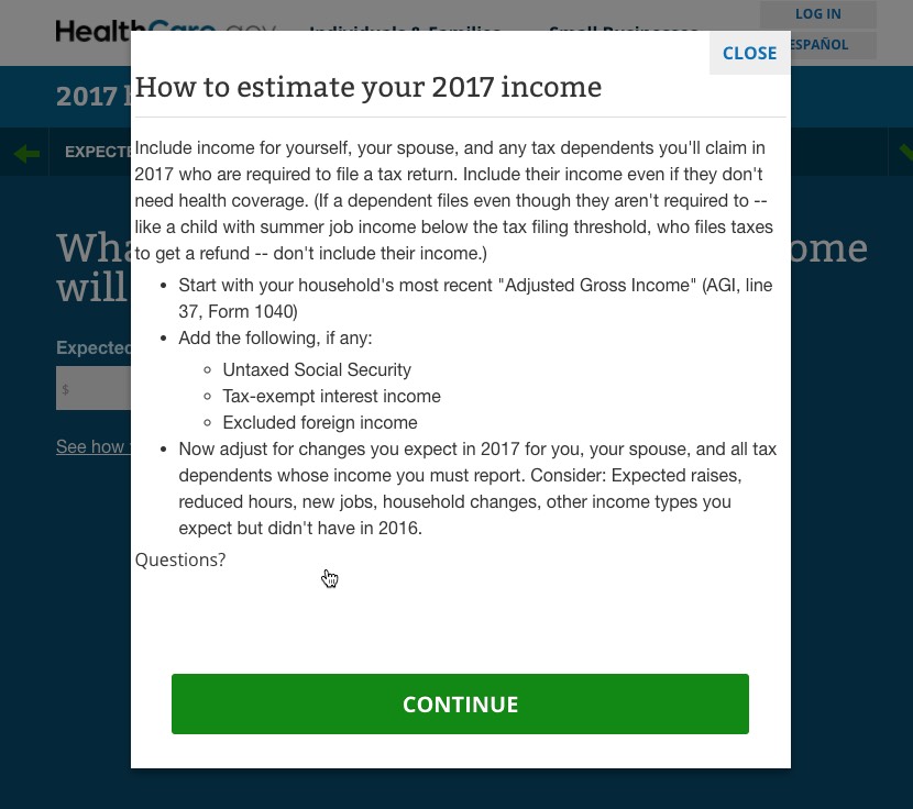
Like last year, there's a pop-up helper which lets you know how to estimate your income:
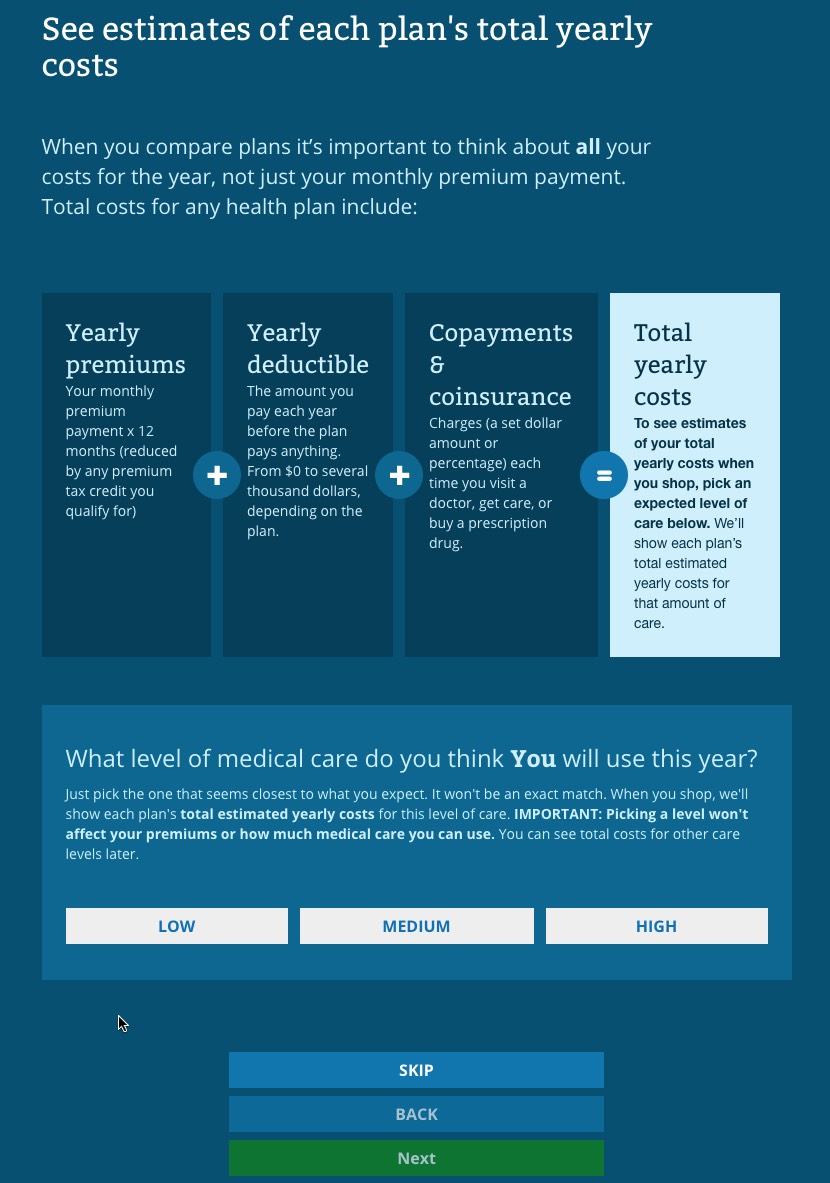
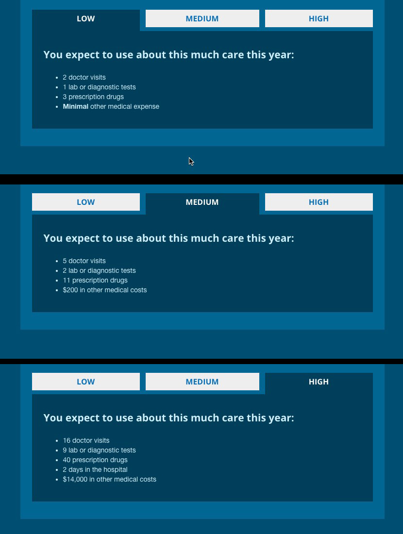
Also like last year, HC.gov has a handy "total cost estimator" which gives an idea of your out of pocket costs depending on low, medium and high levels of use throughout the year...but they've made it more obvious how this works:
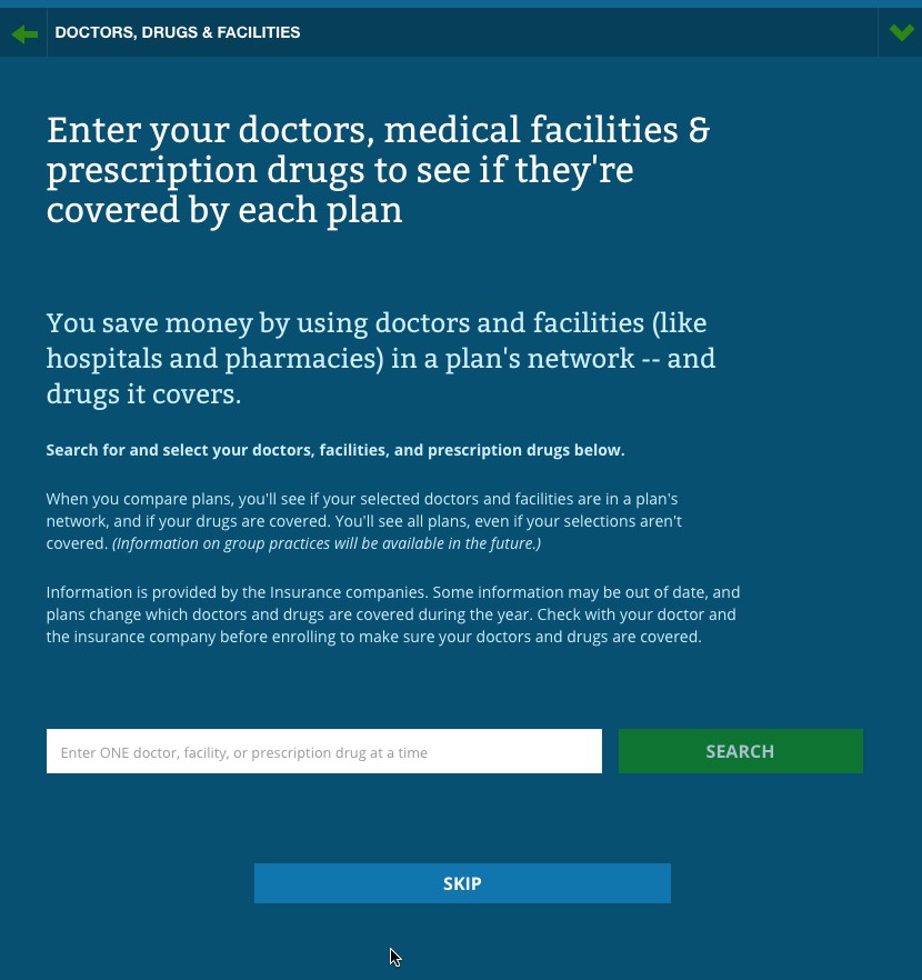
They'e also revamped the interface for the "In Network Tool" which checks to make sure that your preferred doctors, hospitals and drugs are included in the policy you choose or not:
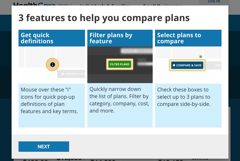
After you review your data, it's on to the actual plan options...but they've also changed this interface somewhat, with an automatic pop-up helper to start you off:
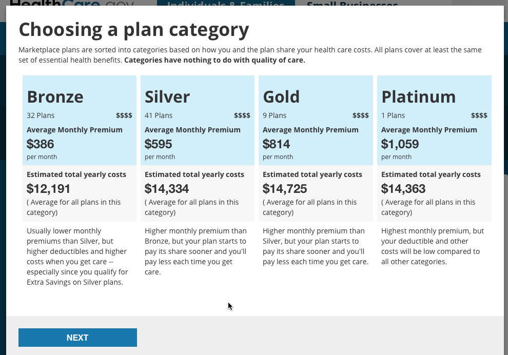
They've also added a new pop-up which lists the average premium and total costs for all plans by each metal level as a guide:
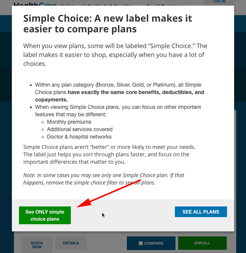
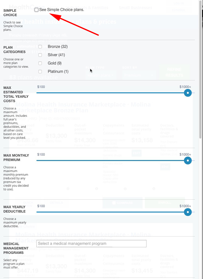
There's also the brand-new Simple Choice option, which lets you strip away all the clutter and view just the "standardized" plans available in your area:
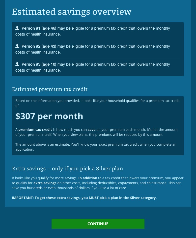
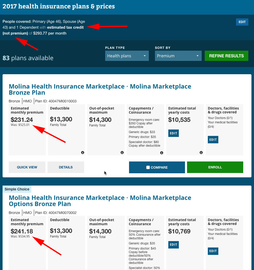
Finally, you're onto the actual plans themselves...and to HC.gov's credit, they've finally learned the importance of stressing the SUBSIDIZED price, NOT the UNSUBSIDIZED price, something which I've been pushing them to do for 2 years now:
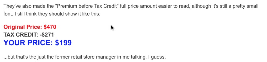
They actually went one step further this year, making the final price even more prominent while shrinking the unsubsidized price down to a tiny font; good for them:
Notice that the filtering system is also different. Last year the formatting changed depending on whether you were on a desktop/laptop system or a tablet/smartphone, but this year they've just gone with the mobile verion across the board, which is fine with me:
They've also made some changes/streamlined the way things like "plan details" and so forth work, but I think you get the idea.
Will all of these improvements lead to increased enrollment, less frustration and fewer upset enrollees? I have no idea, but they're all steps in the right direction.
Advertisement
