

Massachusetts: 175.6K *effectuated* enrollees & a whole mess of other data
Thu, 09/10/2015 - 1:33pm
The Massachusetts Health Connector just held their monthly board meeting this morning, and have released the August dashboard report with a whole mess of demographic data for Baystate-obsessed nerds to revel in.
I've pasted screen shots of every page of the report below, but here's the main takeaways:
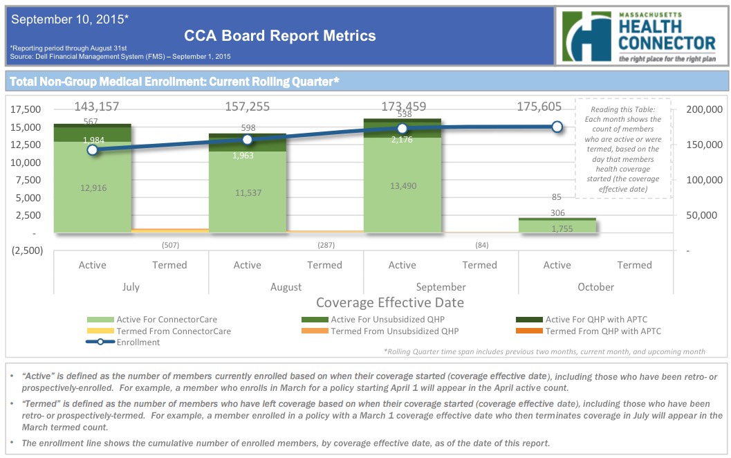
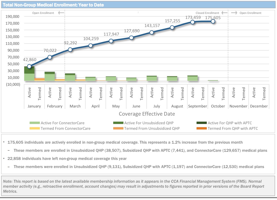
- Effectuated QHPs have reached 175,605 enrollees...a whopping 35,065 higher (25%) than at the end of Open Enrollment.
While the national effectuation number is 2.3% lower or so today than it was in March (9.95 million vs. 10.19 million), in Massachusetts it's 42% higher. There's two main reasons for this, both connected to "ConnectorCare", which is unique to Massachusetts. ConnectorCare consists of the same low-end Qualified Health Plans that anyone can purchase (ie, they're still counted as QHPs in the national tally), except that in addition to the federal Advanced Premium Tax Credits (APTC), enrollees in ConnectorCare also receive additional state-based financial assistance, making them even more attractive to enrollees. In addition, however, unlike "normal" APTC or Full Price QHPs, which are limited to the official open enrollment period for most people, ConnectorCare enrollment, like Medicaid/CHIP, is open year round. That makes a dramatic difference, as you can see below; the vast bulk of the net QHP enrollment increase since March is thanks to ConnectorCare additions.
- In addition, MA is the only state I know of which actively reports their attrition numbers--that is, so far this year they've had just 16,874 people drop their QHP policies, meaning a total of 192,479 people have selected a plan and paid at least their first monthly premium.
- Assuming a 90% payment rate (confirmed for Massachusetts back in April), this also suggests that the cumulative QHP selection total should be roughly 213,000 people to date, which is only significant to me and The Graph.
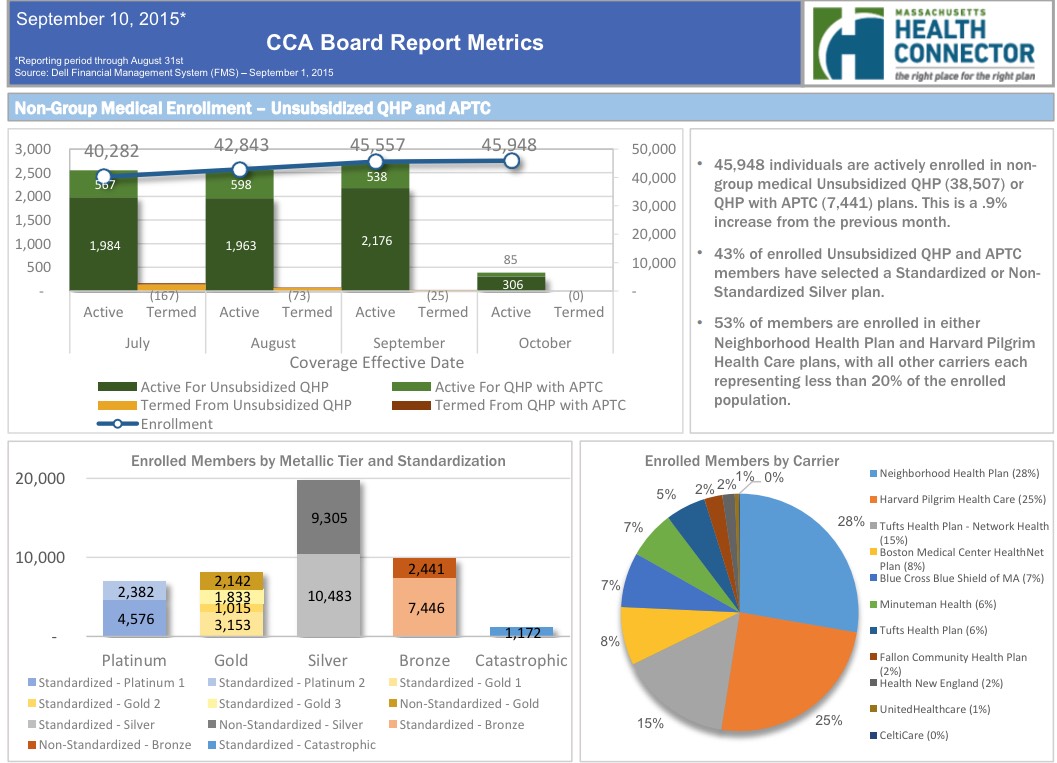
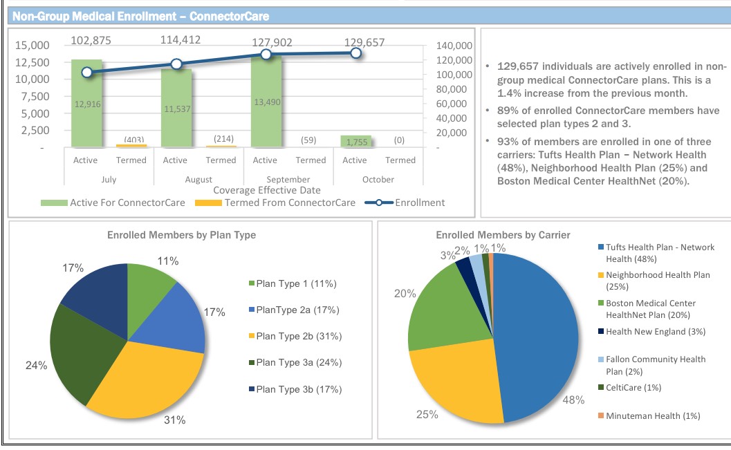
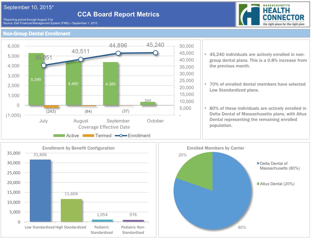
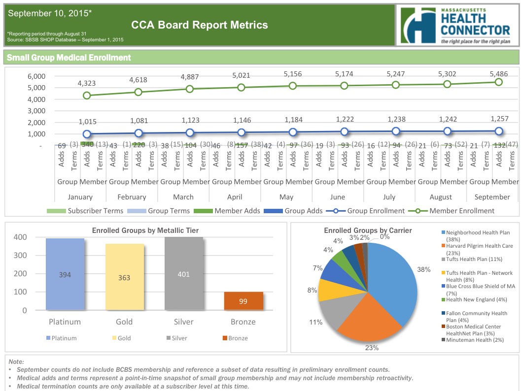
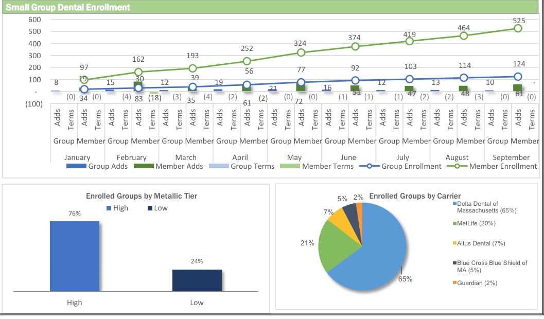
But wait, there's more! Look below and you'll see a whole mess of pie charts, bar charts and line charts, breaking out everything from Metal Level selections and Market Share by Provider to SHOP enrollments (5,486 lives covered as of September 1st) and even Dental Plans!
Data nerds, go nuts!!
Advertisement
