Two examples of how charts can be misleading
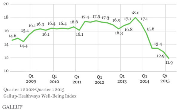
A couple of weeks ago I posted an entry about the latest quarterly Gallup poll results, which show that the uninsured rate among U.S. adults has continued to drop, and stood at just 11.9% as of the end of March.
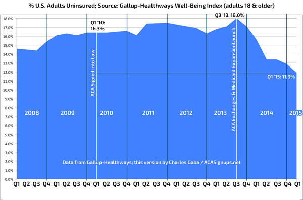
However, I also noted that the graph included by Gallup makes the drop look more dramatic than it really is, by not including the entire picture. I whipped up my own version which starts at 0% to give a more accurate representation; here they are again:


As you can see, the drop since Q3 2013 is quite striking, just not nearly as impressive as Gallup's own graph makes it look.
Tonight I've discovered an even better example of this...in an article which is not only quite fairly written, but in a section which is actually quite positive about how Obamacare is doing.
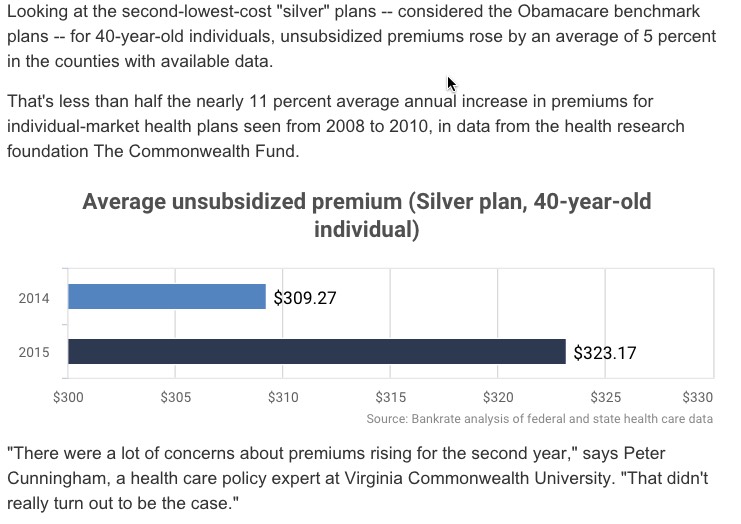
This overview of the state of the ACA 5 years out from BankRate is quite reasonable overall, highlighting both the plusses and minuses to date...but there's one particular bar graph which caught my eye. I've included the surrounding text so you can see that the writer is trying to make the point that premium rates didn't skyrocket last year...and in fact, they only increased at around half the rate that similar policy premiums had been spiking before the ACA exchange policies kicked into place:

Yikes!! If you look carefully, you'll see that, as Mr. Kahn states quite clearly right above the graph, Silver plan premiums (without subsidies) only went up about 5% (less, in fact; it appears to be just 4.49%).
HOWEVER, if you just give the visual a quick glance, it makes it look as though Obamacare caused these premiums to skyrocket! The 2015 bar is over twice as long as the 2014 one, making it appear that premiums more than doubled!
Here's what this graph should look like instead:

Again, I'm not accusing Mr. Kahn of anything here; his assessment of the ACA was fairly accurate overall, and he deserves kudos for pointing out this particular data point. I just wish the accompanying graph made it more obvious just how small the rate increases really were this year.


