

More fun with bar charts: Which states are likely to hit their targets or not?
Wed, 02/04/2015 - 9:11pm
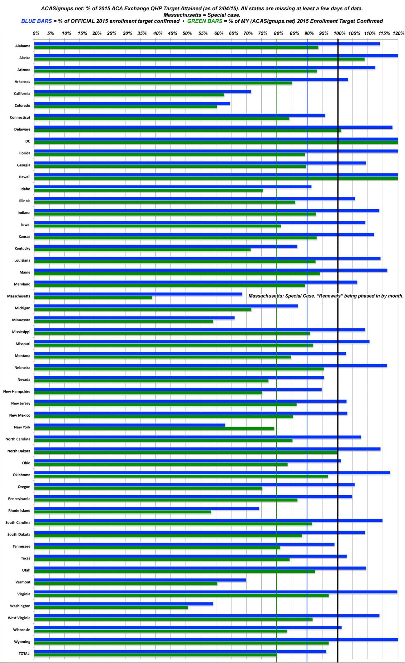
I've slightly modified the State-Level Goals graph, with color-coded lines at 80% and 90% of the target numbers. As always, the blue lines represent the percent of the official HHS/State Exchange target achieved; the green lines represent the percent of my target achieved. In every state (except New York), the green line is shorter because my target is higher than the HHS/Exchange goal.
Important: The other day I lowered my personal targets for 9 states and raised them for 26 others. However, I'm not changing these on my actual spreadsheet or any of my graphs; I'm curious to see how far off my original targets end up being.
Here's how to read this graph:
- Any state where the blue line has already hit at least 90% by now is likely to reach the HHS/Exchange target
(36 states have already hit 100%+; another 5 are above 90%)
- Any state where the green line has already hit at least 80% by now is likely to reach my (original) target
(5 states already have hit 100%+; another 33 are above 80%)
For example, Connecticut is basically guaranteed to hit their official target (100K even), and is also very likely to hit my target for them (114K).
Any blue line below 70% is almost certain not to reach the HHS/Exchange target, and any green line below 60% is pretty much guaranteed not to reach mine. Basically, CA, CO, MN, RI, VT and WA are doing the worst at this stage relative to where they were hoping to be, although CA has an ace in the hole: A good 480K people who have been determined eligible but haven't actually selected a plan yet; if they can get just about all of those folks to close the deal, they'll squeak by their 1.7M target.
There's also some special cases:
- Massachusetts: Not their fault. Simply put, my target of 300K was simply absurd to begin with; I completely misunderstood their "temporary coverage" situation. A more realistic target would be 200K, but they'd still only be at 58% of that. However, MA is also "unleashing" their "temp coverage" enrollees in stages, so it's possible that their final surge will be even more dramatic than the other states (shrug).
- New York: The only state where the official target is higher than mine. They think they'll enroll over 90% more this year than last. I think that's unrealistic (especially when you subtract out the 60K or so "Child Health Plus" enrollees who they keep lumping in with their enrollment reports).
- Rhode Island: Actually doing a bit better than it appears, because they're purging unpaid enrollees from their total numbers. Since this graph is for plan selections whether they're paid or not, there's a built-in 12% disadvantage for RI. However, when you take that into account, they're still coming up somewhat short.
- Vermont: May be a case of the QHP-eligible pool simply being much smaller than originally thought. VT's target was 38K, mine is 44K...but they may not have even had 38K eligible to begin with!
As for Colorado, Minnesota and Washington State, they're just lagging, really. Hopefully they'll all kick into overdrive with their end games.
Advertisement
