

The Graph, Updated w/one more color-coded section...
Thu, 12/25/2014 - 10:58am
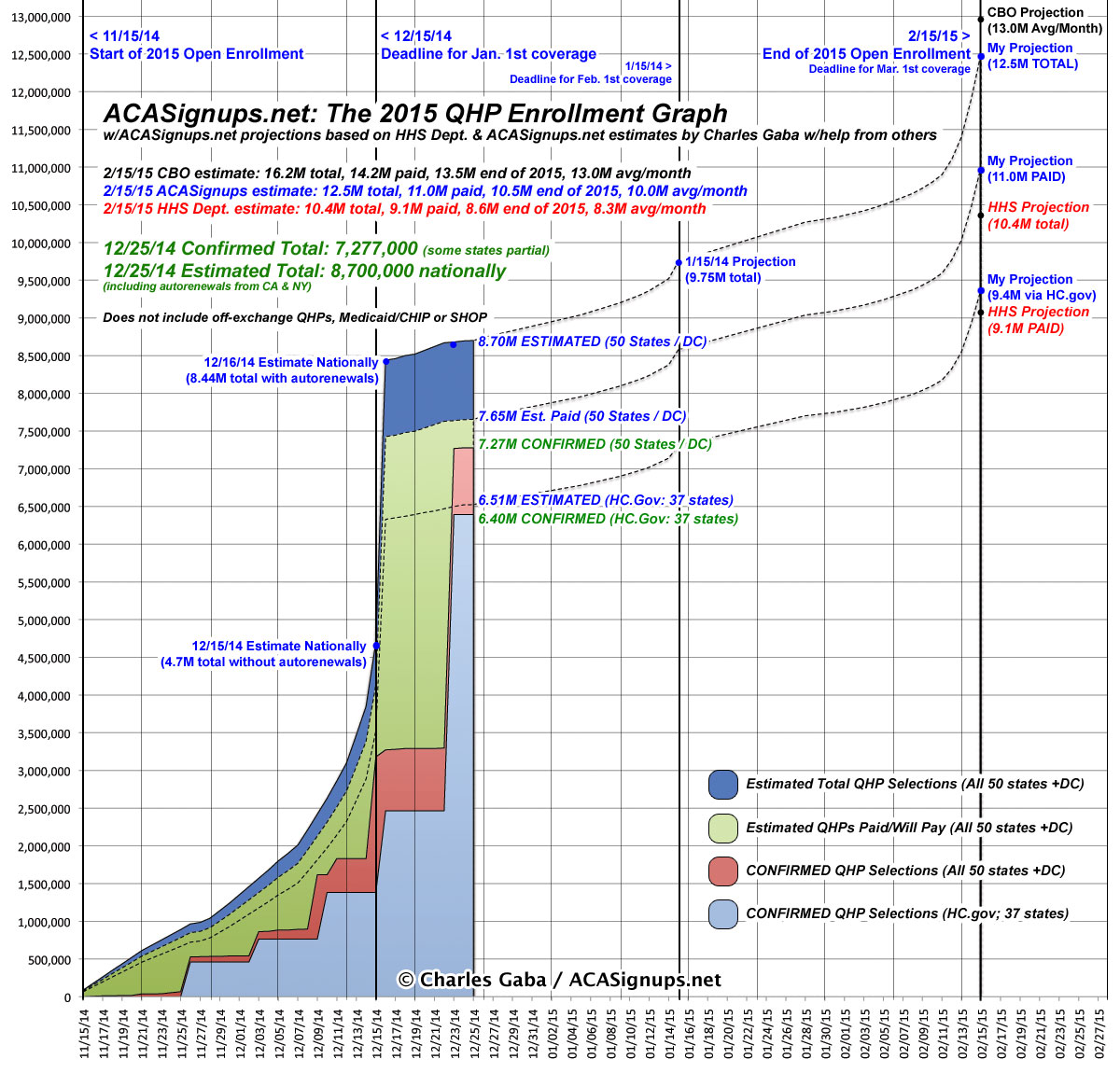
Merry Christmas! If you check out The Graph today, you'll note that today's update, in addition to adding yesterday (12/24), of course, also features a 4th color-coded section labelled "Confirmed via Healthcare.Gov".
I thought about whether to add this or not for some time. One of the complaints about the 2014 Graph was that while it was comprehensive, that also meant it was far too confusing for many people, with up to 8 different colored sections & labels all over the place. For 2015, I overhauled the format by a) separating out Medicaid/CHIP onto their own Graph and b) getting rid of off-exchange and SHOP enrollments entirely (at least until I have decent numbers for them). This left just 3 main data points: Total Estimated QHP selections, Total Estimated Paid QHPs and Total Confirmed QHP selections. I also added a dashed-line projection for how many of these I estimated were from the federal exchange (HC.gov) out of the total nationally.
The problem with this is that now that HHS has finally started releasing weekly "snapshot" reports, countless media outlets keep forgetting that the number reported by HHS (6.4 million as of last Friday) only includes HC.gov, not the 14 additional state-run exchanges which comprise roughly 25% of the total selections. So, after much thought, I've added this as a 4th color-coded section (in turquoise at the bottom). I hope this will make it more obvious what each of the other sections represent, since the "6.4 million" number reported by HHS the other day is spelled out.
Advertisement
