

Presenting The QHP Graph, Reborn!!
Mon, 11/17/2014 - 11:10pm
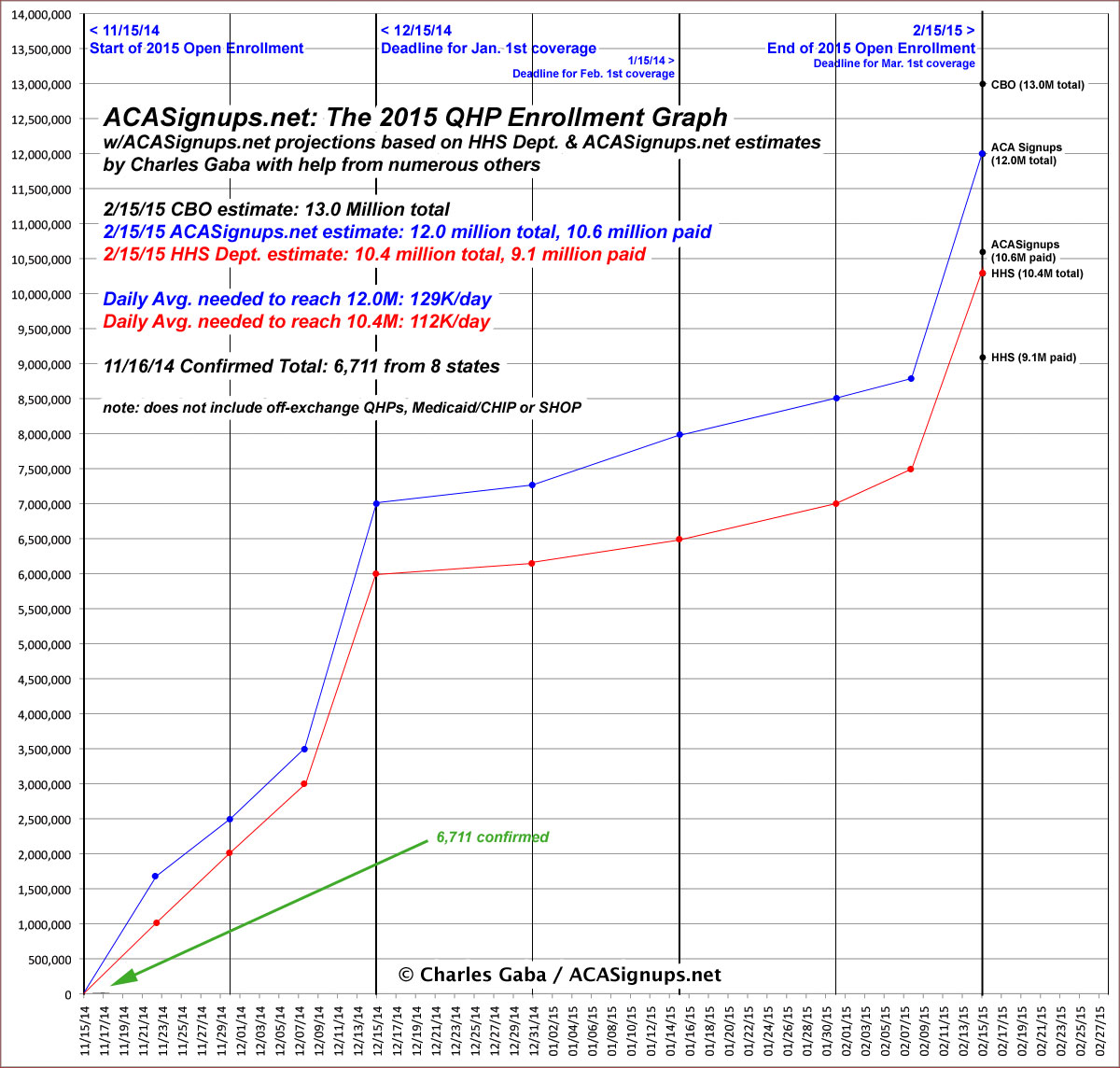
Yes, I realize it's kind of stupid to post The Graph when there's barely anything to Graph yet, but I wanted to set the stage for 2015 #OE2. As you can see, I'm doing it in a much cleaner, more organized way this time--the timeline includes the entire open enrollment period (which is less awkward to do this year since it's only 3 months instead of 6).
I've also overlaid projection lines to show roughly how I expect the QHP enrollment pattern to go--an initial "mini-surge", then a massive spike as the December 15th deadline approaches (anyone who's already enrolled who auto-renews or manually switches to a different policy will be part of this, since they don't want to have a coverage gap in January). I'm assuming roughly 7 million QHPs by 12/15 (or possibly a few days later...it's my understanding that some state exchanges are using 12/18 as the cut-off for January 1st?).
Then things should level out a bit from mid-December until mid-January because all the autorenewals will be accounted for (not to mention the holiday season). I'm figuring perhaps 1 million more; these folks will have coverage starting on February 1st.
Finally, like last spring, there should be a similar lull followed by a second huge spike as people scramble to get covered before the February 15th deadline, for coverage starting March 1st. If I'm right about another 4 million or so during this period, that would hit my total estimate of roughly 12 million exchange-based QHP enrollees by 2/15/15.
On the other hand, assuming that the HHS Dept. has it right and the grand total ends up being a more modest 10.4 million or so (of which 9.1 million would eventually pay up), I'd still expect the pattern to be pretty much the same, just with lower totals at each point.
I'm also assuming that that unlike last year, there probably won't be a 2-week "extension period" at the end of February, and that the 12/15 (or 12/18) deadline for January coverage won't be pushed out to Christmas (or even New Year's Eve, as some states ended up doing). Obviously if either of these do happen, the flow will look somewhat different, but I'll deal with that at the time.
Anyway, I've added a (hopefully very temporary) green arrow to point out the barely-perceptible line at the very bottom-left corner of the graph, representing the 6,711 enrollments that I've been able to document so far. Needless to say, this should start to get much larger very quickly in the days ahead...
Advertisement
