

Benchmarks: To reach 12M total in #OE2, HC.gov needs 97K/day
Sat, 11/15/2014 - 1:48pm
During the 2014 Open Enrollment Period, the federal exchange at Healthcare.Gov enrolled 68% of the 8.02 million total through April 19th. However, it didn't start out that way; 68% was the cumulative percentage. Due to the severe technical problems at HC.gov (along with some of the state exchanges), during the first month, the federal site only made up 25% of the total. As technical problems were worked out, this ratio shifted dramatically as follows:
- October: 25% Federal, 75% State-based
- November: 43% Federal, 57% State-based
- December: 59% Federal, 41% State-based
- January: 65% Federal, 35% State-based
- February: 72% Federal, 35% State-based
- March/April: 75% Federal, 25% State-based
As you can see, once HC.gov worked the bugs out, it took off bigtime, and was enrolling 75% of the total by the time the Big Surge came at the end.
So, what does this tell us about the 2015 #OE2 period? Well, it's possible that the ratio will be different--after all, the state exchanges had already picked the low-hanging fruit, so to speak, whereas this year all of the exchanges should be starting out at around the same point (assuming they're all working reasonably well now, that is). I'd imagine that it'll probably be something like a 70/30 split fairly consistently between the federal & state-run exchanges.
However, there's another factor: Two of the state-run exchanges from last year (Nevada & Oregon) have been moved to the Federal exchange this time, while one (Idaho) has split off on its own. Oregon and Nevada only enrolled roughly 100,000 in QHPs combined as of 4/19 (due mainly to their technical problems which led to abandoning their own platforms, of course), while Idaho had enrolled 76,000. Since Oregon & Nevada will likely do considerably better on HC.gov this year, it sounds like at least twice as many potential enrollees will be moving from state > fed than from fed > state, which should bump the ratio back up to the same 75/25 split which we ended OE1 with.
Assuming that's the case, how many people will HC.gov specifically need to enroll in order to hit my personal 12.0 million QHP total by 2/15/15? Easy, around 9 million.
There's only 93 days total this year (11/15/14 - 2/15/15), so that's an average of about 97,000 per day for Healthcare.Gov, and another 33,000 per day for the 14 state-run exchanges collectively, for a grand total of 130,000 per day nationally.
I mention all of the above because of this tweet from Jeffrey Young of the Huffington Post:
HealthCare.Gov processed 23,000 completed applications during the first eight hours, @SecBurwell says. pic.twitter.com/COAJpKFftV
— Jeffrey Young (@JeffYoung) November 15, 2014
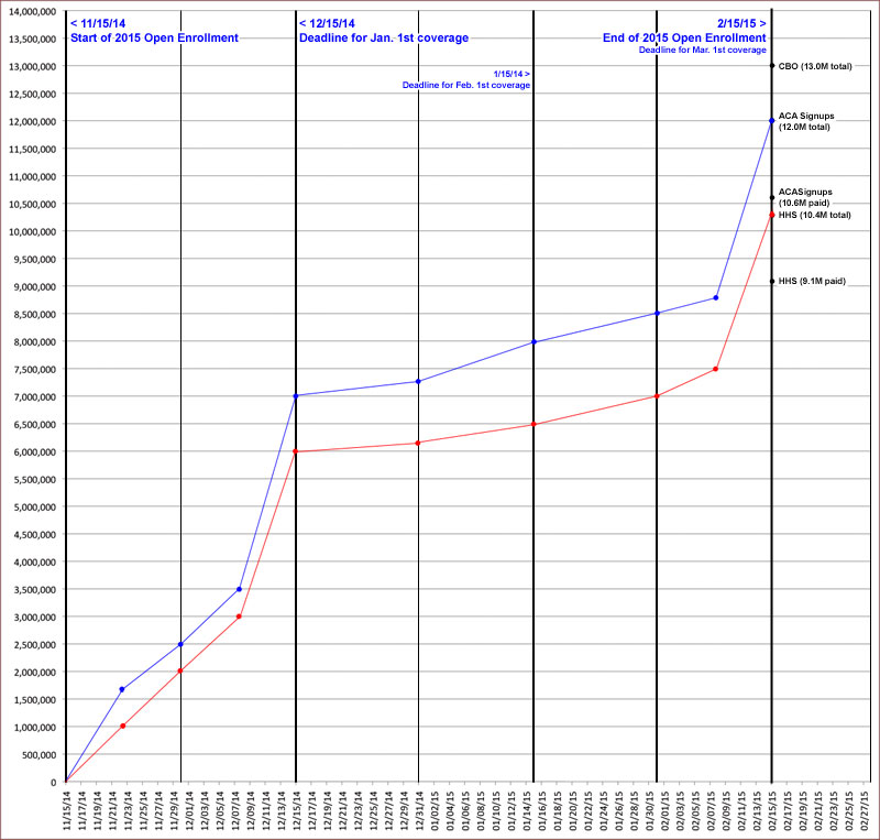
Of course, it's absurd to try and extrapolate from the first 8 hours of the first day; there will be huge spikes and large drop-offs, not to mention likely millions of people who simply allow their policies to be quietly renewed automatically (regardless of whether this is a good idea for them or not, it's gonna happen for many). There should be a huge spike around December 10 - 15 (as people make sure they're enrolled in time for January 1st coverage), then a drop-off for the holidays, then another smaller spike from January 10 - 15, and then another large spike from February 10 - 15.
My guess (assuming my 12M QHP estimate proves accurate) is it will break out something like the following:
- 11/15/14 - 12/15/14: Appx. 7 million
- 12/16/14 - 01/15/15: Appx. 1 million
- 01/16/15 - 02/15/15: Appx. 4 million
Of course, the official HHS projection is somwhat lower than mine; they're assuming about 9.1 million paid enrollments out of 10.4 million total. Assuming the same 75/25 ratio holds, that would mean 7.8 million on the federal exchange, or 84,000/day at HC.gov + another 28,000/day on the state exchanges, for 112,000/day total.
Still, at least the highlighted numbers above at least give some benchmarks to keep an eye on.
UPDATED: For the heck of it, I've decided to plot a crude projection of what I expect the enrollment pattern to look like, based on either a lower-end scenario (HHS's 10.3M total) or a higher-end scenario (my own 12M total). Obviously the CBO's 13M pattern would be basically like mine but with all of the plot points moved a bit higher:
Advertisement
