The data below comes from the GitHub data repositories of Johns Hopkins University, except for Utah, which come from the GitHub data of the New York Times due to JHU not breaking the state out by county but by "region" for some reason.
I've made some important changes starting this week:
First: Until now, I've been using the 2016 Trump/Clinton election results for partisan lean for each county. Now that the dust has (mostly) settled on the 2020 election, I've updated this to the Biden/Trump results for 2020. There's a few states where I don't have county-level data for 2020 yet (AK, CT, MA, NH, NY, RI & VT). In most of these states it's only broken out by city- or legislative district-level so far; in New York, they still haven't reported a large chunk of the vote itself yet. For those 7 states I still have them categorized by the 2016 results, but will update these with 2020 status in the future.
Second: I've also added columns listing the actual Biden/Trump vote percentage for each county to give a feel for how partisan it is. Again, I'm defining "Swing District" as any county where the difference is less than 6.0%. There's 188 swing districts (out of over 3,100 total), with around 35 million Americans out of 331 million total, or roughly 10.6% of the U.S. population.
With these updates in mind, here's the top 100 counties ranked by per capita COVID-19 cases as of Saturday, November 28th (click image for high-res version). Blue = Joe Biden won by more than 6 points; Orange = Donald Trumpwon by more than 6 points; Yellow = Swing District
UPDATE: It looks like the 2022 NBPP will be open for Public Commentstarting on December 4th and ending on December 30th at 5pm. This is obviously 4 days shorter than the typical 30-day minimum, and it includes Christmas Eve & Christmas Day as well. I've been informed that this is technically legal as allowing a minimum of 30 days is a guideline, not requirement...but it sure wouldn't look good if the rule is brought in front of a judge.
The Affordable Care Act includes a long list of codified instructions about what's required under the law. However, like any major piece of legislation, many of the specific details are left up to the agency responsible for implementing the law.
Way back in October 2013, I launched the ACA Signups project as a light, nerdy hobby thing which was only supposed to last around six months, through the end of the first ACA Open Enrollment Period (March 31, 2014). Instead...well, let's just say that it's more than seven years later and I'm still doing this.
The reality is that The Graph itself doesn't serve a whole lot of useful function anymore. The enrollment patterns were erratic the first couple of years but have since settled into a pretty predictable...if not downright boring pattern for both the federal and state exchanges. The main reason I keep doing it each year is mostly out of tradition these days; after all, without The Graph, there wouldn't be an ACA Signups and I wouldn't have become a healthcare policy wonk in the first place.
In Week Three of the 2021 Open Enrollment period, 758,421 people selected plans using the HealthCare.gov platform. As in past years, enrollment weeks are measured Sunday through Saturday.
Every week during Open Enrollment, the Centers for Medicare & Medicaid Services (CMS) will release enrollment snapshots for the HealthCare.gov platform, which is used by the Federally-facilitated Exchange and some State-based Exchanges. These snapshots provide point-in-time estimates of weekly plan selections, call center activity, and visits to HealthCare.gov or CuidadoDeSalud.gov.
The final number of plan selections associated with enrollment activity during a reporting period may change due to plan modifications or cancellations. In addition, the weekly snapshot only reports new plan selections and active plan renewals and does not report the number of consumers who have paid premiums to effectuate their enrollment.
I was doing this earlier in the summer but stopped updating it in August; I've started over with a fresh spreadsheet and have expanded it to include every U.S. territory, including not just DC & Puerto Rico but also American Samoa, Guam, the U.S. Virgin Islands and even the Northern Mariana Islands.
I've done my best to label every state/territory, which obviously isn't easy to do for most of them given how tangled it gets in the middle. The most obvious point is that while New York and New Jersey are still far above every other state, other states are quickly catching up...and the trajectories of both North & South Dakota are incredibly disturbing in particular.
ST. PAUL, Minn.—The Minnesota Insulin Safety Net Program, launched earlier this year, provides a pathway for Minnesotans in urgent need of insulin (less than a 7-day supply on hand) to access the life-saving drug through their pharmacy. The program—implemented by MNsure, the state's health insurance marketplace, and the Minnesota Board of Pharmacy—was created to help Minnesotans facing difficulty affording their insulin.
The Insulin Safety Net Program is made up of two parts: 1) The urgent need program for eligible Minnesotans to receive a once-per-year 30-day supply of insulin immediately at their pharmacy for no more than a $35 copay; and 2) The continuing need program for eligible Minnesotans to receive up to a year supply of insulin for no more than $50 per 90-day refill.
Interested individuals should visit MNinsulin.org to see if they qualify and learn how to apply.
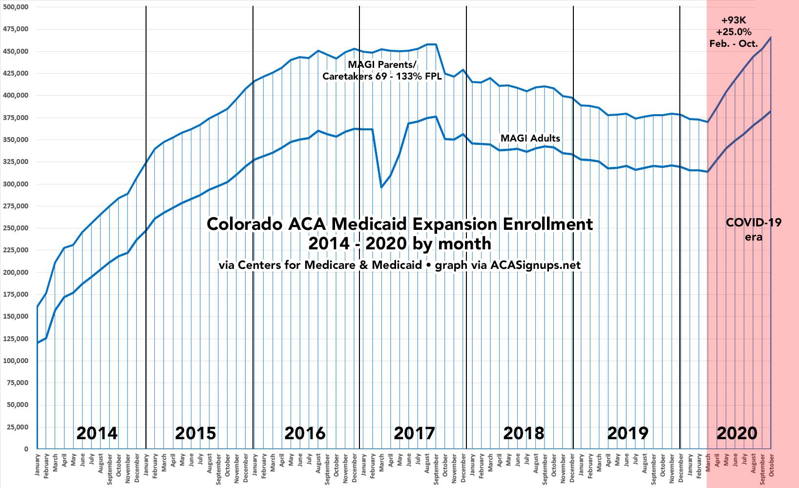
Coloradans Are Getting Covered During the Pandemic
DENVER – Nearly 30,500 Coloradans signed up for a health insurance plan through Connect for Health Colorado’s Marketplace between Nov. 1 and Nov. 20. Through the first three weeks of the Open Enrollment period, approximately 73 percent of applicants qualify for financial help to help pay their monthly premiums.
Unlike many of the state-based exchanges, the Colorado ACA exchange is not "front-loading" their autorenewals of existing enrollees. They address this further down the press release:
“Unfortunately, the pandemic is continuing to grow and affect our communities. That’s why it’s more important than ever that Coloradans have access to affordable and quality health coverage.” said Chief Executive Officer Kevin Patterson. “I urge Coloradans to connect with us online, over the phone, or by making a virtual appointment with a certified Broker or Assister. We are here to make your enrollment as easy as possible.”
I was doing this earlier in the summer but stopped updating it in August; I've started over with a fresh spreadsheet and have expanded it to include every U.S. territory, including not just DC & Puerto Rico but also American Samoa, Guam, the U.S. Virgin Islands and even the Northern Mariana Islands.
I've done my best to label every state/territory, which obviously isn't easy to do for most of them given how tangled it gets in the middle. The most obvious point is that New York and New Jersey, which towered over every other state last spring, are now utterly dwarfed by North & South Dakota, which are skyrocketing.
The data below comes from the GitHub data repositories of Johns Hopkins University, except for Utah, which come from the GitHub data of the New York Times due to JHU not breaking the state out by county but by "region" for some reason.
Note that a few weeks ago I finally went through and separated out swing districts. I'm defining these as any county which where the difference between Donald Trump and Hillary Clinton was less than 6 percentage points either way in 2016. There's a total of 198 Swing Counties using this criteria (out of over 3,200 total), containing around 38.5 million Americans out of over 330 million nationally, or roughly 11.6% of the U.S. population.
With these updates in mind, here's the top 100 counties ranked by per capita COVID-19 cases as of Saturday, November 21st (click image for high-res version). Blue = Hillary Clinton won by more than 6 points; Orange = Donald Trump won by more than 6 points; Yellow = Swing District
Over at Xpostfactoid, my colleague Andrew Sprung has been doing a great job of tracking ACA Medicaid expansion enrollment growth since the onset of the COVID-19 pandemic this past February/March at the macro (national) level, by looking at around a dozen states which have monthly reports available. He puts the overall enrollment growth rate at 23.6% from February thorugh October 2020.