NATIONAL COALITION LAUNCHES “GET COVERED 2021” URGING AMERICA TO MASK UP AND GET INSURED – FOCUS ON COVID AND COVERAGE FOR 16 MILLION AMERICANS ELIGIBLE FOR FINANCIAL HELP NOW
“Get Covered” is a call to wear a mask to prevent the spread of COVID as well as a public statement that you want your family and friends to get health insurance.
COVID underscores why insurance matters - but not just because of the pandemic - coverage can help people stay healthy and provide a pathway to care for diseases like cancer, diabetes, and many others that impact people’s lives.
Get Covered 2021 will focus on getting the estimated 16 million uninsured people across America eligible for financial help – through their Affordable Care Act marketplace, or free coverage through Medicaid – insurance coverage now.
The Get Covered 2021 coalition announced that December 10th will be Get Covered America Day -- a day of action where everyone will be encouraged to keep wearing their mask and post a picture of themselves on social media, including a personal message about how friends, family and neighbors can get financial help for insurance now, sharing the website GetCovered2021.org and using the hashtag #GetCovered2021.
Over at Xpostfactoid, my colleague Andrew Sprung has been doing a great job of tracking ACA Medicaid expansion enrollment growth since the onset of the COVID-19 pandemic this past February/March at the macro (national) level, by looking at around a dozen states which have monthly reports available. He puts the overall enrollment growth rate at 23.6% from February thorugh October 2020.
I've decided to take a closer look at individual states. The graph below shows how many Arizonans have been actively enrolled their Medicaid expansion program (awkward named the Arizona Health Care Cost Containment System, or AHCCCS):
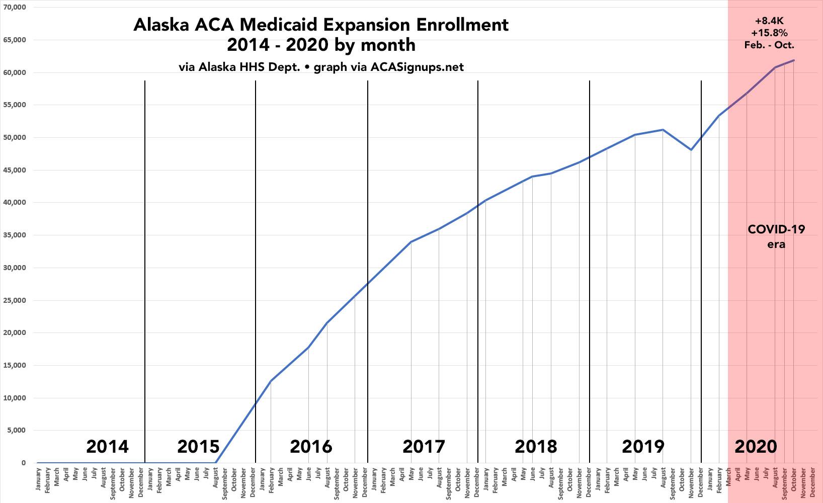
Over at Xpostfactoid, my colleague Andrew Sprung has been doing a great job of tracking ACA Medicaid expansion enrollment growth since the onset of the COVID-19 pandemic this past February/March at the macro (national) level, by looking at around a dozen states which have monthly reports available. He puts the overall enrollment growth rate at 23.6% from February thorugh October 2020.
Instead of replicating his work, I decided to take a closer look at individual states. The graph below shows how many Alaskans have been actively enrolled in our Medicaid expansion program (Healthy Michigan) every month since it was launched in September 2015:
Over at Xpostfactoid, my colleague Andrew Sprung has been doing a great job of tracking ACA Medicaid expansion enrollment growth since the onset of the COVID-19 pandemic this past February/March at the macro (national) level, by looking at around a dozen states which have monthly reports available. He puts the overall enrollment growth rate at 23.6% from February thorugh October 2020.
Instead of replicating his work, I decided to take a closer look at individual states, starting with my own: Michigan. The graph below shows how many Michiganders have been actively enrolled in our Medicaid expansion program (Healthy Michigan) every month since it was launched in April 2014 (we had a 3-month delay in the program due to the state legislature refusing to implement the new law with immediate effect; I have no idea why):
The data below comes from the GitHub data repositories of Johns Hopkins University, except for Utah, which come from the GitHub data of the New York Times due to JHU not breaking the state out by county but by "region" for some reason.
Note that a few weeks ago I finally went through and separated out swing districts. I'm defining these as any county which where the difference between Donald Trump and Hillary Clinton was less than 6 percentage points either way in 2016. There's a total of 198 Swing Counties using this criteria (out of over 3,200 total), containing around 38.5 million Americans out of over 330 million nationally, or roughly 11.6% of the U.S. population.
With these updates in mind, here's the top 100 counties ranked by per capita COVID-19 cases as of Saturday, November 14th (click image for high-res version). Blue = Hillary Clinton won by more than 6 points; Orange = Donald Trump won by more than 6 points; Yellow = Swing District
The data below comes from the GitHub data repositories of Johns Hopkins University, except for Utah, which come from the GitHub data of the New York Times due to JHU not breaking the state out by county but by "region" for some reason.
Note that a few weeks ago I finally went through and separated out swing districts. I'm defining these as any county which where the difference between Donald Trump and Hillary Clinton was less than 6 percentage points either way in 2016. There's a total of 198 Swing Counties using this criteria (out of over 3,200 total), containing around 38.5 million Americans out of over 330 million nationally, or roughly 11.6% of the U.S. population.
With these updates in mind, here's the top 100 counties ranked by per capita COVID-19 cases as of Saturday, November 7th (click image for high-res version). Blue = Hillary Clinton won by more than 6 points; Orange = Donald Trump won by more than 6 points; Yellow = Swing District
The data below comes from the GitHub data repositories of Johns Hopkins University, except for Utah, which come from the GitHub data of the New York Times due to JHU not breaking the state out by county but by "region" for some reason.
Note that a few weeks ago I finally went through and separated out swing districts. I'm defining these as any county which where the difference between Donald Trump and Hillary Clinton was less than 6 percentage points either way in 2016. There's a total of 198 Swing Counties using this criteria (out of over 3,200 total), containing around 38.5 million Americans out of over 330 million nationally, or roughly 11.6% of the U.S. population.
With these updates in mind, here's the top 100 counties ranked by per capita COVID-19 cases as of Saturday, October 31st (click image for high-res version). Blue = Hillary Clinton won by more than 6 points; Orange = Donald Trump won by more than 6 points; Yellow = Swing District
The data below comes from the GitHub data repositories of Johns Hopkins University, except for Utah, which come from the GitHub data of the New York Times due to JHU not breaking the state out by county but by "region" for some reason.
Note that a few weeks ago I finally went through and separated out swing districts. I'm defining these as any county which where the difference between Donald Trump and Hillary Clinton was less than 6 percentage points either way in 2016. There's a total of 198 Swing Counties using this criteria (out of over 3,200 total), containing around 38.5 million Americans out of over 330 million nationally, or roughly 11.6% of the U.S. population.
With these updates in mind, here's the top 100 counties ranked by per capita COVID-19 cases as of Saturday, October 24th (click image for high-res version). Blue = Hillary Clinton won by more than 6 points; Orange = Donald Trump won by more than 6 points; Yellow = Swing District
A month later, the RI DOI issued their approved 2021 rate decisions, and made some small tweaks to each. In fact, it looks like there was at least one revision in between, as the new press release lists slightly different numbers for the "preliminary" requests.
In any event, Rhode Island indy & sm. group enrollees will be looking at roughly 4.2% increases on the individual market and 2.6% increases for small group plans:
Last night, during the final Presidential debate of 2020, Joe Biden noted:
Biden: Take a look at what New York has done in terms of turning the curve down, in terms of the number of people dying. And I don’t look at this in terms of the way he does, blue states and red states. They’re all the United States. And look at the states that are having such a spike in the coronavirus. They’re the red states, they’re the states in the Midwest, they’re the states in the upper Midwest. That’s where the spike is occurring significantly. But they’re all Americans. They’re all Americans. And what we have to do is say, wear these masks, number one. Make sure we get the help that the businesses need. That money’s already been passed to do that. It’s been out there since the beginning of the summer, and nothing’s happened.
Of course Biden's entire point was that ALL the states are American states, and thus we shouldn't treat them differently depending on their political lean.