

CMS Effectuation Report, Part 4: Four Years of TOTAL ACA Enrollment in One Chart!
Thu, 07/05/2018 - 10:05pm
A few days ago, the Centers for Medicare & Medicaid released three important new reports on the 2018 Open Enrollment Period and trends in the individual market. There's a lot of data to go over, so I'm breaking my analysis into several smaller posts for easier readability.
Overview • Part One • Part Two • Part Three • Part Four
- February 2018 Effectuation snapshot report
- Subsidized/Unsubsidized Enrollment Trend Report
- Exchange Trends Report
Now we move onto the second report released by CMS this week: The "Subsidized/Unsubsidized Enrollment Trend Report". If you set aside the anti-ACA digs from the Trump Administration, there's some fascinating data to be found, including what they claim to be one of the Holy Grails of the ACA individual market: Supposedly accurate data on the number of off-exchange ACA-compliant enrollees across the first four years of the ACA exchanges! Yes, I know, it's exciting, heady stuff.
OK, first, their key findings (and again, these supposedly all include off-exchange ACA-compliant individual market enrollment along with on-exchange enrollees:
- Average monthly enrollment in individual market plans decreased by 10 percent between 2016 and 2017 at the same time premiums increased by 21 percent.
- Most of the decrease in enrollment between 2016 and 2017 occurred among people who did not receive APTC subsidies. Non-APTC enrollment declined by 20 percent, compared to a 3 percent decline in APTC subsidized enrollment.
No surprises here. If you raise premiums by 21%, then yeah, those who have to pay full price are gonna be more likely to drop their coverage.
- Since 2014, average monthly enrollment in the APTC subsidized portion of the market has diverged considerably from the non-APTC market. The APTC subsidized portion of the market was 61 percent larger than the non-APTC portion in 2017, up from 23 percent larger in 2014.
Again...not terribly surprising. Every year, as premiums increase, those who have to pay full price are a lot more likely to drop coverage than those who only receive subsidies to cover the bulk of the cost. This was true before the individual mandate was repealed and will only get worse now post-repeal.
- Reviewing state-level data shows that 10 states experienced declining individual market enrollment between 2015 and 2016. From 2016 to 2017, 44 states experienced declining enrollment.
- Declining enrollment between 2015 and 2016 was more widespread in the non-APTC portion of state markets. Over that period, 23 states experienced a decline in non-APTC enrollment, with 10 states experiencing double-digit percentage declines.
- The decline in the non-APTC portion of state markets grew larger and more widespread between 2016 and 2017. Non-APTC enrollment declined in 43 states, with six states losing over 40 percent of their non-APTC enrollment.
Well, again...not surprising, since 2017 saw a significant average premium increase. I'm sure the problem has gotten even worse this year (thanks to CSR payments being cut off last fall), and will be worse yet next year with the mandate having been repealed and #ShortAssPlans being unleashed everywhere.
The methodology of the report is interesting--for years, I've spent countless hours trying to hunt down the elusive off-exchange enrollment data with limited success. Sometimes I find it, but it's mixed in with grandfathered or transitional enrollees. Sometimes it's a vague estimate. Sometimes it's way outdated. Here's what the CMS report says about where they got their data:
The enrollment trends in this report cover individual health insurance market plans that participate in the PPACA federally operated risk adjustment program. These include individual health insurance market plans sold on and off Exchange, but exclude grandfathered plans, transitional plans, excepted benefit plans and student health insurance plans. The analysis excludes data on plans from Massachusetts and Vermont, because both states are considered to have merged their individual and small group markets for purposes of the risk adjustment program.
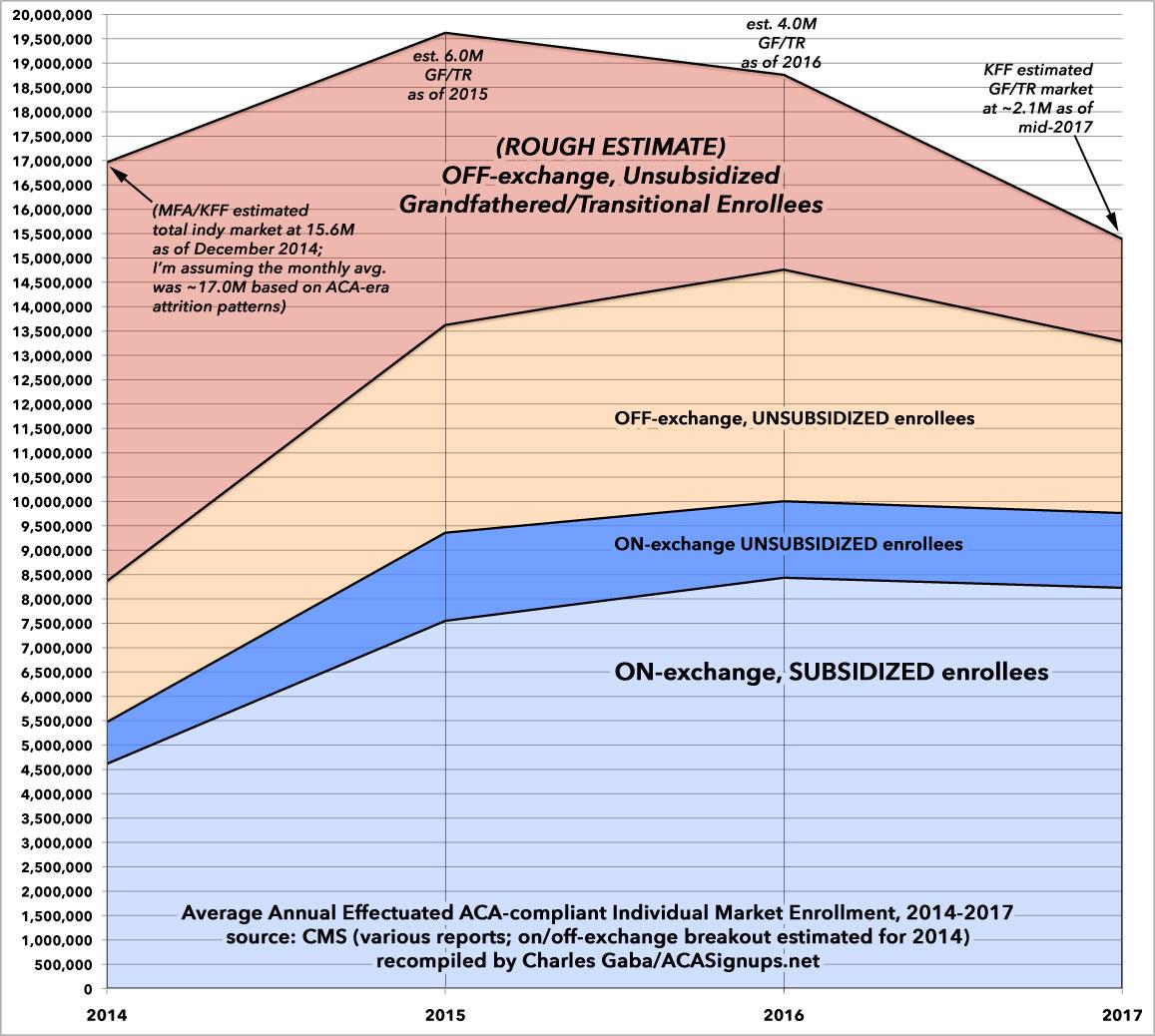
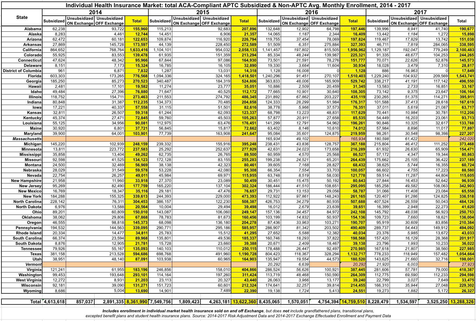
Arrrgh! Darn it...so close! I've taken the liberty of filling in some blanks and breaking the data out into the more colorful, comprehensive four-year graph below. I was even able to break out the unsubsidized enrollment numbers between on & off-exchange enrollees at the state level for 2016 & 2017. I was able to find some of the missing data for MA & VT in other CMS reports, such as this one from 2016. Unfortunately, I haven't been able to find off-exchange enrollment data for 2016 & 2017, or any hard monthly average data for MA/VT for 2014 & 2015, however.
The biggest unknown is the Grandfathered/Transitional section at the top. For 2014, I started with this post by the Kaiser Family Foundation (using Mark Farrah Associates data), which pegged the total individual market at around 15.6 million people as of December 2014. I then used ACA-era attrition trends to assume that the monthly average enrollment in 2014 was likely around 17.0 million (that is, the December enrollment total should be roughly 92% of the monthly average). That means roughly 8.6 million Grandfathered/Transitional enrollees on average in 2014. For 2017, I used Kaiser's rough estimate of around 2.1 million. For 2015 & 2016 I just eyeballed it, figuring GF/TR enrollments were likely around 6.0M in 2015 and 4.0M in 2016.
With all that said, here's what it looks like visually:
...and here's the spreadsheet (WARNING: IT'S BIG...click the image itself for a high-res version. Remember, these numbers are all the average per month for the given year:
Advertisement
