

Three sets of tables and maps tell the same story.
Wed, 03/08/2017 - 8:59am
Back in January, being a spreadsheet guy but not being a particularly good graphic artist, I put together a crude table which attempted to give a general idea of which groups of people the Affordable Care Act is, in general, working out for fairly well vs. which groups the ACA isn't working for, by income threshold. A couple of days ago, with details about the GOP's "replacement plan" popping up all over, I posted a similar version of the table which tried to compare the winners/losers between the two plans, and the contrast was remarkable: Nearly a complete reversal.
Last night, with the GOP's plan finally, officially revealed, I made some minor adjustments so that the two tables were more of an apples-to-apples and came up with the following:
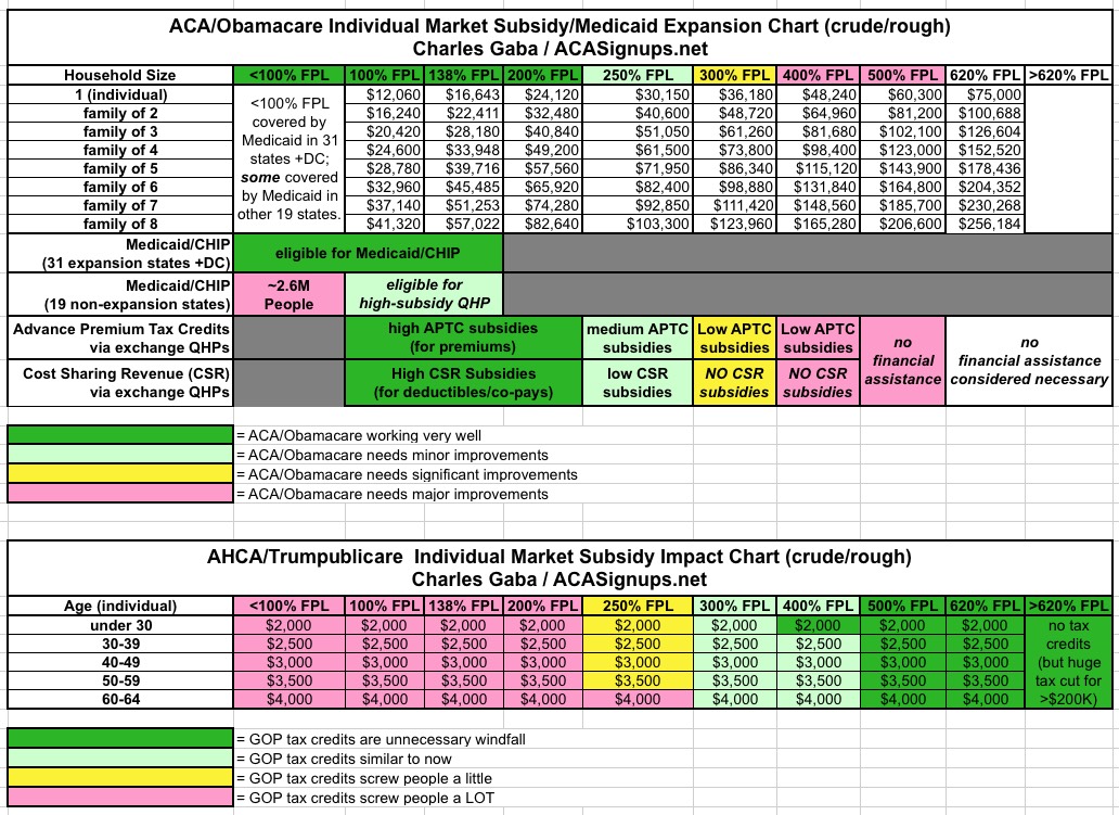
Again, both of these are somewhat crude; there are variables by state and even county, and the "helping/hurting" color scheme is oversimplified. Still, the general trend is unmistakable: ACA financial assistance generally helps those with incomes below the 250% federal poverty level, doesn't do much for those between 250-350% FPL, has real problems for those between 350-500% and doesn't do much at all for those above that threshold (this doesn't include things like the guaranteed issue/community rating clause, removal of annual/lifetime caps, etc. which apply to everyone, since those are, for the moment, still kept under the GOP plan as well).
Meanwhile, the Trumpcare/Ryancare/whatever you want to call it plan does the exact opposite...it hurts those below around the 250% FPL mark, is about the same as the ACA in the 250-350% range, is somewhat helpful between 350-500%, and is a huge windfall for those above that (remember, while the GOP plan has tax credits tapeing off starting at around 620% FPL, once you hit 1,600% FPL (around $200,000 and up), there's a massive tax cut for the wealthy).
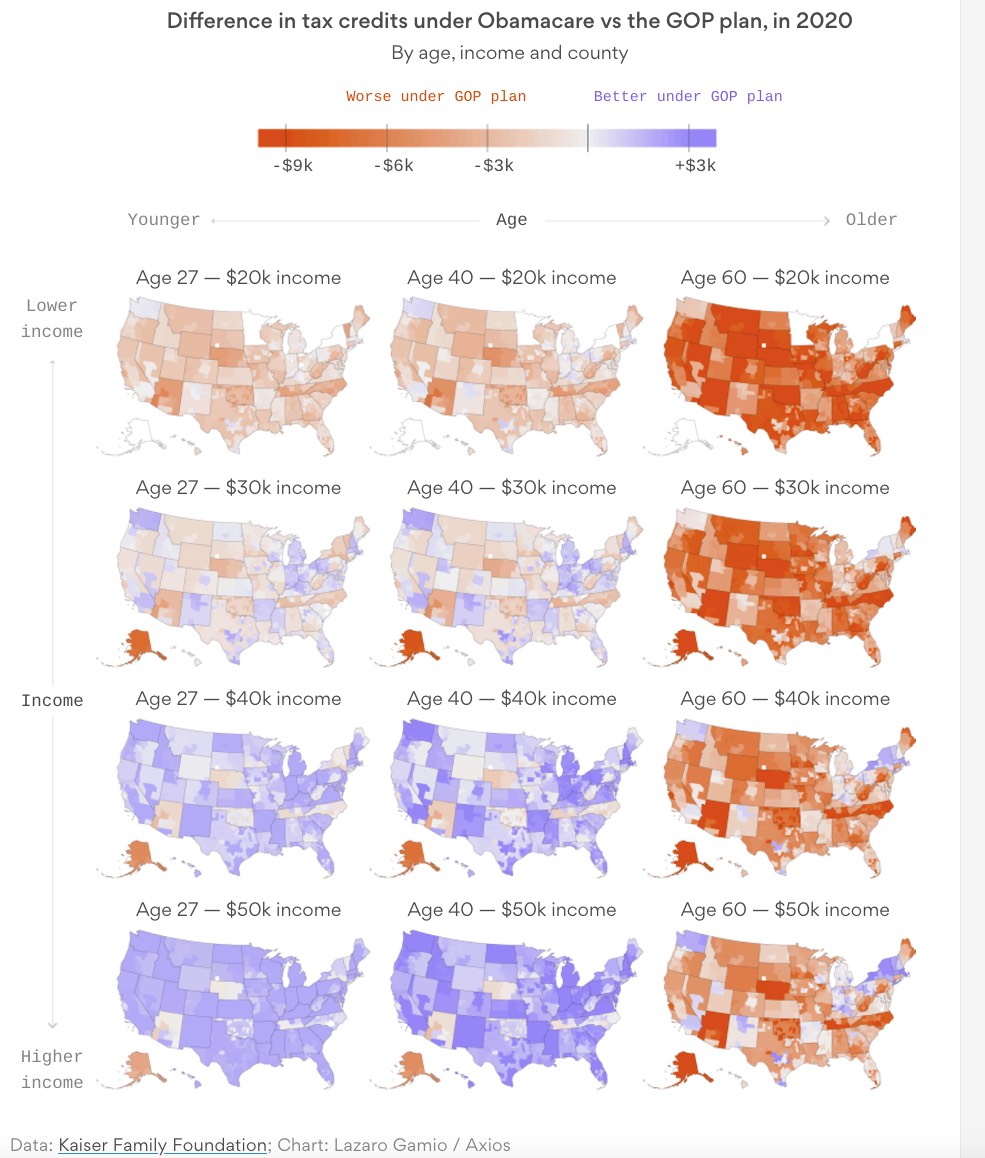
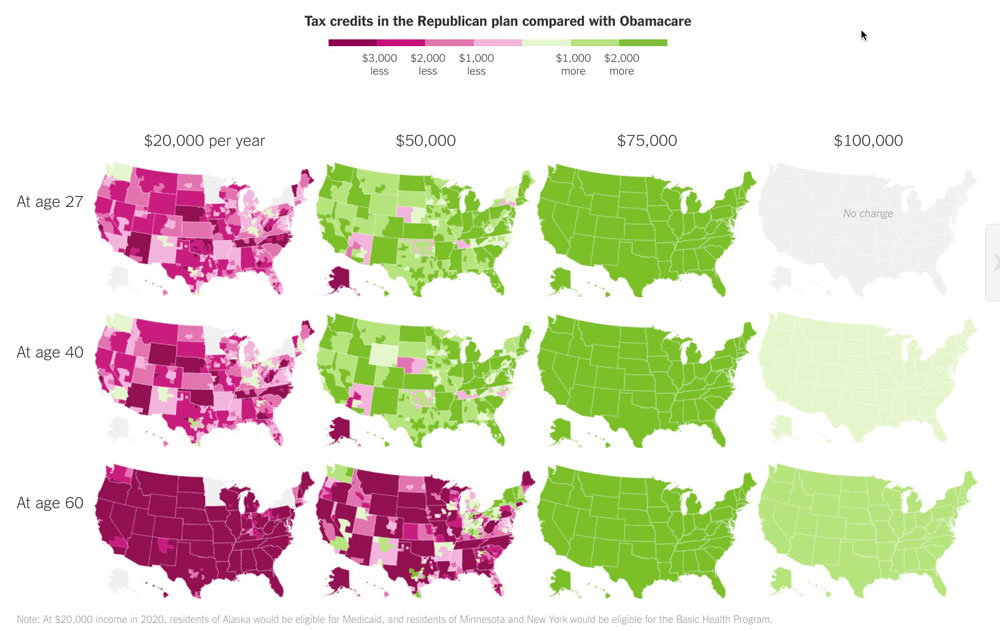
Anyway, as crude as these tables are, they do the trick...but this morning both Axios and the New York Times have gone much further to help visualize this reversal, with two similar sets of maps:
Advertisement
