

Who is the ACA working for & who isn't it working for?
Sun, 01/08/2017 - 5:52pm
OK, it's really important to note that a) this is a very simplified rendering of the true situation and b) this only applies to two populations: The individual market (around 20 million people) and the medicaid expansion population (around 14 million, plus another 2.6 million being denied thanks to 19 states refusing to expand it). In other words, it has nothing to do with the large group market, small group market, Medicare, the VA/TriCare, federal/state/local public employees and so on. This chart only applies to around 37 million people in the U.S. Got it?
Having said that, what I've tried to do is to provide a visual representation of, among that population, who the ACA is working well for, who it isn't working so well for, and who can legitimately complain about feeling screwed by it:
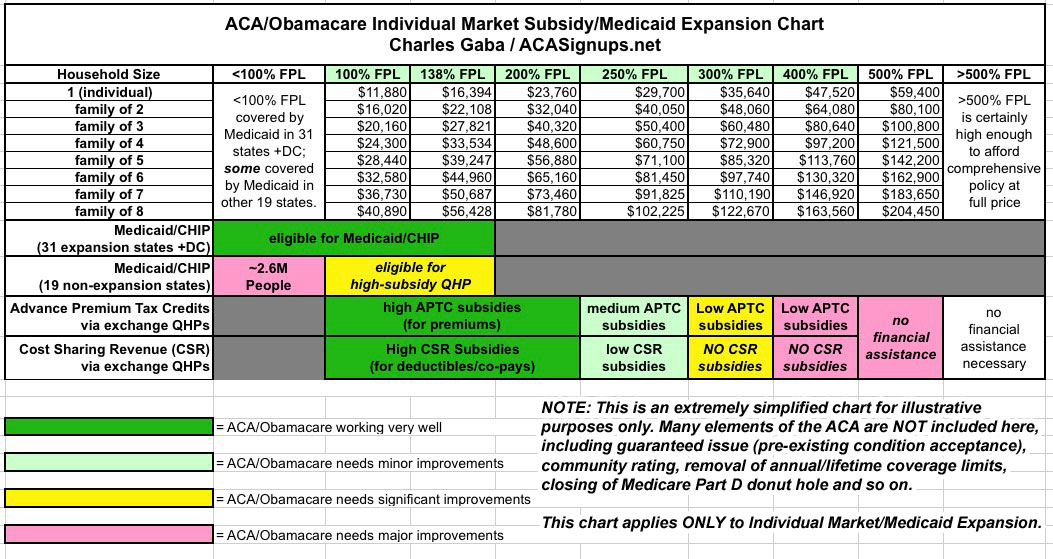
In short, expanding Medicaid in the 19 remaining states, beefing up the subsidies between 250% FPL - 400%, and bumping up the subsidy threshold from 400% FPL up to 500% would solve a great many gripes about the ACA. It wouldn't do much to address other issues, but it'd be a major start.
Advertisement
