

SHOP AROUND, DAMMIT! 86% of HC.gov enrollees would save avg. of $51/month by switching plan
Fri, 10/30/2015 - 1:59pm
NOTE: True Healthcare Data Nerds who want to see the details on every 2016 HC.gov policy should skip to the end of this entry.
The HHS Dept. held a conference call and issued a brief regarding 2016 Open Enrollment this afternoon. There's a bunch of data points and info, but the biggest takeaway for me is this one:
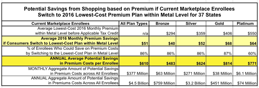
More than 8 in 10 (86 percent) current Marketplace enrollees can find a lower premium plan in the same metal level before tax credits by returning to the Marketplace to shop for coverage. If all consumers switched from their current plan to the lowest-cost premium plan in the same metal level, the total savings would be $4.5 billion. In 2015, nearly one-third of consumers who reenrolled in a Marketplace plan switched to a new plan.
Specifically, they've provided a handy table listing the average lowest-priced 2016 premium rates (at full price) for each Metal Level on Healthcare.Gov only (37 states), followed by how much current enrollees would theoretically save on average if they switched to that plan from whatever their current policy is:
Note: Amounts presented here do not take into account potential premium tax credits. The lowest-cost premium refers to the plan with the lowest premium within the county within each metal tier and based on all plans available in 2016. The lowest cost plan does not take into account other cost-sharing features, but refers only to the cost of the premium charged for that plan. In some cases, plans were tied for lowest premium. This analysis includes only enrollees linked to complete plan and premium data for both 2015 and 2016, and excludes tobacco users, who may face additional surcharges. Catastrophic plans, which are not available to all consumers, were not considered in these calculations. We assume that all enrollee characteristics are unchanged and calculate premiums based on the same age, family composition, and household income as percentage of the FPL as in 2015. Metal-level analysis is based on the metal consumers would be automatically re-enrolled into for 2016, based on their metal choice in 2015. See the “Methods and Limitations” section at the end of this brief for more details
Obviously there's a lot of big caveats here. Switching to the "lowest priced" plan may also mean higher deductibles/co-pays/co-insurance. It may mean giving up your preferred doctor or hospital. It may mean switching to a provider with worse customer service, and so forth. On the other hand, you may discover that the new plan and/or new carrier has better service, or that you get exactly the same services from the same providers while saving money in the process.
I should note that this hypothetical "$51/month savings" is in comparison with what your current plan will cost in 2016, not compared to what you're paying this year; you may still end up paying more, but you might get away with only a $10 increase instead of a $61 increase, for instance.
The larger point is that EVERYONE should shop around, even if they end up sticking with the same plan after all.
Beyond the table above, much of the call and brief are rehashes of the "Benchmark Plan" press release from a few days ago, including stuff like:
More than 7 in 10 (72 percent) current Marketplace enrollees can find a plan for $75 in premiums or less per month, after any applicable advance premium tax credits in 2016. Nearly 8 in 10 (78 percent) current Marketplace enrollees can find a plan for $100 in premiums or less per month, after any applicable tax credits in 2016.
Nearly 6 in 10 (57 percent) can find a plan for $75 in premiums or less within their metal level. Nearly 7 in 10 (66 percent) can find a plan for $100 in premiums or less within their metal level.
They also include some additional info, though:
- A 27-year-old with an income of $25,000 a year will on average get an annual tax credit of $1,164—compared to $972 in 2015. A typical family of four with an income of $60,000 will on average receive an annual tax credit of $5,568—compared to $4,848 in 2015. Marketplace tax credits adjust to match changes in each consumers’ benchmark silver plan premium.
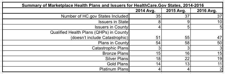
- The average number of issuers remained stable between 2015 and 2016. The average consumer has 10 issuers in their state, up from 9 in 2015 and 8 in 2014. On average, consumers can choose from 5 issuers for 2016 coverage, just as they could for 2015 coverage. Consumers had a choice of 4 issuers on average in 2014 (Table 1a).
- Like last year, nearly 9 out of 10 consumers returning to the Marketplace will be able to choose from 3 or more issuers for 2016 coverage (Figure 1). Previous research across a variety of product markets suggests that price competition typically intensifies with three or more competitors in a market.
They provide a full breakdown of the number and types of plans and insurance carriers available on HealthCare.Gov in 2014, 2015 and 2016 (again, for 37 states only). It should be noted that this data is only current as of October 19th...which means that the last-minute failures or pullouts from several CO-OPs as well as a few private insurance companies (WINhealth in Wyoming, Moda in Oregon and Washington State, etc.) are likely not reflected in this table:
Note: All averages in this table are weighted based on plan selections in the county. The 2014 estimate uses PY2014 plan selections in 35 states, and the 2015 and 2016 estimates are based on PY2015 plan selections in 37 states.The number of issuers per state is calculated by finding the total number of issuers offering QHPs anywhere in each state, then taking an average over all states weighted by plan selections in the state. Numbers may not sum due to rounding. The 2014 and 2015 numbers differ from the previous ASPE issue brief “Health Plan Choice and Premiums in the 2015 Health Insurance Marketplace” as a result of calculating averages weighted by plan selections, rather than unweighted averages. See Appendix Table 1b for an unweighted version of this table.
Finally, they've included state-level breakouts of a whole bunch of stuff: The average theoretical savings for people who switch to the lowest-priced plan; the average premium rates and tax credits for a theoretical 27-year old earning $25K and a Family of Four earning $60K, and so on.
Read the whole thing if you're a data wonk.
However, if you really want to do a deep dive, you can even bring up the official 2016 HealthCare.Gov Individual Market QHP Landscape Database, which includes detailed data on every single 2016 policy available for 34 states on HealthCare.Gov from every carrier in every metal level.
NOTE: Again, the data at this link is only current as of Oct. 19th, so there may be some carriers/plans listed which have since been removed (defunct CO-OPs, etc). HHS said that they'll be updating this database over the next few days/weeks, however).
Note: Here's a more consumer-friendly link which frames the database within a frame and also includes links to ZIP files for Hawaii, New Mexico, Nevada and Oregon.
Advertisement
