

Final 2016 HC.gov rate hikes only 7.5% on average...with some *major* caveats...
Mon, 10/26/2015 - 5:30pm
The CMS division of the HHS Dept. just posted their 2016 "Marketplace Affordability Snapshot", which is their version (in a way) of my own "2016 Average Rate Hike" project:
The next Open Enrollment period for the Health Insurance Marketplace begins on November 1, 2015 for coverage starting on January 1, 2016. According to an HHS analysis, about 8 out of 10 returning consumers will be able to buy a plan with premiums less than $100 dollars a month after tax credits; and about 7 out of 10 will have a plan available for less than $75 a month. Highlights of the 2016 Marketplace Affordability Snapshot include:
- New HHS data indicates that in 2016 nearly 8 in 10 returning Marketplace consumers will be able to buy a plan with premiums less than $100 month after tax credits.
- In addition, about 7 in 10 returning Marketplace consumers will be able to buy a plan for $75 or less in monthly premiums after tax credits in 2016.
- The average rate increase for a benchmark plan across 30 of the largest markets, representing 60 percent of Marketplace enrollees, is 6.3 percent. This rate increase does not account for the benefit provided by tax credits to eligible consumers.
- Across all markets in the 37 states, the cost of the benchmark plan will increase an average of 7.5 percent.
- For 2016, over two thirds of counties will have three or more issuers.
- New analysis based on the second open enrollment found that those returning consumers who switched plans within the same metal tier saved an average of nearly $400 on their 2015 annualized premiums after tax credits as compared to those who stayed in their same plans.
At first glance, this appears to be great news compared to my own estimate of a 12-13% average rate increase nationally on the individual market; 7.5% is a considerably lower average increase than 12-13%, right?
Well, yes...except for several important differences between the two:
- First of all, the CMS report only includes the 37 states run through HealthCare.Gov. It does not include the 14 states which ran their own exchanges for 2015 (Hawaii is moving to HCgov for 2016, but still had it's own exchange for this report)
- Secondly, my averages are ranked based on three different enrollment measurements:
- Effectuated exchange enrollment as of 6/30/15,
- Total 2014 individual market for each state, or
- Total State Population as of 2014...
- ...wheras the CMS report measures against total QHP selections as of 2/22/15 (right at the end of 2015 open enrollment).
Fortunately, these first two factors are easy to correct for; all I have to do is remove the 14 state-based exchanges and change the enrollment numbers for each state back to the 2/22/15 QHP selection totals.
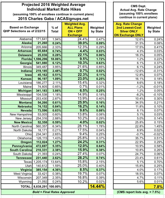
Again, at first glance, this appears to be even further off than before: Over 14%, vs. the 7.5% average that CMS is reporting (oddly, I come up with a weighted average of 7.8% vs. their 7.5%...)
HOWEVER, there are still two more vitally important factors which I simply can't correct for:
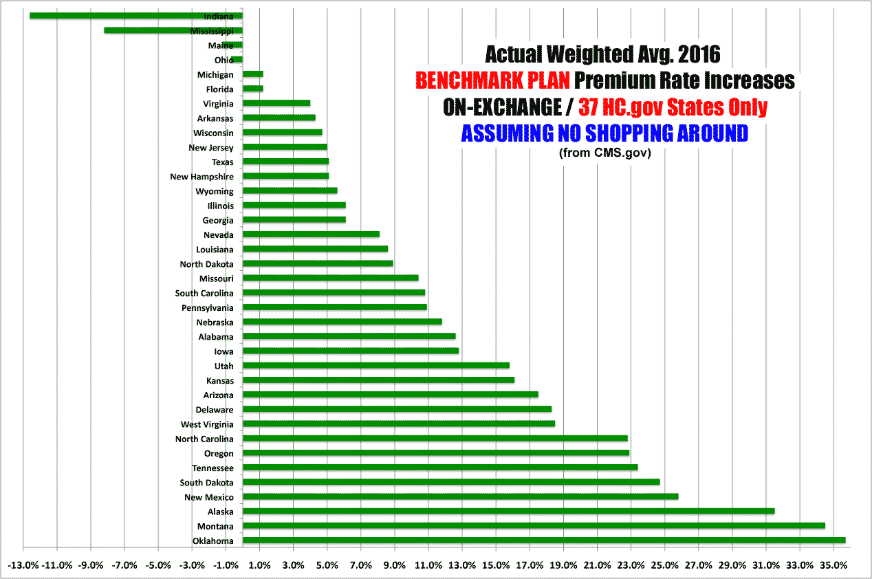
The 2016 Affordability Snapshot provides a review of the final rate increases for second lowest cost silver plans, known as benchmark plans, which will be available for purchase in the 37 states that used the HealthCare.gov platform in 2015, including those in the Federally-facilitated Marketplace, State Partnership Marketplaces, and supported State-based Marketplaces.
This is probably the single biggest factor accounting for the difference between my average and CMS's: They're only averaging out the benchmark Silver plans, while I'm averaging out every individual ACA-compliant plan regardless of metal level (ie, Bronze, Silver, Gold, Platinum and even Catastrophic plans).
Yes, Silver plans are the most popular (with good reason), but they still only make up around 2/3 of total exchange enrollments, and even then, the "benchmark" plan is only 1 out of perhaps two dozen or more Silver plans available in every region. If the Benchmark Silver plan in a given area is only going up 3% in 2016, but the Gold, Platinum and Bronze plans are all going up 10%, that's going to seriously mess with the weighted average. For that matter, if every other Silver plan besides the Benchmark goes up by 10% or whatever, that will skew the weighted average considerably as well.
Finally, the plans weighted by the CMS report don't include off-exchange enrollees, even though there are almost as many people enrolled in off-exchange ACA-compliant policies as there are through the exchanges (perhaps 7 million off-exchange vs. 10 million exchange-based, plus another 2-3 million "transitional" or "grandfathered" enrollees which aren't part of this equation).
OFF-exchange ACA-compliant policies are generally part of the same risk pool as the exchange enrollees, so those policies skew the rates up or down as well.
Add these factors into the mix and there's simply no way of running an apples-to-apples comparison between my projections and today's CMS report...which is a shame because I really am curious to see just how far off the mark I am on both a per-state and national basis.
Then again, there probably won't be any way of comparing them accurately anyway, because the effective average rate increase will end up being somewhat different than the theoretical average...assuming most people shop around and many of them switch to less-expensive policies.
So, while I'm disappointed that I can't run my numbers against CMS's, at the very least no one can accuse me of trying to shill for them here...
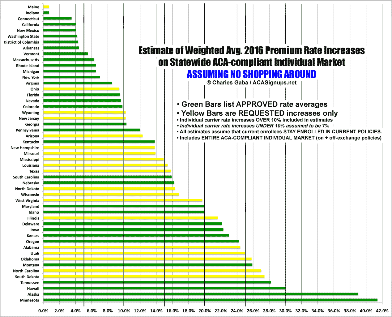
Anyway, here's what things look like at the state level, from lowest to highest, based on my full state-wide individual market estimates and CMS's benchmark plan-only, on-exchange only, 37-state only rate changes:
Advertisement
