

The Final 2015 Graph (2015 vs. 2014, Full Year Comparison)
Wed, 10/14/2015 - 9:47pm
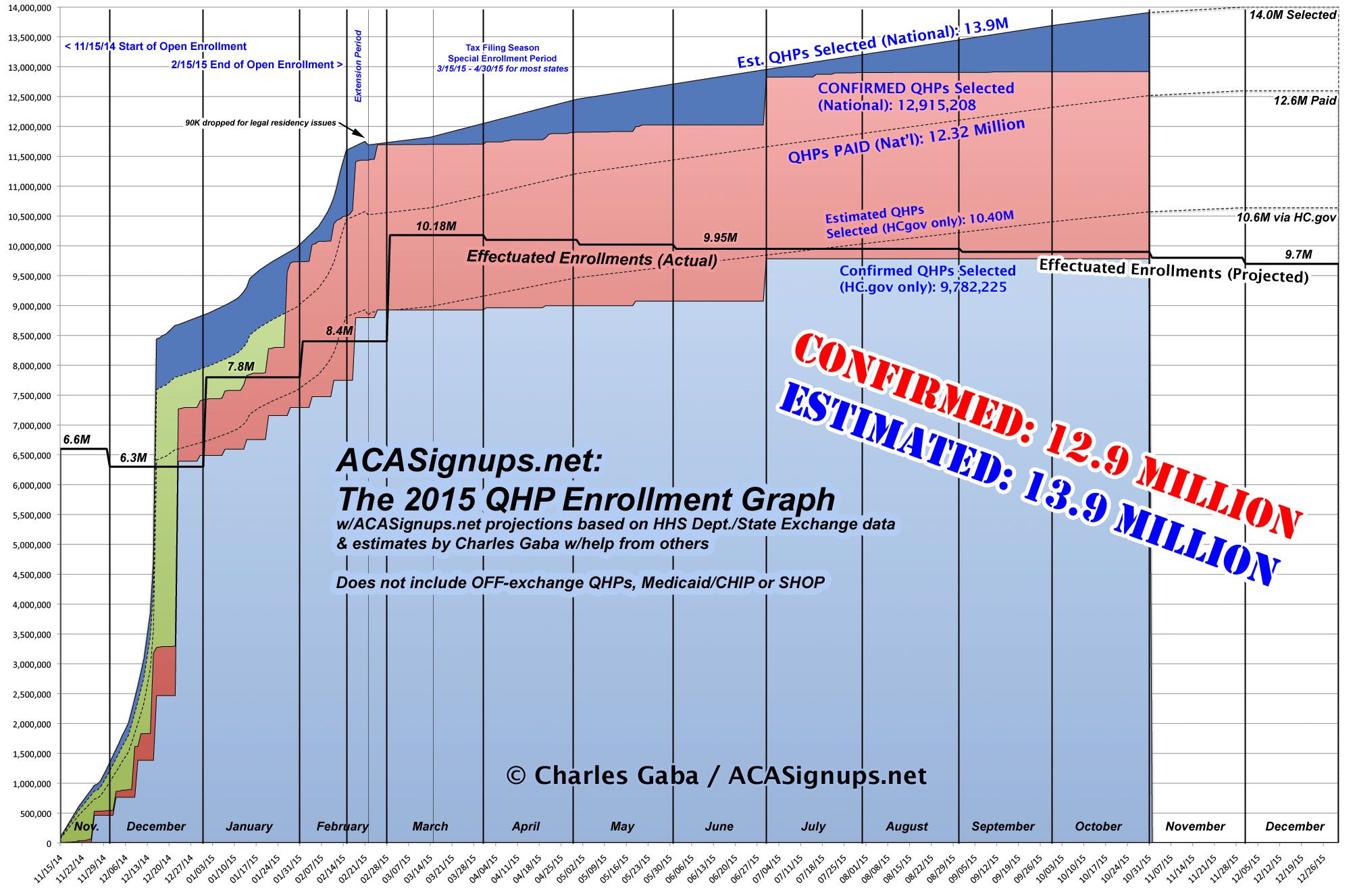
With things ramping up for the 2016 Open Enrollment Period (#OE3), there's not much point in my continuing to track 2015 QHP selections. The June CMS report confirmed that off-season enrollments have been tracking pretty closely to my estimates (slightly higher, actually, although the number later dropped from their plans due to legal residency issues also turned out to be much higher than I had expected).
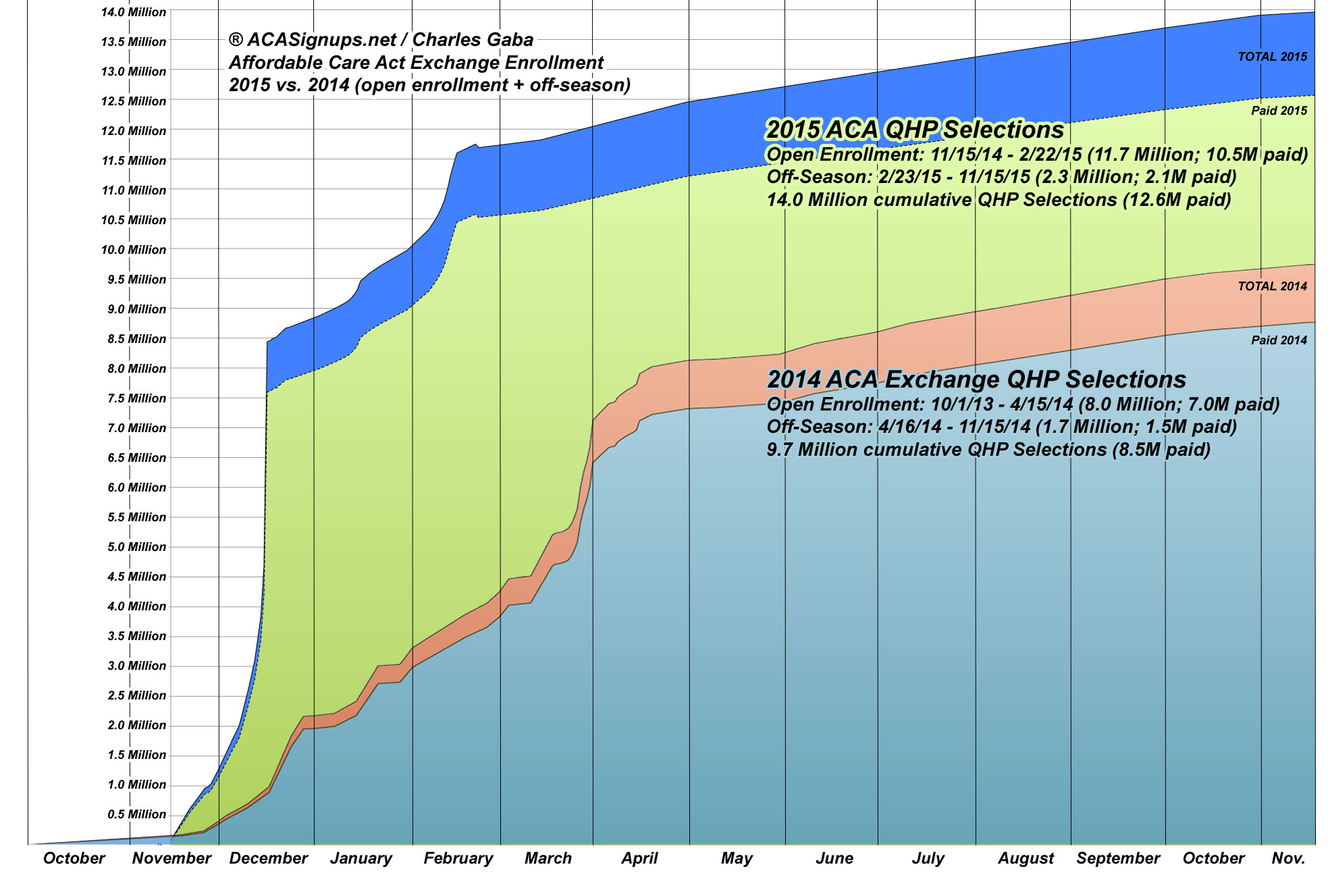
In general, however, it's been averaging roughly 8,000 - 9,000 new QHP selections per day during the off-season, and will likely continue at about that rate for another few weeks (hitting roughly 13.9 million by the end of October) before tapering off as the 2016 enrollment season kicks into gear. I'm pretty certain that it'll close out the year with around 14 million QHP selections even, of which around 12.6 million will actually be paid for and around 9.7 million will still be enrolled as of the end of December.
With that in mind, here's the last 2015 Graph I'll be posting, which I've also superimposed over the full-year 2014 Graph for comparison (as always, click on the images below for the high-resolution versions):
Advertisement
