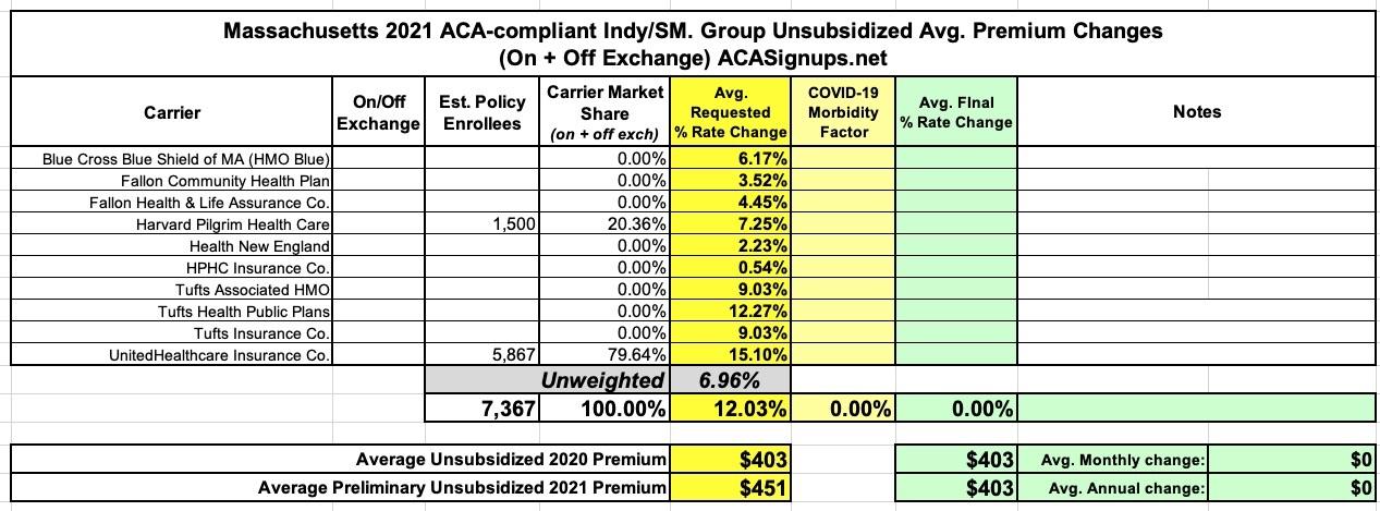
Massachusetts: Preliminary avg. 2021 #ACA premiums: 7% (unweighted; combined indy/sm. group market)
Massachusetts, which is arguably the original birthplace of the ACA depending on your point of view (the general "3-legged stool" structure originated here, but the ACA itself also has a lot of other provisions which are quite different), has ten different carriers participating in the individual market. MA (along with Vermont) has merged their Individual and Small Group risk pools for premium setting purposes, so I'm not bothering breaking out the small group market in this case.
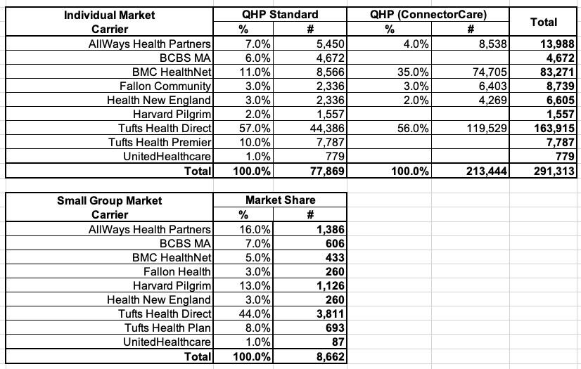
Getting a weighted average is tricky. On the one hand, only one or two of the rate filings included actual enrollment data. On the other hand, the Massachusetts Health Connector puts out monthly enrollment reports which do break out the on-exchange numbers by carrier. This allowed me to run a rough breakout of on-exchange MA enrollment. I don't know whether the off-exchange portion has a similar ratio, but I have to assume it does for the moment.
It's also important to note that Massachusetts' ACA exchange has a unique arrangement for the policies they offer,,,around 3/4ths of exchange enrollees sign up for "ConnectorCare" policies (which include additional supplemental subsidies), while the other 1/4th enroll in "standard" subsidized or unsubsidized Qualified Health Plans (QHPs). I had to play around with the percentages for each and then merge them to get the following rough compilation of market share breakout of the combined total enrollment.
Unfortunately, I'm missing enrollment data (even rough numbers) for some carriers, and there are others which are head-scratchers...for instance, there are three "Tufts" carriers on the MA market: Tufts Associated HMO, Tufts Health Public Plans and Tufts Insurance Co. In the Health Connector Report, however, it lists "Tufts Health Direct", "Tufts Health Premier" and "Tufts Health Plan".
In other words, the three "Tufts" in the filings have different names from the three "Tufts" in the report, and I have no clue which of these correspond to which.
In addition, while "Fallon Community" is listed in each, "Fallon Health" appears on the report while "Fallon Health & Life Assurance Co." is in the filing. Are these the same? I've no idea.
Finally, "AllWays Health Partners" shows up in the Connector report but isn't listed in the filings. Is AllWays another branding of some other carrier? Not a clue.
Therefore, even with all this data, I still have to list the average as an unweighted: +7.0%.


