

Weekly Update: Which COUNTIES have the highest per capita rates of #COVID19 cases and deaths?
Sun, 09/13/2020 - 1:01pm
The data below comes from the GitHub data repositories of Johns Hopkins University, execpt for Rhode Island, Utah and Wyoming, which come from the GitHub data of the New York Times due to the JHU data being incomplete for these three states. Some data comes directly from state health department websites.
A reminder that I made two important changes to the spreadsheet last week:
- First, the Johns Hopkins Github archive has finally started breaking out New York City's data into the five separate boroughs/counties
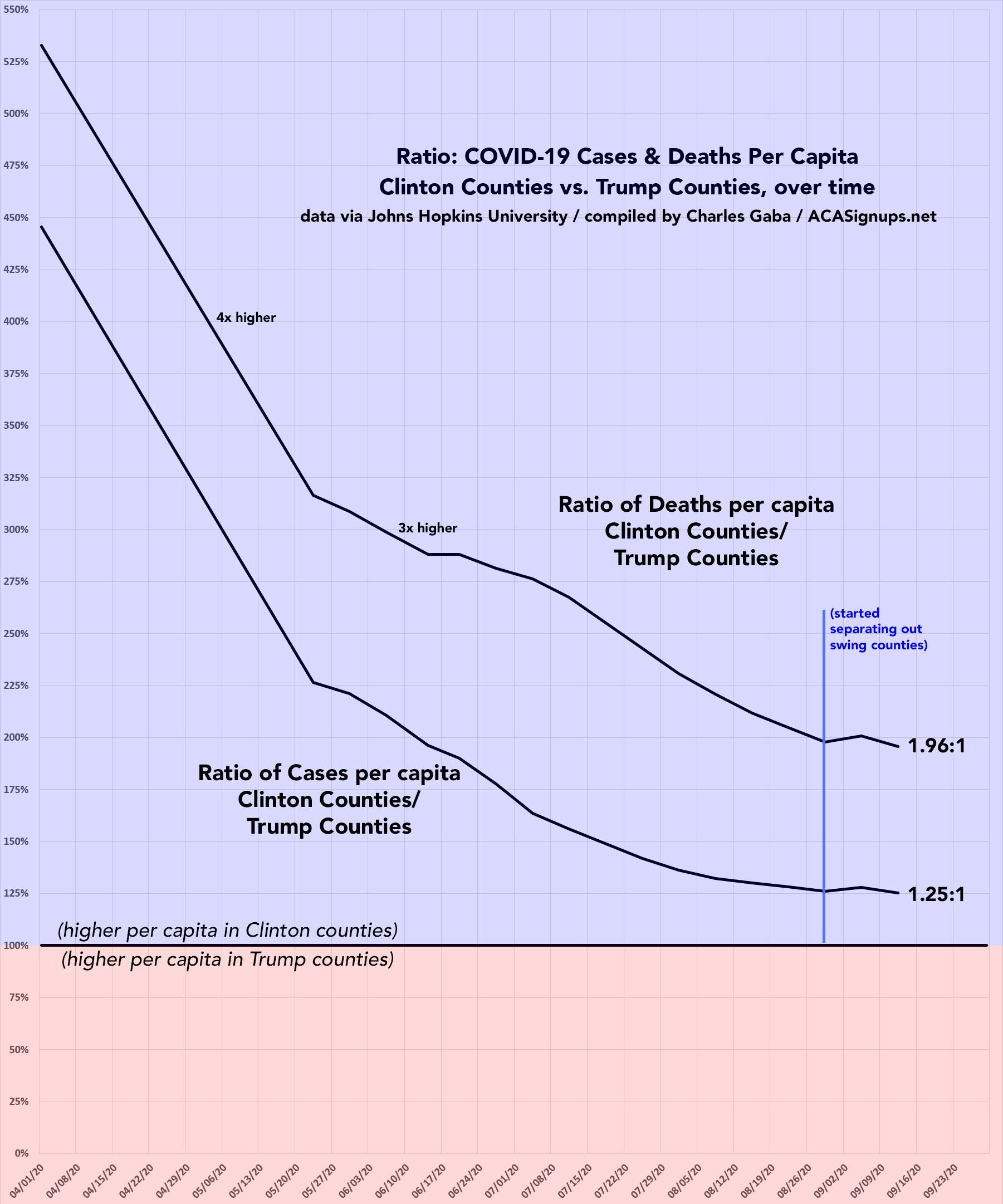
- Second, I've finally gone through and separated out swing districts. I'm defining these as any county which where the difference between Donald Trump and Hillary Clinton was less than 6 percentage points either way in 2016. There's a total of 198 Swing Counties using this criteria (out of over 3,200 total), containing around 38.5 million Americans out of over 330 million nationally, or roughly 11.6% of the U.S. population.
With these updates in mind, here's the top 100 counties ranked by per capita COVID-19 cases as of Saturday, September 12th (click image for high-res version). Blue = Hillary Clinton won by more than 6 points; Orange = Donald Trump won by more than 6 points; Yellow = Swing District
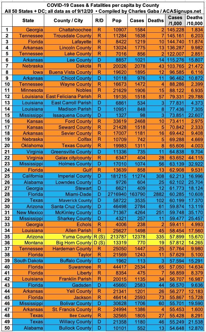
After several months in the top spot, Trousdale County, Tennessee has been replaced at #1 per capita by Chattahoochee County, Georgia. 15 of the top 20 counties were solidly won by Donald Trump in 2016, as were 65 of the top 100.
New York doesn't even show up until #118 (Rockland County, a swing district).
New York City's 5 boroughs show up at:
- #210 (Bronx)
- #302 (Staten Island)
- #341 (Queens)
- #552 (Brooklyn)
- #868 (Manhattan)
Michigan no longer shows up until #930 (Wayne County, where Detroit is located). Oakland County, where I live, now ranks #1,263.
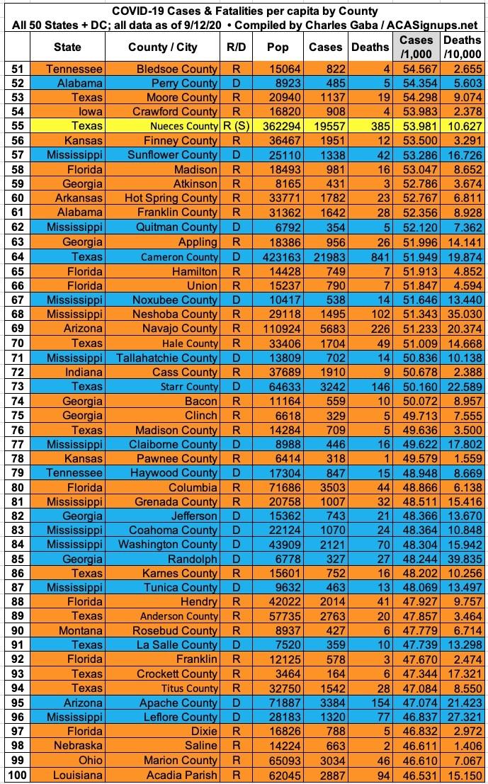
Here's the top 100 counties ranked by per capita COVID-19 fatalities as of Saturday, September 12th (click image for high-res version):
17 of the top 100 deadliest counties are in Georgia. Another 16 are in Mississippi. 11 are in Texas and 10 are in Louisiana.
New York City's 5 boroughs now rank #8, 11, 15, 31 and 53. Wayne County, Michigan (which includes Detroit) is now down to #87.
It's also worth noting how the ratio of per capita cases has shifted between the Clinton and Trump counties over time. Back in mid-March, the rate was 4.5x higher in Clinton-voting counties than Trump counties. As of this weekend that ratio was down to 1.25x higher. In terms of the mortality rate, the ratio has dropped from 5.3x to 2.0x.
As you can see below, separating out the ~200 swing counties from the Red and Blue ones caused the ratio between the two for both case rates and death rates to bump back up towards a higher blue county rate, but only slightly and only for that one week. This week the trend has continued downwards:
Advertisement
