

Weekly Update: Which COUNTIES have the highest per capita rates of #COVID19 cases and deaths?
Sun, 08/02/2020 - 12:29pm
The data below comes from the GitHub data repositories of Johns Hopkins University, execpt for Rhode Island, Utah and Wyoming, which come from the GitHub data of the New York Times due to the JHU data being incomplete for these three states. Some data comes directly from state health department websites.
Here's the top 100 counties ranked by per capita COVID-19 cases as of Saturday, August 1st (click image for high-res version):
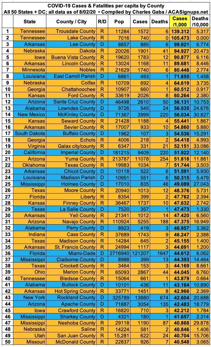
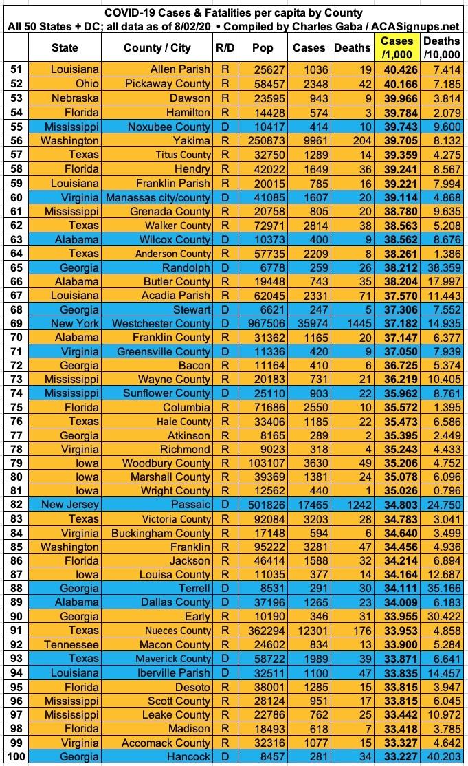
There's still clear disconnect between the counties with the highest rates of infection and the ones with the worst mortality rate. 68 of the 100 counties with the highest rate of infection voted for Donald Trump...and 25 of the other 32 are in states Trump won.
New York doesn't even show up until #43 (Rockland County), and Michigan no longer shows up until #499 (even then, it's not Wayne County which ranks highest...it's Oceana County. Wayne County, where Detroit is located, doesn't show up until #608).
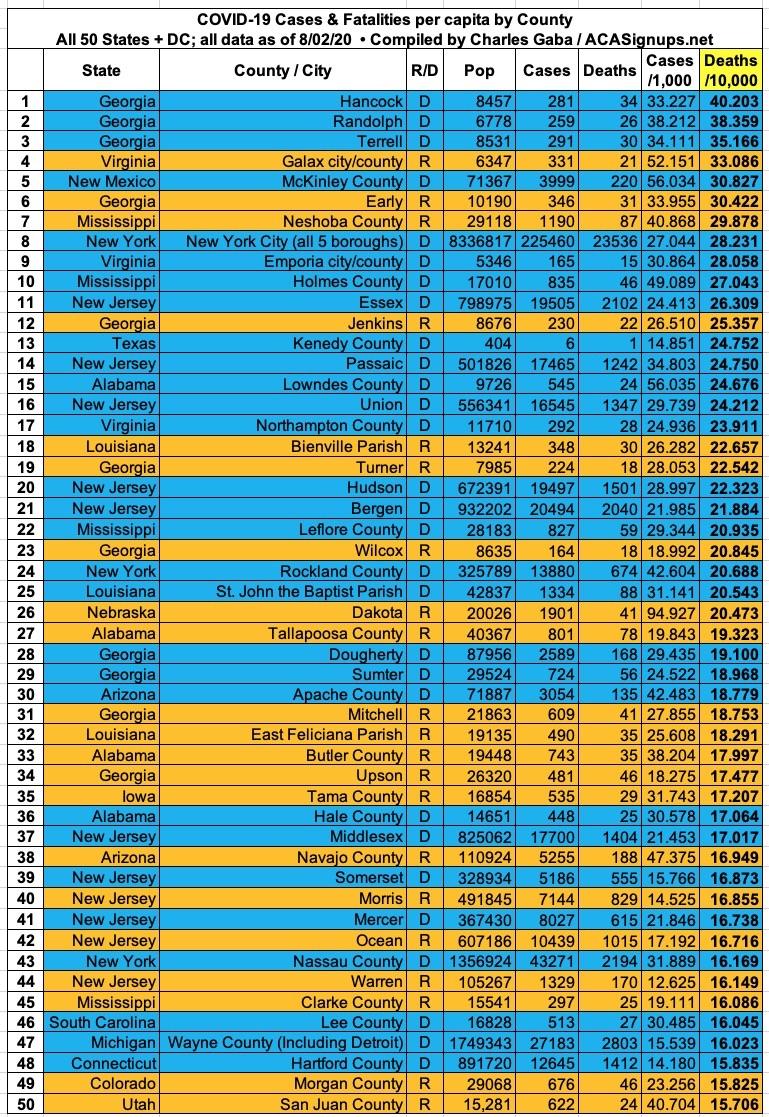
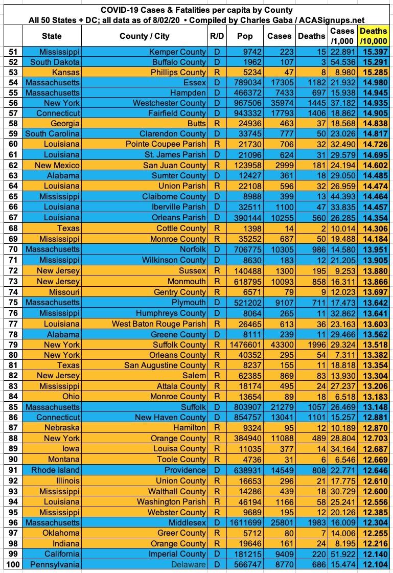
On the other hand, as you can see below, fatalities are a different story: 52 of the 100 counties with the highest COVID-19 mortality rates voted for Hillary Clinton. It's actually more like 55 out of 100, since both the NY Times and John Hopkins University data files lump all 5 New York City boroughs (which are actually counties) into a single listing. Four of the five are solid blue (the exception is Richmond County, aka Staten Island).
Setting political lean aside, it's noteworthy that the three deadliest COVID counties are located in Georgia, as are 12 of the top 100. New York City ranks #8 (or #8-12, really). Michigan doesn't show up until #47 (Wayne County, which includes Detroit).
Here's the top 100 counties ranked by per capita COVID-19 fatalities as of Saturday, August 1st (click image for high-res version):
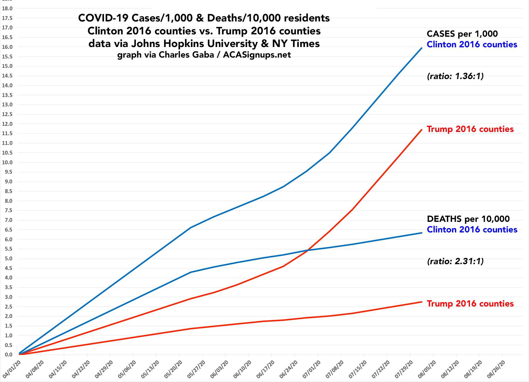
It's also worth noting how the ratio of per capita cases has shifted between the Clinton and Trump counties over time. Back in mid-March, the rate was 4.5x higher in Clinton-voting counties than Trump counties. As of this weekend that ratio was down to 1.36x higher. In terms of the mortality rate, the ratio has dropped from 5.3x to 2.3x.
It's been pointed out that a whopping 84% of all counties voted for Trump. However, here's the point: Of the 100 highest-positive rate counties...
- On 3/20, it was 51 Trump counties to 49 Clinton counties.
- On 4/05, it was 57 Trump, 43 Clinton.
- On 5/12, it was 59 Trump, 41 Clinton.
- On 6/06 it was 62 Trump, 38 Clinton.
- On 7/11 it was 65 Trump, 35 Clinton.
- On 7/18 it was 68 Trump, 32 Clinton.
- On 7/25 it's 70 Trump, 30 Clinton.
- Interestingly, as of 8/01 it's back to 68 Trump, 32 Clinton...this is the first time this trend has reversed.
Advertisement
