

Update on my County-Level #COVID19 Tracking Project
Fri, 05/22/2020 - 2:41pm
Since I've been neglecting other ACA/healthcare posts the past couple of weeks, I figured I should at least provide regular updates on why I've been mostly absent.
I've made major progress in updating and revising my breakout of COVID-19 cases and fatalities at not just the state level but the county level. Again, I've separates the states into two separate spreadsheets:
Until two weeks ago, I was only able to track about a dozen states at the county level, and even then it went painfully slow, as every state health department website presents their data differently. Some make it easy to collect, others make it difficult. Getting ahold of historic data (that is, daily numbers prior to the current date) was even more difficult; I had to rely on the Internet Archive's Wayback Machine, which can be spotty at times.
Fortunately, someone clued me in to the New York Times' GitHub archive; the paper's team of data researchers are doing most of the work for me...and have been dating back to as early as February in some states. This has made the data itself far more accessible for every state and U.S. territory...but it still doesn't speed up the actual data plotting process, which I'm still doing manually.
In addition, there's one downside to the NY Times data: For some reason, they've decided to lump together all five NYC borroughs into a single "New York City" listing each day. This is irritating since the whole point of this project is to break out the numbers into smaller units, and of course NY City is composed of over 8 million people, but it's the best I can do (the NY state health dept. does break out the numbers by each of the five boroughs, but that's only available for the current day, and the layout of their site is confusing and hard to work with as well).
In any event, as of this writing, I've completed the following:
- Daily county-level data from 3/20 until at least 5/20 for Alabama, Alaska, Arizona, California, Delaware, Hawaii, Louisiana, Michigan, Minnesota, North Carolina, Pennsylvania, Texas, Washington State, Wisconsin and Wyoming
- At least 10 days of county-level data (from 5/11 - 5/20) for most other states
I hope to fill in the back-data for every state within the next few days, bringing them all up to date through at least 5/20. This should allow for plenty of interesting analysis of trends and counties to keep an eye on. It will also allow me to get back to posting more regular ACA policy updates/etc.
UPDATE TO THE UPDATE: Thanks to a Twitter follower of mine for leading me towards an even better GitHub data repository resource from Johns Hopkins University; this should speed things up even more, and I believe they also break out NYC into the 5 boroughs as well!
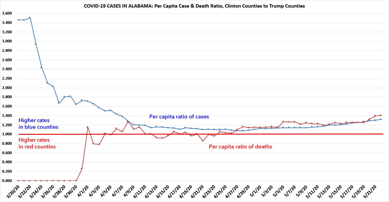
Here's an example of some of the visualizations I can do by integrating the county population and 2016 Presidential election results data. Alabama is a solid red state, so it's hardly surprising that most of the cases (72% as of this writing) are found in Trump-voting counties...but what is interesting is the per capita ratio of cases and fatalities in the handful of blue counties vs. red ones.
To clarify: On 3/20, Alabama COVID-19 cases were split exactly 50/50 between blue and red counties...but of course the population of those red counties is far higher; on a per capita basis, it was 0.049 per thousand in the blue counties vs. just 0.014 per thousand in the red ones. That's a ratio of 3.45:1. By 4/20, the per capita cases were 1.139/1,000 vs. 1.016/1,000, or just 1.121:1...in other words, cases had reached near parity on a per capita basis. Since then this trend has slowly reversed, however, reaching around 1.3:1 again as of yesterday.
The death rate, on the other hand (which is still pretty low in Alabama...only 529 people had died of COVID-19 as of last night) has hovered pretty evenly, although it's also been slowly trending more towards the blue counties (1.4:1 as of yesterday):
Advertisement
