

How #COVID19 has spread across 13 states since mid-March
Wed, 05/20/2020 - 5:34pm
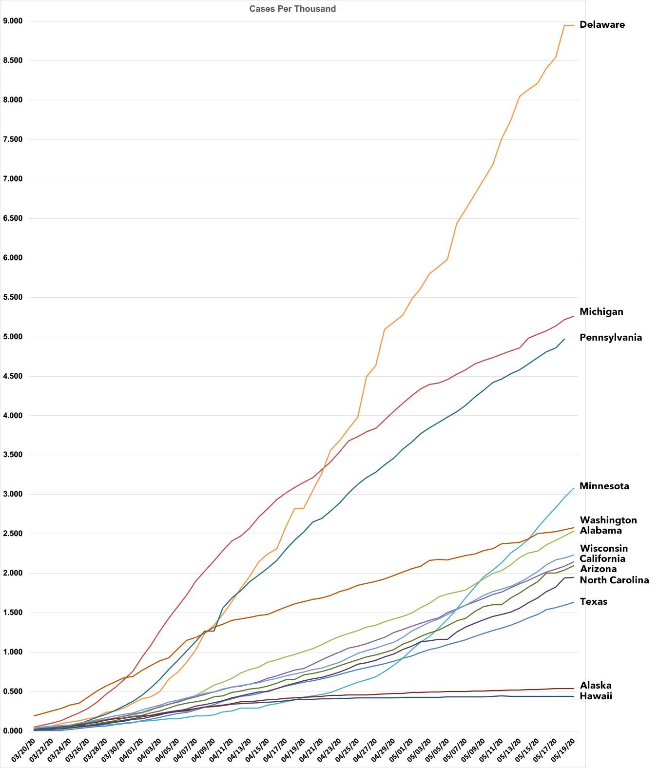
I've been spending a lot of time working on my county-level COVID-19 tracking project the past few weeks. I'm happy to report that I've managed to plug in the county-level case and fatality data for every thirteen states so far, so I figured this would be a good time to post a visual showing how the virus has spread over time across them in cases per capita (actually cases per thousand residents).
This is a much more useful measure than the raw number of cases since the population of each state (and county) varies so widely.
The states I've completed don't follow any particular pattern...aside from Michigan (which I started with because I live here, of course), the others are simply the states which I was able to get ahold of historic case/death toll data for from March 20th until today. Other states will follow as I complete backdating the data into the spreadsheets.
The thirteen states below fall into five groups: Delaware is part of the New England hot spot, of course; I don't have any other states completed from that region, and Delaware is actually at the lower end for New England...New York has double the rate, for example, at over 18 per thousand. Delaware's line is probably jaggy due to its low population, which exaggerates even small data changes.
Michigan and Pennsylvania are in the "tier 2" category...ugly outbreaks but they both started flattening the curve a few weeks ago.
Minnesota is in a tier by itself...they weren't doing too badly until around 3 weeks ago (around 4/27). Since then, however, their line has curved in the wrong direction, and they're at risk of reaching MI/PA levels of infection over the next few weeks.
The fourth group is a cluster of states all hovering around the 2 cases per thousand threshold: Washington (which was the first state hit but which has slowly but surely flattened the curve), Alabama (also trending the wrong way), Wisconsin, Alabama, California, Arizona, North Carolina and Texas.
Finally, the two noncontiguous states, Alaska and Hawaii, are both benefitting from being thousands of miles away from anyone else; both of their lines are nearly flat...for now.
This chart will become more meaningful once I've filled in the other 37 states, along with DC, Puerto Rico, etc., although it'll also get very messy.
I also plan on posting a similar chart plotting COVID-19 mortality rates for every state.
Advertisement
