

(Finally) A Deep Dive into the 2019 Open Enrollment Period Report...
Tue, 04/02/2019 - 5:43pm
NOTE: CLICK THE IMAGES FOR HIG-RES VERSIONS.
The Centers for Medicare and Medicaid released the official 2019 Open Enrollment Period report over a week ago. Normally I pounce all over these reports and spend a couple of days analyzing every last data point, seeing how that's the core of what I do here at ACASignups.net.
However, this report was released amidst a gusher of other major ACA/healthcare news stories over the course of the week, and I never really got around to a deep dive. I'm still swamped, but I figured I should at least go back and do a little more analysis today.
OK, first of all, I need to clean up the discrepancies between the OE6 enrollment data I had and what's in the official CMS report. Every year there are always slight variations in a few states, usually when it comes to the state-based exchanges, and this year is no exception. There were differences reported in six states; in five of them, CMS reported lower enrollment numbers; in one the CMS tally is higher:
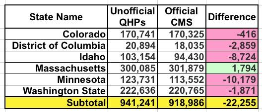
Colorado and Washington State are likely simple clerical errors or last-minute dropouts.
I included a warning about the DC number (20,894) at the time, noting that the odds were high that they'd still have to go back and clear out some people whose enrollments were cancelled or terminated before OE6 ended. I projected this would bring the final number down to 17,760 QHPs, so technically speaking the DC exchange did slightly better than I expected (18,035). This still represents a 6.5% drop from last year instead of the 8.3% increase I previously had down. Ouch.
UPDATE: Christina Cousart just gave me a heads up re. this anlaysis by the NASHP: "** The District of Columbia reports that 1,352 lives transitioned from their individual health insurance marketplace to their Small business Health Options Program (SHOP) from 2018 to 2019, a major factor contributing to its individual market loss in 2019.
This is interesting...that's over 7% of DC's exchange enrollment shifting from the Indy market to the Small Business market in one year. Huh.
Furthermore, it suggests that DC would have seen a slight net Indy market increases (perhaps 100 people) without that shift. Interesting.
Idaho's drop is also substantial: Instead of increasing 9% year over year, it turns out they were pretty much dead even (they technically dropped by 0.1%). I haven't checked yet but I'm guessing the confusion was caused by the same thing that happened last year: They likely included standalone dental plan enrollments in the 103K figure. Take away 8,700 dental enrollees and voila, you get virtually the same number as last year. I'll have to remember this next time around.
Minnesota had the largest discrepancy by raw number, over 10,000 QHP selections. I'm going to have to contact them to see where the gap came from, because according to MNsure's official dashboard report, the 123,731 figure does not include standalone dental plans or anything along those lines. This again changes MN's year over year performance from +6.3% to -2.4%.
Finally, there's Massachusetts. Unlike the other five states above, CMS actually has the Bay State exceeding their already incredibly impressive numbers for OEP 2019, by nearly 1,800 more people. This means that Massachusetts actually surpassed their 2018 number by a whopping 13%.
With these corrections included, here's what the final tables/graphs look like:
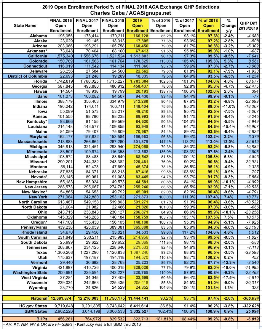
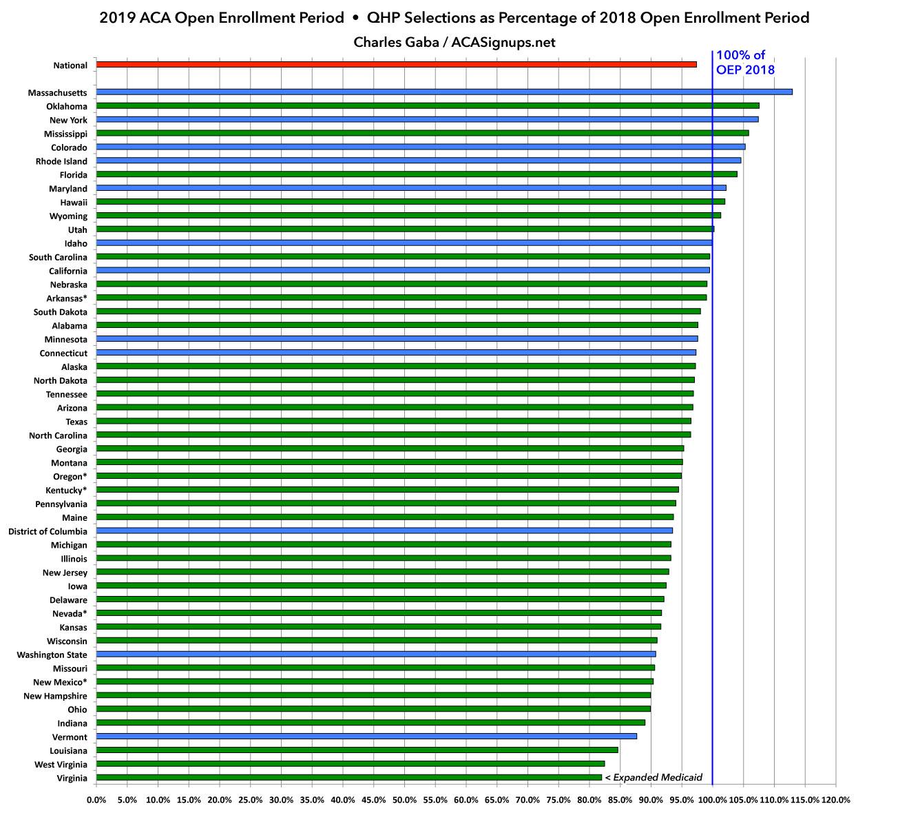
The final takeaways are still pretty much the same: The state-based exchanges outperformed the federal exchange-based states significantly (again). The main exceptions were Vermont (due to a wildly successful #SilverLoading launch, which actually reduces on-exchange enrollment) and Washington State (which had the highest rate increases on a percentage basis in the country this year). Eleven states managed to outperform last year, five of which were state-based:
OK, so what else is noteworthy in the report itself? Well, I covered some of the basics last week, but let's take a look:
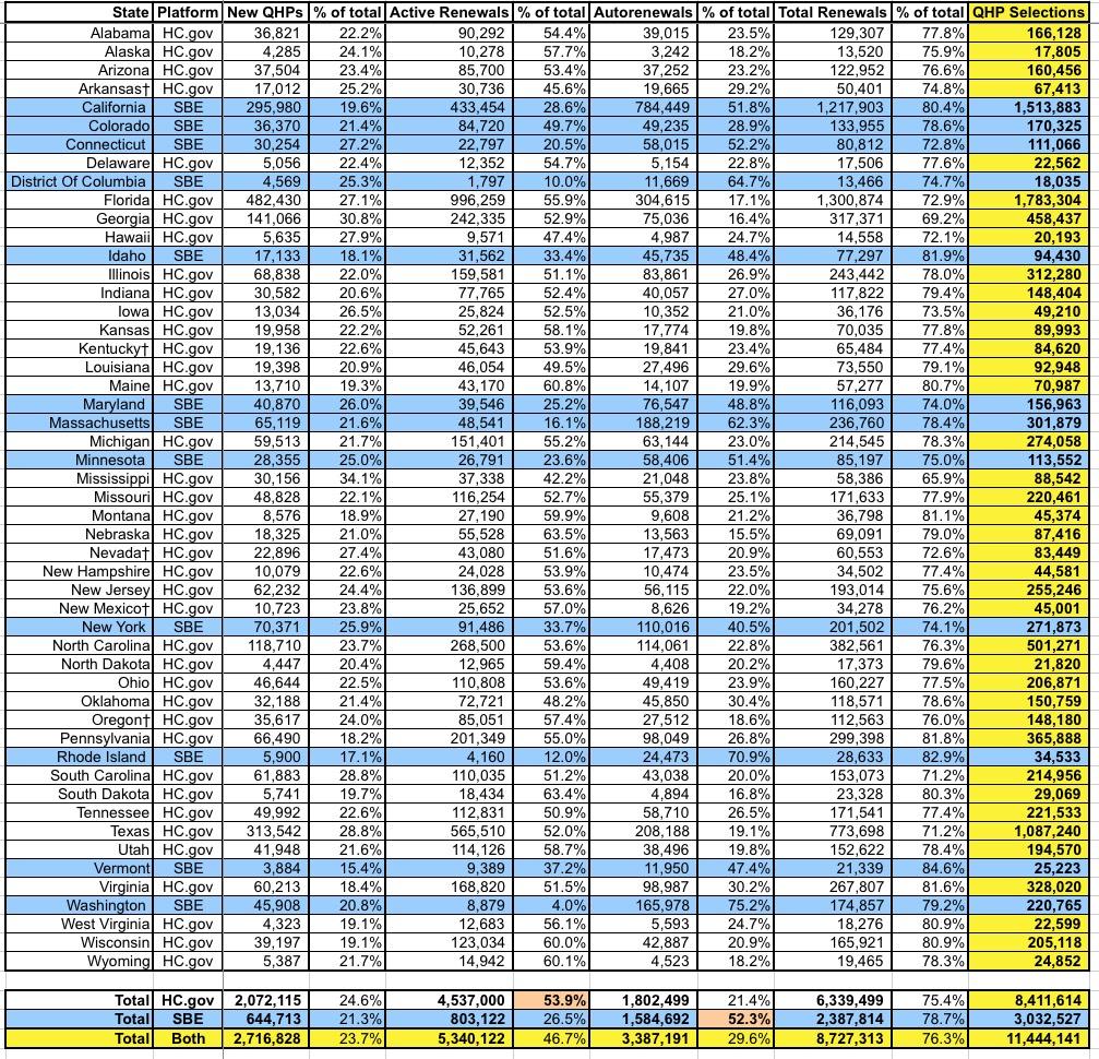
First up is the breakout of new enrollees vs. active re-enrollees vs passive re-enrollees. Overall, new enrollments made up a smaller percentage of the total on the state-based exchanges (21% vs. 25%). The split betwee active and auto-renewals is kind of interesting--over half of HC.gov enrollees actively re-enrolled, while over half of those in state-based exchanges let themselves be passively renewed.
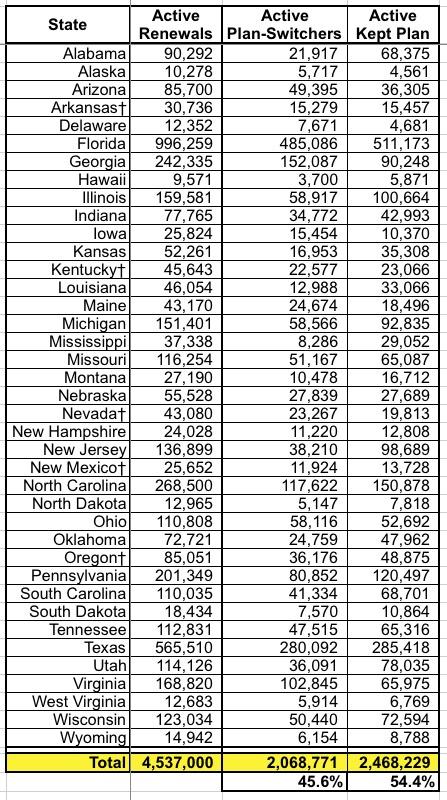
This table only includes the 39 states hosted by HealthCare.Gov, so it's missing about 15% of the total who actively re-enrolled, but it breaks out how many of those who did kept the exact same policy (or were cross-walked to a similar plan in cases where theirs were discontinued) vs. those who actively switched to a different policy. It was roughly a 45/55 split.
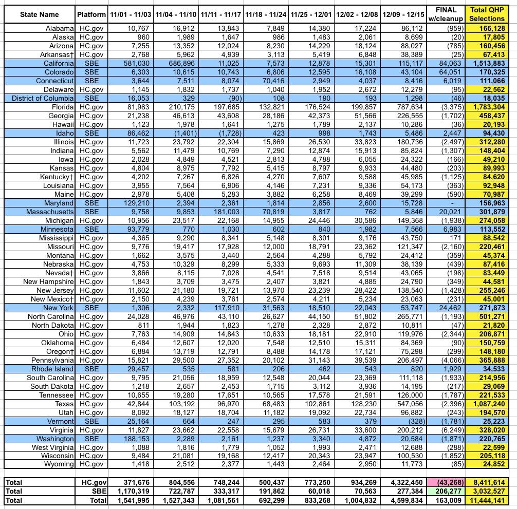
Here's the weekly 2019 Open Enrollment Period numbers. The "final" week is a bit skewed because it includes both the "extended deadline" enrollees from many of the state-based exchanges as well as reductions from most of the HC.gov states as last-minute cancellations/terminations were processed to clean up the database.
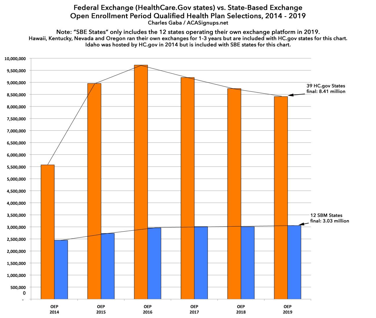
Looking at HealthCare.Gov states: The 4.3 million figure from 12/09 - 12/15 makes it look like over half of the enrollments happened in Week 7, but this is skewed because around 1.8 million auto-renewals on HC.gov states were added into the system that week. It's also worth noting that the longer enrollment period added around 7.3% to the total enrollments in the state-based exchanges...although not all of those states extended their deadlines either, so the actual impact was likely closer to 10%, I'd guess.
Here's the Big One (click image for the full-sized version). I've added two columns to it as well as as filling in a few fields which the CMS report left blank for whatever reason (espeically Idaho...I got their average unsubsidized premium from the YourHealthIdaho.org executive board meeting minutes, which allowed me to fill in a few other fields as well):
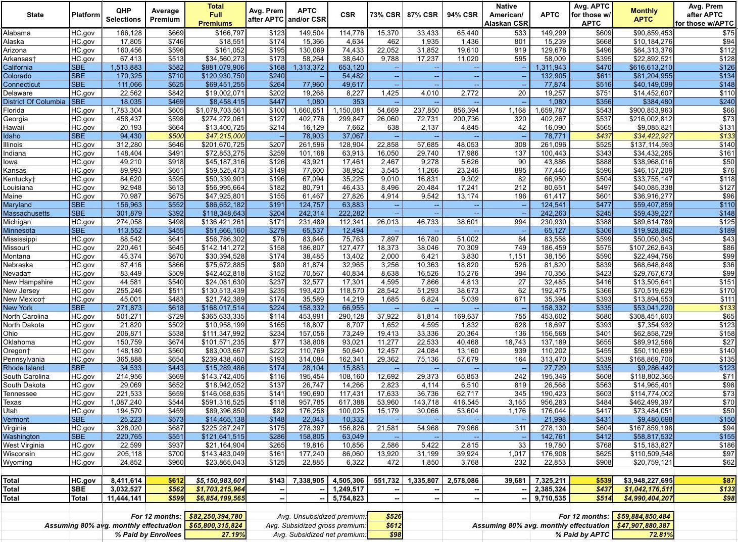
The CMS report states that the average unsubsidized premium for HealthCare.Gov states averages $612/month this year...but the average for state-based exchange states is 8.2% lower, at $562/month. This brings the national average down to $599/month. The biggest driver of this drop, of course, is Covered California, which averages $582/mo and makes up exactly half of the SBE portion of exchange enrollment. This is again an important argument in favor of states operating their own full exchanges, including being active purchasers who negotiate rates with the carriers.
The columns I added tally up the actual dollar amounts paid each month assuming all 11.4 million enrollees stick it out for the full year (which of course never happens...average monthly effectuated coverage is usually around 80% of the starting QHP selection total. This means that over all of 2019, there will likely be an average of 9.1 million enrollees, around $66 billion in premiums for the year, with roughly $48 billion in APTC subsidies paying 73% of that total.
Also worth noting: While unsubsidized SBE-state premiums are 8.2% lower than HC.gov states, the average subsidized premium paid is actually higher (around $133/mo vs. $87/mo) for the same reason--lower full priced premiums actually means less APTC assistance, which can skew net premiums higher. The national average net premium paid for subsidized enrollees is around $98/month, while the average paid by unsubsidized enrollees is around $526/month. THIS is where the whole ACA 2.0 "remove the 400% FPL subsidy cap issue comes into play.
There's some discrepancy here, however...CMS claims that subsidized Colorado enrollees are paying an average of $134/mo, for instance, while the official Connect for Health CO report claims it's only $117/mo. Hmmm...
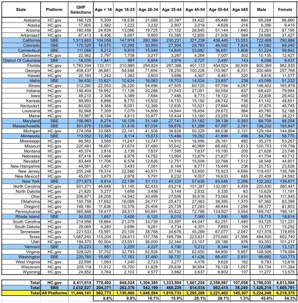
This table includes the age and gender breakout by state. The actual CMS report also includes ethnic and racial demographics, but only for the 39 HC.gov states, and even then 23% and 30% of enrollees respectively never entered their ethnicity or race respectively, making this data somewhat useless in my view. They also broke out enrollment between "rural" (18%) and "non-rural" (72%), but again, that's only for the 39 HC.gov states.
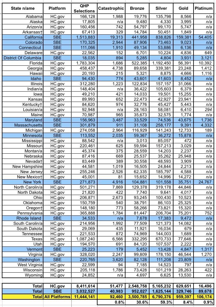
Here's the table breaking out the metal level selections. As usual, Bronze and Silver combine to make up over 90% of all exchange enrollments. However, the impact from Silver Loading since 2017 & 2018 is noticeable: Bronze/Gold have inched their way up from 33% of the market to 39%, while Silver has dropped from 66% to 59%.
- 2017: 27% Bronze, 66% Silver, 6% Gold
- 2018: 29% Bronze, 63% Silver, 7% Gold
- 2019: 31% Bronze, 59% Silver, 8% Gold
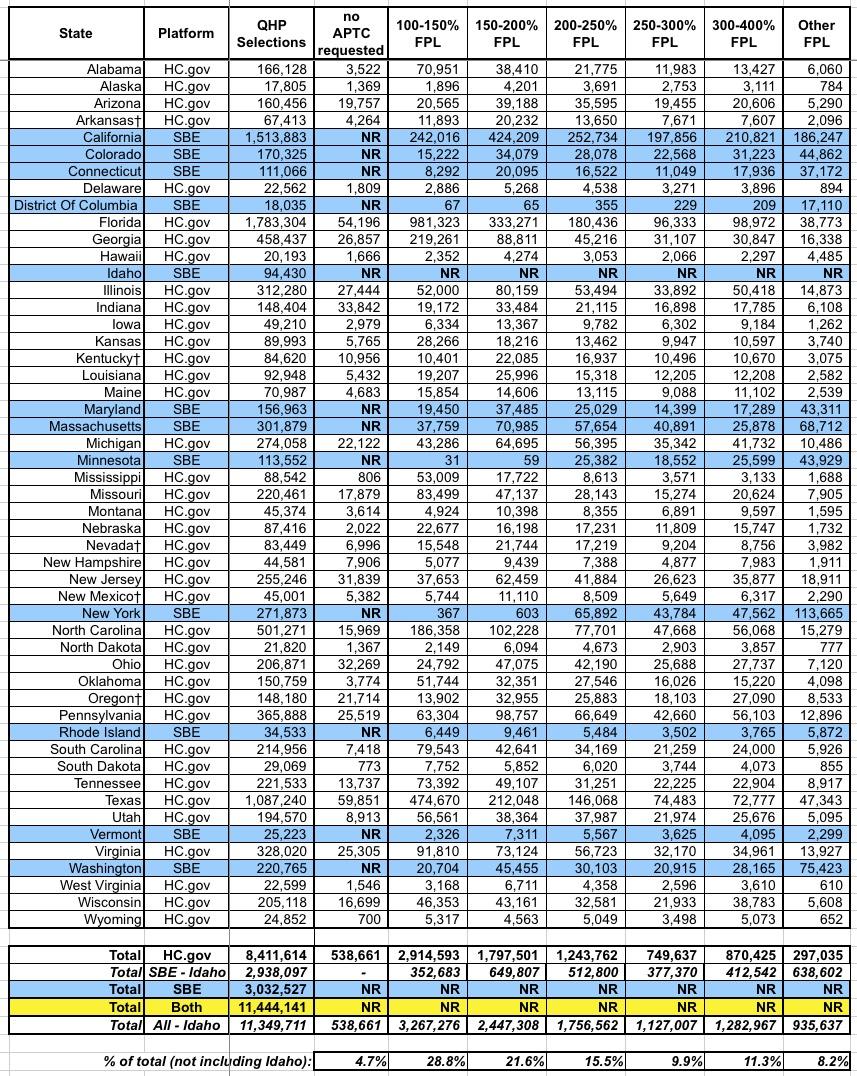
Here's the income bracket breakout by state. Unfortunately, Idaho's data isn't included, so I can't technically get an overall breakout, but I added a line which includes every state except Idaho (which only makes up 0.8% of total enrollments anyway. As you'd expect, the lower income brackets make up the bulk of total enrollments: Around 66% of enrollees earn less than 250% of the Federal Poverty Level.
There's a whole bunch of other spreadsheets included in the PUF, but this is getting absurdly long so I'll just add one more: Standalone dental plan enrollments, which most analysts (including myself, I admit) have a tendency to ignore:
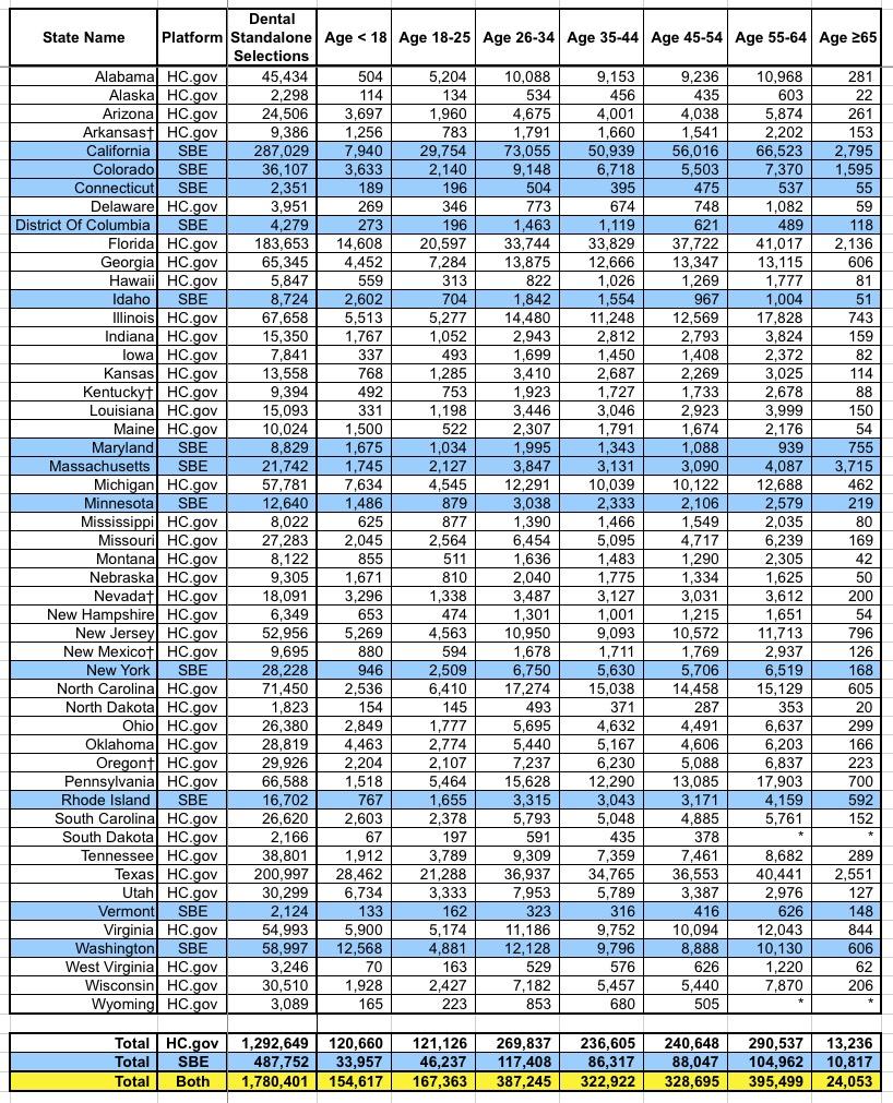
It's important to remember that some healthcare policies also include dental coverage, and I believe most of them are required to include it for children. These are standalone dental plans, purchased separately from the main healthcare plan...nearly 1.8 million people nationally.
Advertisement
