

Right Under My Nose The Whole Time!
Thu, 11/09/2017 - 5:27pm
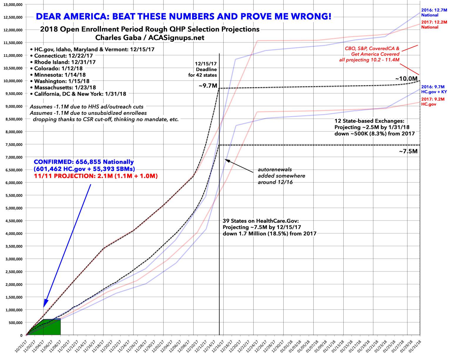
Every year, I painstakingly patch together Open Enrollment Period data from both the weekly (or bi-weekly, last year) snapshot reports for HealthCare.Gov as well as the dozen or so state-based exchanges to compile The Graph. Usually it's kind of bumpy and scattershot because the numbers for some of the state exchanges are released at (and through) seemingly random times. This means that the curve of the graph is usually a bit bumpy and skewed as I try my best to catch up.
Then, at some point the following year, CMS always compiles the data and posts it to a Public Use File (PUF) in a much more comprehensive, organized fashion. I knew this, and have used the PUF for prior years many times to analyze different demographics (income, age, metal level, financial aid, etc).
HOWEVER, what I didn't realize until tonight is that the same PUF also breaks out the enrollments by week in a nice, even fashion. This allowed me to more accurately recompile the enrollment graphs for both 2016 and 2017 at both the federal (HC.gov) and national (HC.gov + SBMs) level.
I therefore present the new, improved 2018 Graph:
Advertisement
