

UPDATE x2: 2017 Rate Hikes: Yes, Medicaid Expansion matters. So do State-Based Exchanges and Transitional Policies
Thu, 10/27/2016 - 10:42am
NOTE 10/29/16: For anyone who read this entry yesterday, please note that I've gone back and completely reworked all 4 the charts, along with adding a fifth one, for several reasons:
- I had to correct an error re. Medicaid expansion (I had Iowa not expanded and Wisconsin expanded by mistake)
- I was able to add the final approved averages for both New Hampshire and Virginia, leaving Louisiana as the only state with a "requested" average only
- The original graphs only listed the median rate hikes for each group; they now list the actual weighted averages for each group of states
- I even added a fifth chart which separates the states out into those which embraced all 3 provisions vs. those which only embraced 1 or 2 of them, and those which didn't implement any.
OK. I ran the numbers several different ways way back in August, when I had compiled the requested 2017 individual market rate hike averages for all 50 states (+DC). However, many things have changed since then. Not only do I have the approved rate changes for 48 states, there were a lot of other major changes along the way, including various carrier pullouts and rate filing re-submissions.
Now that the dust has settled and the 2017 Open Enrollment Period premiums are finally locked in, let's take another look at the average unsubsidized rate hikes by state, ranked by different criteria.
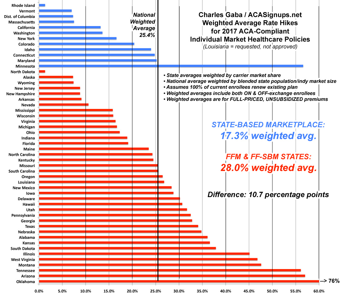
First, here's the states sorted from lowest average rate hike to highest. At the low end are Rhode Island and North Dakota, each with a mere 1.3% average increase. Alaska, which had the highest rate hikes the prior two years, comes in at the low end this year thanks to legislative action taken by the state legislature to create a special reinsurance program. Other states with excessive increases might want to look to Alaska to see how they made this work. In all, 9 states are averaging rate hikes below 10%: RI, ND, VT, DC, AK, WY, MA, NJ and AR.
At the opposite end, unfortunately, are 17 states averaging unsubsidized rate increases higher than 30%...seven of which are over 40%: Illinois, West Virginia, Montana, Tennessee, Minnesota, Arizona and especially Oklahoma, which literally runs off the chart at a whopping 76% for the sole indy market carrier in the state, Blue Cross Blue Shield of OK:

OK, so what trends can be deduced? Is it strictly partisan? Well, both Rhode Island (blue) and North Dakota (red) are at the low end...while Oklahoma (red) and Minnesota (blue) are at the high end, so it's a bit more complicated than that...but there are definitely trends related to partisan leanings.
First up: Medicaid expansion. As of today, 31 states + DC have expanded Medicaid (most via standard expansion, some via modified versions such as Arkansas and Indiana), while 19 states are still refusing to do so. Let's see how they stack up:

Yep, there's a definite difference. States which haven't expanded Medicaid under the ACA have weighted average rate increase of nearly 7 percentage points higher than those which have.
Next up: State-based exchanges vs. states which rely on HealthCare.Gov. This was a bit trickier, since there are several states which technically run their own exchanges but are still hosted via HC.gov (Oregon, Nevada, Hawaii, New Mexico and starting this year, Kentucky). Kentucky was particularly tricky because they're in the middle of moving from their own full exchange onto HC.gov. I wasn't sure where to place these 5 states, but for the moment I'm including them with the federal exchange group:
Wow! Aside from Minnesota (which has their own special situation going on), the difference is even more stark--nearly 11 percentage point difference. The lesson here seems to be that states which take a more active role in operating their marketplaces tend to keep costs under control better. On the other hand, it may simply be that these states already had higher premiums to begin with (I know that's true of New York and Massachusetts, anyway). In fact, if you remove Minnesota from the equation, it drops even more dramatically, to 15.2%.
Finally, what about Transitional (or "Grandmothered") plans? Remember, originally, any non-ACA compliant policy enrolled in after March 2010 (when the ACA was signed into law) was supposed to be discontinued effective 12/31/13. Instead, in response to the massive "If you like your plan you can keep it!" backlash, the Obama administration issued a special extension offer: Any state which wanted to do so could allow their carriers to keep plans enrolled in between March 2010 and October 2013 in effect for one extra year. Eventually they extended this offer by two more years, though the end of 2017.
Some states took them up on this, some stuck to their guns. In the states which did allow the "transitional" plans, some carriers, in turn, took them up on the offer while others didnt't, and so on. Finally, some of the plans were extended by 1 year, some by 2 and some by 3. The net result of this is that as of today, 32 states still have at least some people enrolled in these transitional policies, vs. 19 states in which they've been completely phased out. Here's how that looks:
![]()
Again, there's a significant difference in the weighted average rate hikes of 9.6 percentage points. However, as noted above, the phaseout of transitional plans has been much more gradually/evenly spread out, making it more difficult to see a distinct impact nationally.
In summary: Fully embracing the ACA (expanding Medicaid, running your own full exchange, sticking with the original timeline, etc) is a pretty good way to help keep rate hikes down...but as Minnesota shows, that's not guaranteed. The bottom line is that every state is different, with different demographics, economies and so on...and even then, every county is different. As we learned recently from the Pinal County, Arizona crisis, not only are there 51 markets instead of just one...there's actually over 3,300 if you consider every county/parish in the country to be it's own unique beast.
So what's going on in Minnesota, then? Well, ironically, the biggest factor I can think of appears to be Minnesota's embrace of the ACA's Basic Health Plan program (called "MinnesotaCare" there) which has siphoned off a large chunk of people who would otherwise be eligible for the ACA's "normal" Qualified Health Plans. New York has also implemented the BHP (they call it the "Essential Health Plan"), but that was just added this year and NY has a very different economy and insurance market situation than Minnesota, while MN has had a version of MNcare in place for many years, predating the ACA.
This is a good example of one positive feature of the ACA actually working against another portion of it: BHP is an excellent idea, but it also cannibalizes people from the QHP risk pool. A similar example is the "Sub26er" rule, which allows young adults under 26 years old to stay on their parent's healthcare plans. This is a good and popular provision...but it also means that many of the very same millennials who the HHS Dept. is trying to get to enroll in QHPs to stabilize the risk pool are instead staying on their parent's plans...most of which are part of the employer risk pool instead. Again: Two different ACA-created provisions, each of which is a good idea, but which are actively working against each other in practice.
Oh, one more thing: What happens if I blend all three of these variables together? That is, how much of a difference does it make if a state embraces all of the ACA provisions vs those which are resisting the law every way they can? Here's what you get:
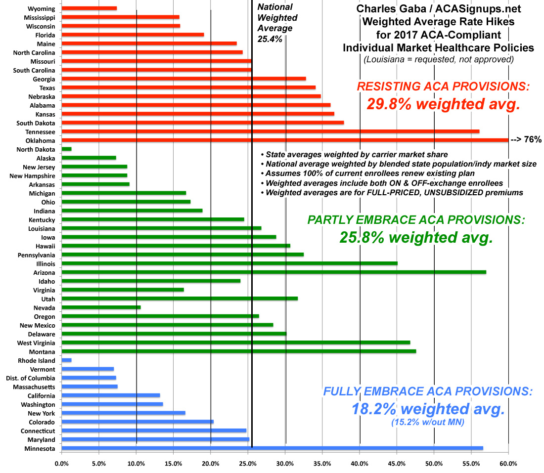
There you have it: The states which are 100% on board with the ACA exchange provisions (running their own full state-based marketplace, expanding medicaid and sticking to the original cut-off date for "transitional" policies) average around 18%. If you remove Minnesota from the equation, it's just 15.2%.
Those which implemented only one or two of the above provisions come in at around 26%. In a possibly coincidental quirk, all five fo the "halfway" state exchange states (Hawaii, Oregon, Nevada, Kentucky and New Mexico) just happen to also fall into this category as well, which is completely appropriate.
Finally, states which are fighting the ACA kicking and screaming (no Medicaid expansion, no state exchange and allowing transitional plan extensions as long as possible) are averaging around 30%.
Make of that what you will.
IMPORTANT UPDATE 10/31/16: I do need to add one important caveat: As several people have pointed out (and as I actually wrote about myself last year), it's also important to distinguish between the percentage increases and the dollar increases in each state...especially if it turns out that the “blue” states tended to already have higher premiums to begin with. If so, that would mean that the same dollar increase would show up as a smaller percentage increase than a state which had much lower rates initially.
For instance, the highest average hike is in Oklahoma, at 76%. The lowest are Rhode Island and North Dakota at just 1.3% each.
However...what if the average premium in OK this year is, say, $200/month, while the average in RI/ND is already $400/month?
If so, OK's 76% would result in averages of $352 next year...still 13% lower than RI/ND's new average of $405.
In other words, I know that New York and Massachusetts, for instance, had pretty high premiums to begin with, so it's possible that the grouping above is misleading. However, this is further complicated by the overall cost of living and average income of each state. I presume that Rhode Island is a lot more expensive to live in than Oklahoma anyway, so it’s hard to run an apples-to-apples comparison. On the other hand, I'd expect North Dakota to be a lot closer to Oklahoma economically/demographically...but having never been to either state, I could be dead wrong about that.
UPDATE x2: (NOTE: I'VE MOVED THE REMAINING PORTION OF THIS UPDATE TO AN ALL-NEW ENTRY)
Advertisement
