A Tale of Two Maps: Trump doesn't even read his own website.
Donald Trump on Tuesday claimed that the Obama administration is lying about the size of ObamaCare premium hikes, saying it put out a "phony" number.
The administration on Monday announced that the average premium increase for a benchmark ObamaCare plan will be 25 percent for 2017, a number seized on by Republicans.
But Trump took the line of attack a step farther.
“And the number of 25 percent is nothing,” the GOP presidential nominee told Fox News. “That’s a phony number, too, that’s a lie, just like everything else.”
The 25 percent number comes from a 40-page report released by the Department of Health and Human Services on Monday. It includes a four page section on its methods, as well as tables breaking down the premium increases by state and county.
Spokespeople for Trump’s campaign did not immediately respond to a request to elaborate on his comments.
Actually, Donald, that's not the original source for "the 25% number". THIS is.
Oh, and if I'm not a reliable enough source for you, how about the Barclays U.S. Health Care-Managed Care 2Q16 Review, which came to the exact same conclusion that I did (remember, Barclays supposedly utilizes international financial services corporation equity researchers for their reports)?
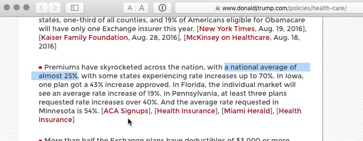
But really, I don't need to wonder whether or not you trust my judgment on this data point. I know you do...because here it is on your very own friggin' campaign website:
Premiums have skyrocketed across the nation, with a national average of almost 25%, with some states experiencing rate increases up to 70%. In Iowa, one plan got a 43% increase approved. In Florida, the individual market will see an average rate increase of 19%. In Pennsylvania, at least three plans requested rate increases over 40%. And the average rate requested in Minnesota is 54%. [ACA Signups], [Health Insurance], [Miami Herald], [Health Insurance]
Just in case you decide to edit the page, here's a screen shot:

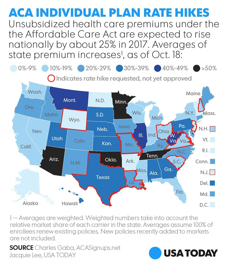
Now, 25% isn't pretty, and yes, some states like Arizona, Minnesota, Tennessee and Oklahoma are indeed looking at rate hikes in the 50-70% range...but others like Rhode Island, North Dakota, Wyoming, DC, Vermont and New Jersey are looking at single digit hikes. It's called a weighted average. You should look into it.
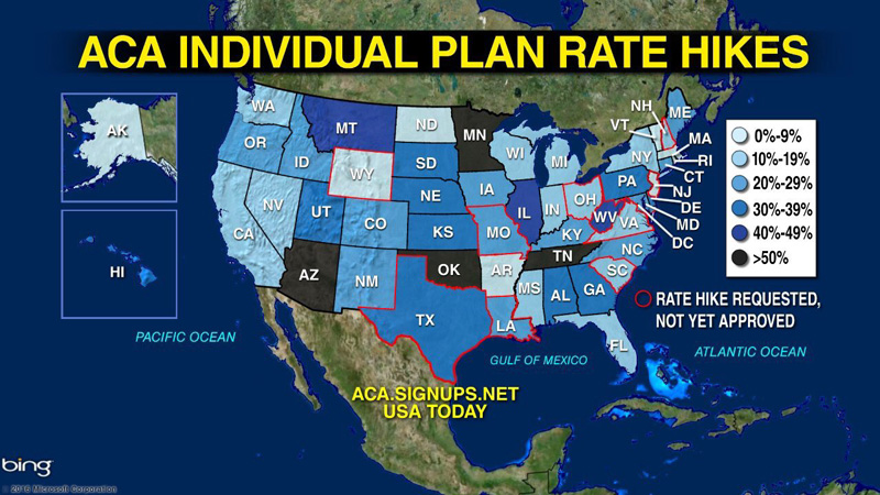
But it gets even better: Not only does Trump contradict his own source (namely, me), he can't even do that correctly. Check out this tweet of his from yesterday:
Obamacare is a disaster - as I've been saying from the beginning. Time to repeal & replace! #ObamacareFail pic.twitter.com/5CvoMbVceT
— Donald J. Trump (@realDonaldTrump) October 25, 2016
As you can see, to his "credit", Trump actually did attempt to credit ACASignups.net as his source. However, he couldn't even do that right; he listed the link as ACA.Signups.net instead of ACASignups.net. I'm sure the folks at Signups.net received a lot of confused visitors yesterday.
However, there's something else worth noting. Here's the original version, which ran in USA Today last week:

Aside from the misspelled domain name, it took me a moment to figure out why someone in Trump's campaign even bothered revising the map in the first place by superimposing it over a Bing sattelite map. I mean, they didn't change the actual state by state numbers, so what was the point?
However, there's an easy answer to that: Notice that not only did Trump strip away the caveats at the bottom (weighted averages, market share, 100% renewals, etc)...but he also removed the key word "UNSUBSIDIZED" from the title.
Ironically, I insisted that USA Today include "unsubsidized" on the map graphic itself specifically to avoid the sort of misleading map that Trump, of course, went with anyway.
Now, the truth is that the ugly rates above are accurate for about half of individual market enrollees (roughly 8-9 million people)...but for the other 9 million or so who are subsidized, it's mostly much ado about little.


