

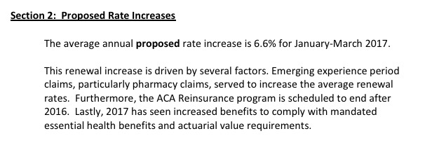
2017 Rate Request Early Look: Massachusetts
Sat, 08/06/2016 - 11:41pm
Massachusetts' total individual market was only around 72,000 people in 2014, but their ACA exchange had disastrous technical problems during the first ACA open enrollment period, causing tens of thousands of Baystaters to enter a sort of "limbo" status healthcare coverage-wise (the first version of the exchange couldn't properly confirm which enrollees qualified for APTC assistance, so only those paying full price were actually enrolled in exchange QHPs; those claiming APTC status were temporarily transferred over to state-based coverage until it could be sorted out, which took nearly a year in most cases). Fortunately, in 2015, the state got their act together and enrolled nearly 214,000 people in exchange-based policies this year.
Of those, over 207,000 were still actively enrolled as of the end of March. MA didn't allow transitional plans, and the bulk of their pre-ACA individual policies were already pretty comprehensive thanks to the ACA's predecessor, "RomneyCare", so I'm pretty sure they have very few non-ACA compliant "grandfathered" enrollees either. The point of all this is that the Massachusetts Health Connector enrollment numbers should cover the vast majority of ACA-compliant enrollees state-wide.
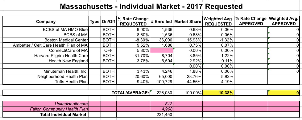
This is a good thing, too, because, like New Hampshire, most of the carriers offering indy policies in MA didn't provide their actual current enrollment data in their filings; only 3 out of 11 did so. For the remaining 8 carriers, I'm using the latest exchange enrollment numbers to calculate the relative market share for weighting purposes.
However, even getting those nubmers requires some calculations. Massachusetts has unique private plans called "ConnectorCare", which are still full ACA Qualified Health Plans (QHPs), but which have additional subsidies for lower-income residents. They're categorized separately on the exchange and in the enrollment reports, so I have to combine two numbers to get the total QHP market share for each carrier:
- Neighborhood Health Plan: 27% x 51,202 + 24% x 168,586 = 13,824 + 40,461 = 54,285
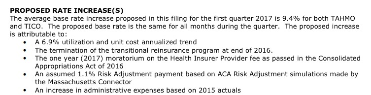
- Tufts Health: 29% x 51,202 + 51% x 168,586 = 14,849 + 85,879 = 100,728
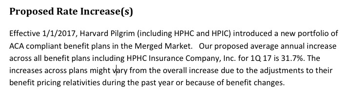
- Harvard Pilgrim: 17% of 51,202 = 8,704
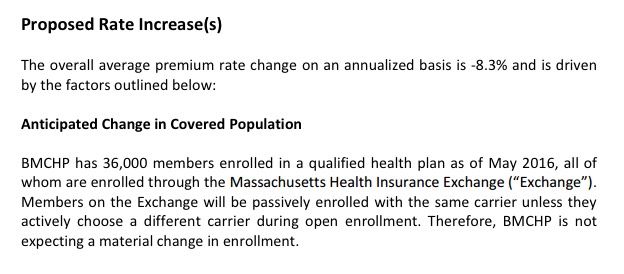
- Boston Medical Center (BMC): 9% of 51,202 + 18% x 168,586 = 4,608 + 30,345 = 34.953
- BCBS MA: 6% x 51,202 = 3,072
- Minuteman: 5% x 51,202 + 1% x 168,586 = 2,560 + 1,686 = 4,246
- Fallon Community Health Plan: 3% x 51,202 + 2% x 168,586 = 1,536 + 3,372 = 4.908
- Health New England: 3% x 51,202 + 3% x 168,586 = 1,536 + 5,058 = 6,594
- UnitedHealthcare: 1% x 51,202 = 512
- CeltiCare: 0% x 51,202 + 1% x 168,586 = 0 + 1,686 = 1,686
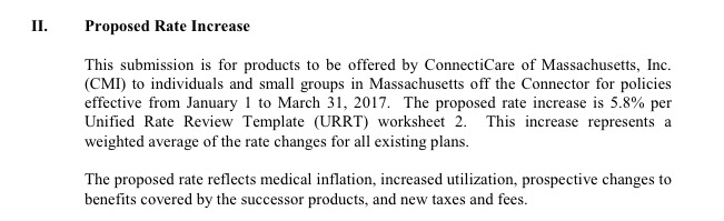
There's two other things to note: "Fallon Community Health Plan", which has 4,908 people enrolled at the moment, does not have any rate filing included on the RR.HC.gov site as of today...while "ConnectiCare", which does have a filing listed (and which shouldn't be confused with either "CeltiCare" or "ConnectorCare"), doesn't appear on the enrollment report because they only sell policies off-exchange. Still, the grand total is over 226,000, so I think I have pretty much everything accounted for.
With that in mind, MA carriers are requesting a (relatively low) average increase of 10.4%.


Advertisement
