

HealthCare.Gov: 2016 Window Shopping Now Open!
Sun, 10/25/2015 - 10:56pm
Well, the HHS Dept. said it'd be live "on Sunday" and while I kind of figured that would mean Sunday morning, they've kept their promise with an hour to spare:

...and sure enough, even the Window Shopping experience has changed since last year; here are the new screens, step by step (I'm using fake data here):
First of all, it's important to note that the benefits of going with a Silver Plan (for those under 250% of the Federal Poverty Line...around $60,000 for a family of 4 in most states) are pretty prominently displayed on the home page:

Here's the overview of Silver Plans and Cost Sharing Reductions, including a quick video explainer.
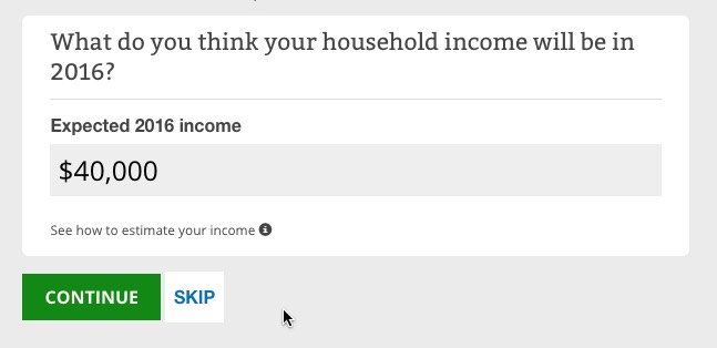
Once you get into the window shopping area, they've vastly streamlined the general info fields; instead of separate screens, about a dozen of them flip by automatically on the same browser screen; the page doesn't have to reload for each field, speeding things up tremendously:


Another good thing this year: They've made both the Advance Premium Tax Credit and especially the Cost Sharing Reduction assistance more prominent (sometimes just a larger font size can make a big difference)...although they still keep the "CSR is limited to Silver plan" text fairly obscure. In spite of the home page reference noted above, I still wish they would call more attention to this point:

The total annual cost calculator is an important and welcome addition, even if it's still in "Beta" mode at the moment:

The way it works is pretty clever (and presumably modelled after similar tools on Covered California and a couple of other State-Based Exchanges. You choose from "Low", "Medium" or "High" expected medical needs for the upcoming year for each person in the household.

Interestingly, the "low/medium/high options change depending on the age (and presumably gender?) of the person. For instance, as a 45-year old man, my "Medium" shows up as "5 doctor visits, 2 lab/diagnostics, 11 prescription drugs (!) and $200 in additional expenses".
However, my 9-year old son's "Medium" shows up as just "3 doctor visits, 1 lab/diagnostic, 2 prescriptions and $100 other".
After you're done with all of this, you review your info and then move on to the actual plans...

...where they've added 4 new "Help Guides"...screen overlays to explain what the hell all of this stuff means (Copayments, Deductibles, Metal Levels and Out of Pocket vs. Premiums, as well as the Plan Filtering tool on the left sidebar):


Finally, you're off to the races. Again, they really should automatically default you to the Silver plans if your income/info suggests that you qualify for Cost Sharing Reduction, but this is still a huge improvement over last year.
Notice that they have made the "Premium vs. Deductible" sorting option more prominent, as well as the "Health vs. Dental" plan toggle switch.
They've also made the "Premium before Tax Credit" full price amount easier to read, although it's still a pretty small font. I still think they should show it like this:
Original Price: $470
TAX CREDIT: -$271
YOUR PRICE: $199
...but that's the just the former retail store manager in me talking, I guess.
By far, the biggest improvement here is the "Estimated Total Yearly Costs" area, which should help people understand how important deductibles and co-pays are when making their choice. While this still isn't as good as defaulting to Silver (especially for those under 250% FPL), it's a huge step forward:

Advertisement
