

New York: 2016 Weighted Avg. Rate Request: 10.0%...with some mysteries attached
Wed, 07/29/2015 - 5:41pm
Earlier today I posted about a mountain of data being released by the New York State of Health ACA exchange, including, among many other data points, the rough market share breakdown of the 19 insurance carriers operating on the exchange this year, like so:
|
|
I assumed this would be helpful in determining the weighted average rate increase requests. Sure, it would be partial since it doesn't include off-exchange enrollees, but it should be fairly representative.
Then I stumbled upon this Crains NY Business article which appeared to have done all the heavy lifting for me:
Health insurers in New York filed for average 2016 rate increases of 13.5% for individuals who buy their own insurance, including sole proprietors, and a 14.3% average hike for the small-group market, according to data released by the state Department of Financial Services.
Under New York's prior-approval law, the agency has the power to lower the requested premium rates. Last year, insurers in the individual market asked for a 12.5% average premium increase, but DFS granted a 5.7% hike. The small-group market averaged a 13.9% gain; DFS approved a 6.7% increase.
Hey, cool! They even threw in the small group market as well. However, the list of carriers only specified New York City, and I wanted to be sure that the 13.5% average was properly weighted, so I asked Louise Norris.
She pointed me towards this article, which not only gave the same 13.5% average, but even broke out all of the companies by percent and total enrollment (both on & off of the exchange)! Awesome!
In fact, that article even points towards the original source database which lists every company--individual and small group alike--with the proposed % change and people impacted all in a nice neat sortable table! Fantastic! If every state did this my life would be sooooo much easier...and it even pointed out an error on the reporter's part: The CDPHP change, which he had down as increasing 5.69%, is actually a 5.69% decrease.
Only one problem: When I plugged in the numbers in the article, the weighted average doesn't come even close to 13.5%...it's actually 10.0% virtually on the nose (and the 5.69% correction actually made the discrepancy worse):
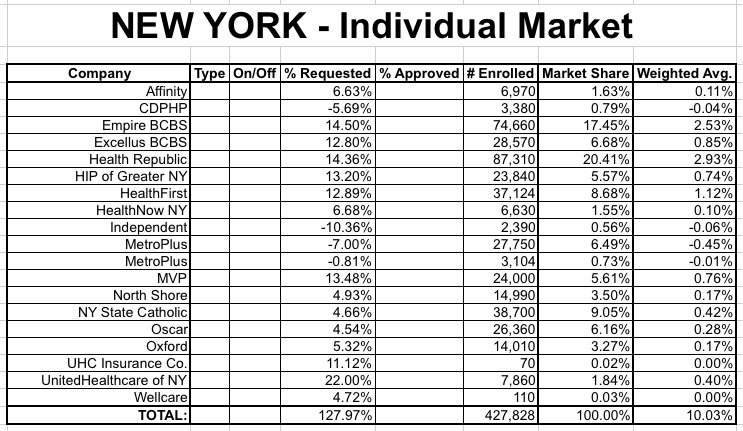
Now, this is obviously good news (relatively speaking), but I'm still mystified by where the 13.5% figure came from. It's not an unweighted average either--if you divide 127.97% by 19 companies, it's less than 7%, so that isn't it.
Ken Kelly suggested that he might be averaging the individual & small group markets together, but not only would that be very silly, it doesn't wash either; doing that only brings it up to 12.7%. Besides, the Crains article was very specific about the 13.5% being for the individual market only.
In addition, there's another problem: The "full" list of companies in the table above should include all of the carriers, both on and off the exchange...yet several of those listed in the NY State of Health press release aren't listed at all: Fidelis, Emblem, BCBS West, Empire BC Upstate and Univera aren't listed at all.
It's conceivable that some of these companies pulled out of the exchange, but they should still be listed as off-exchange carriers unless they've pulled up stakes state-wide entirely (and I'm pretty sure that would have been included in at least one of the articles/press releases).
I've contacted the LOHUD reporter to see what's going on, but until I hear back from him, it looks very much like New York's weighted average requested rate increase is 10.0% even. Of course, even this could change after the state regulators go over them, as they did last year.
UPDATE: Well, Louise has cleared up one of the mysteries...while also highlighting one of the more absurd issues we run into when trying to track this stuff:
@charles_gaba @_kjkelly Fidelis is NY State Catholic Health Plan, if that helps at all.
— LouiseNorris (@LouiseNorris) July 29, 2015
@charles_gaba @_kjkelly And Emblem's plans might be included in HIP's plans, since Emblem is underwritten by HIP.
— LouiseNorris (@LouiseNorris) July 29, 2015
@charles_gaba @_kjkelly And BCBS of Western NY is a division of HealthNow NY.
— LouiseNorris (@LouiseNorris) July 29, 2015
@charles_gaba @_kjkelly And Univera is part of Excellus. I know you love multiple names for one carrier :-) But at least that's cleared up
— LouiseNorris (@LouiseNorris) July 29, 2015
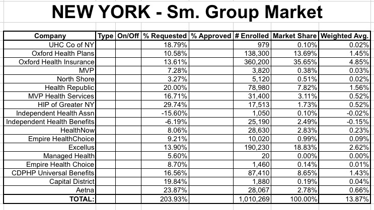
(sigh) Anyway, as for the Small Group market, it looks like the weighted average is around 13.9%...again, slightly lower than the 14.3% claimed in the Crains article, so I once again can't figure out where they got that number from:
Advertisement
