

WSJ story illustrates most of my points re. 2016 rate increase requests
Fri, 05/22/2015 - 2:56pm
A few days ago, over at healthinsurance.org, I pointed out 4 major questions to ask when reading about supposedly-massive rate hikes coming in 2016. This morning I added one more important factor to consider. These boil down to:
- 1. Is the "average" weighted by company?
- 2. Is the "average" weighted by plan/metal level?
- 3. What's the actual old/new pricing?
- 4. Have the rates been approved yet?
- 5. Does the rate change reflect how many people switched policies and/or companies?
Number 4 is easy: NO. None of the requested rate changes that you're seeing flying around right now (and will continue to for the next few weeks) have been approved yet. This could dramatically change some of the final rates.
Number 5 is impossible to know until after the 2016 enrollment period is over, at which point we'll know how many people stuck with their current policies vs. switching to a different one. Last year, for instance, on Healthcare.Gov the breakout was as follows:
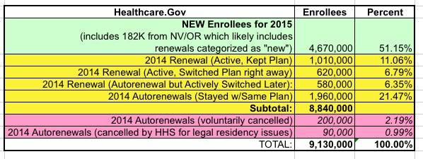
As you can see, out of around 8.8 million total enrollees on the federal exchange, around 24% actively shopped around (when the 14 state exchanges were included later, this number ended up being more like 30% nationally): 11% looked around but stuck with their existing plan, while another 13% looked around at their options and switched to a different plan and/or company. Hopefully the percent who check out their options will increase further this year.
However, Louise Radnofsky in today's Wall St. Journal does a pretty good job of illustrating the importance of the 2nd and 3rd question....especially #3:
The Wall Street Journal scrubbed the biggest health plans’ proposals to see what they might mean for a 40-year-old nonsmoker living in their state capital who picked the lowest-cost, mid-range “silver” plan available.
...Here are the average rate increases by state, included in the Journal story, as well as what the plans are proposing for a 40-year-old capital-living nonsmoker in 2016 and the comparable 2015 rate. In some cases, the across-the-board percentage increase for all the health plan’s products isn’t the same as the change specifically affecting mid-level “silver” plans that cover, on average, 70% of medical costs.
In other words, a given company in a given state may have increased their Silver plan by 10% and their Gold and Platinum plans by 20% while reducing their Bronze plan by 5%...but if most people are enrolled in the Silver plan to begin with, that's the change which will impact the most people.
Here's what they come up with across a dozen states:
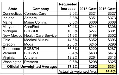
On the surface, headlines screaming about the whopping 36% SPIKE in Tennessee!! and the jaw-dropping 52% SURGE in New Mexico sound pretty horrific...and yes, in some cases they are.
However, when you look at the actual price change that we're talking aobut, it's a very different story. In the case of New Mexico, a 51.6% price hike...as ugly as that may be...is actually only bringing the new total in line with most of the other states. In short, "Health Care Service Corp." appears to have been undercharging this year. The same appears to be the case with Tennessee's crazy-high 36% jump.
In 2015, the basic Silver plan in these 12 states (specifically for a 40-year old nonsmoker living in the state capital) ranged from $199 - $430, a pretty wide spread (54% of the total). In 2016, the range is smaller: from $287 to $476...a 40% spread. My guess is that there's a similar "spread shrinkage" happening between companies within each state as the dust settles on the 2nd year of ACA policy regulations and healthcare policies become commoditized.
In addition, these averages are unweighted by state. New Mexico may have a whopping 52% spike...but they also only enrolled about 52,000 people on the exchange this year, a mere 2.5% of the over 2 million exchange enrollees across these 12 states (I'm not sure about the off-exchange numbers, of course). Virginia's 385K exchange enrollees are going to skew the weighted average with their 13.2% increase a lot more than New Mexico's 52K.
Again, as the WSJ article stresses, this table represents just 1 plan from 1 company in each of 12 states. There are thousands of plans from hundreds of companies across all 50 states (plus DC), each of which will nudge the "average" cost up or down according to how many people are actually enrolled in it, how much of a dollar increase/decrease it represents and a dozen other factors.
In other words, once again: Some policies from some companies in some states will have shock-inducing increases...while others will be reasonable, and others yet may even drop. Keep all 5 of the points above in mind when reading this sort of story (along with numerous other factors like deductibles, co-pays, cost sharing reduction and so on), and above all, don't panic.
Advertisement
